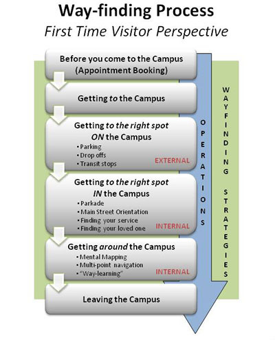
Visiting a hospital, either as a patient, family member, visitor, or even a new staff member can be a stressful experience. In the early stages of the design of the new Alberta Health Services (AHS) South Health Campus hospital in Calgary, Alberta, Canada, it was clear that wayfinding tools would be a key component to improving those experiences, given that it can be a key contributor to stress. As we use the term, wayfinding encompasses all aspects of knowing where you are and successfully navigating to your destination. Figure 1 is a diagram of the wayfinding needs in the course of a visit to the medical campus.

A wayfinding working group included representatives from clinical, non-clinical, and technical services backgrounds, architects, along with patients and families from the hospital’s Citizen Advisory Team. Their work influenced the architect’s design and signage choices, and developed guiding principles and frameworks that would form the basis of the hospital’s wayfinding program. This early groundwork created a real philosophy towards wayfinding through the “first time visitor” lens that was carried through the hospital project as a whole.
Creating an Excellent Wayfinding Experience
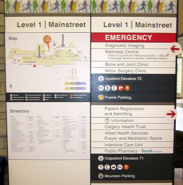
The work on the wayfinding experience incorporated patient feedback and focused on creating user-friendly hospital signage with an emphasis on naming consistency and clarity (see Figure 2). For example, the underground parking garage was divided into four geographic sections each identified by color, a symbol, and a letter to help diverse hospital visitors find their way in a notoriously confusing part of the building. The communication strategy also included the experience before arriving at the hospital, with mailers, brochures, and websites to provide patients and families with maps and directions in advance. The goal is to lessen the anxiety that patient, families, visitors, and new staff have upon entering the hospital by providing a warm welcome, easy access to directions, and/or assistance to hospital areas.

The wayfinding working group conducted a user needs assessment through surveys and focus groups with various stakeholders (including patients, staff, and community members). Although the group thought that the electronic kiosks would be used by a large majority of visitors, patients, and staff, they acknowledged that some people would not be in the frame of mind or state of health to utilize technology. In the needs assessment, many people suggested that a friendly human touch was also important. As a result, the Volunteer Wayfinder Program places people who are experts in finding their way around the hospital at key entry points.
“Some older people won’t use high tech solutions—they want to talk with a person when they are anxious or not feeling well,” —Excerpt from patient feedback survey.
Wayfinding Kiosks
To complement the signage and Volunteer Wayfinder Program, the team decided to create an electronic kiosk, with the direct engagement of users—patients, families, and staff—to define the requirements. The goal was to create a “user friendly” dynamic wayfinding kiosk that would meet the varied needs and abilities of hospital users.
Once the team knew exactly what users wanted the kiosks to do and what features and applications weren’t needed or desired, they developed a Request for Proposals (RFP) for a vendor to develop the wayfinding kiosk.
The human factors team developed a set of custom evaluation heuristics specifically to assess the wayfinding kiosk proposals. The heuristics were based on Molich and Nielsen’s original list of heuristics, but expanded to include kiosk specific requirements and design details.
[bluebox]
Wayfinding Design Heuristics
- Design process: Designed using methods and techniques of “user centered design”.
- Wayfinding principles: Includes overview maps, landmarks, paths, and intuitive signage.
- Anthropometrics and accessibility: Meets ergonomic and accessibility requirements.
- Consistency and standards: Follows consistent standards and conventions.*
- Visibility of system state: It is clear to the user what is going on.*
- Match between system and world: Information matches how users think about the real world. *
- Minimalist: Minimizes extraneous information that could distract or slow down the user. *
- Minimize memory load: Does not require users to memorize a lot of information for tasks. *
- Informative feedback: Provides users with prompts and informative feedback. *
- Flexibility and efficiency: Has a flexible design and customization and efficiency features. *
- Prevent errors: Designed to prevent errors from happening in the first place. *
- Clear task closure: The beginning, middle, and end of each task are clear to the user.
- Reversible actions: Allows users to easily recover from errors and/or change their minds. *
- Use users’ language: Uses language and terminology that is easily understood.
- Users in control: Gives the user a sense of control rather than being controlled.
- Help and documentation: Always provides effective help when needed or requested.*
- Touch screens: Touch screen enables rather than hinders interaction for all users.
* Heuristics from Molich, R. & Nielsen, J. (1990). Improving a human-computer dialogue. Communications of the ACM, 33, 3, 338-348.
[/bluebox]
These heuristics were used to help evaluate the vendor proposals. The three human factors specialists’ evaluations were based on:
- The vendor’s presentation/demonstration and responses to RFP questions,
- Hands-on walkthroughs of each kiosk vendor design solution
- Observation and discussions with a member of the Volunteer Wayfinder Program and a member of the Citizens Advisory Group as end-user representatives.
The human factors team assessed how well each kiosk vendor complied with over ninety-five heuristics using a simple rating scale (from 0 for no compliance to 4 for total compliance). Each person on the team evaluated the kiosk vendor solutions independently. Any discrepancies in ratings were discussed as a group in order to achieve a single consensus rating for each heuristic.
Overall compliance was calculated for each vendor as a percentage based on the sum of the ratings relative to the highest possible compliance score. Scores were also plotted for each heuristic category so that the wayfinding working group could appreciate some of the potential trade-offs associated with each vendor solution. These scores and trade-off considerations were combined with other RFP criteria, which informed the final purchasing decision.
In the end, the chosen vendor, YouRHere Interactive Directories, demonstrated a strong commitment to including the user in the design process (through the use of personas), and a proven track history of design validation. The final kiosk (see Figure 3) also incorporated:
- Wayfinding principles such as landmarks, walking directions, and paths, as well as intuitive icons, symbols, and terminology.
- The best solution to ensure accessibility for a wide range of users. Wheelchair mode moved all buttons to a reachable location at the bottom of the screen and the kiosk has a handrail to support those with limited mobility.
- The best balance of information richness and minimalist design as well as a fast response time and noticeable screen changes to provide feedback to users.

The positive outcome of the procurement of these wayfinding kiosks highlights the need to incorporate usability and human factors testing when purchasing any device for use in the hospital environment. Ultimately, whether designing a new facility or replacing an old technology, we need to ensure that all end-users have been considered and engaged in the process to provide a high quality healthcare experience.
[bluebox]
A Participatory Evaluation Process for Ambulance Stretchers
Moving people on stretcher is hard work: lifting, steering, weight, and care for the patient are all factors. Who knows that better than the healthcare workers themselves? So when Alberta Health Services (AHS) wanted to come up with a better design, the team included people from Ergonomics and Patient Handling (Workplace Health and Safety), Human Factors (Quality & Healthcare Improvement–Patient Safety), and Emergency Medical Services (EMS).
The process included ride-alongs on patient transport and emergency ambulance shifts, and careful evaluation of body mechanics, stretcher handling, weights, and push/pull forces in simulated conditions. Everyone agreed the stretcher prototype evaluated was an improvement on the current EMS stretcher, with a lighter frame and better usability. A list of further design improvements was created to consider when buying new equipment in the future.
—Deborah Goodwin, AHS Ergonomics Team
Deborah has worked in healthcare as a kinesiologist and ergonomist for fourteen years. She holds a Masters’ of Science in Ergonomics (M.Sc.) from Loughborough University (UK) and has her Canadian Certified Professional Ergonomist (CCPE) designation.
[/bluebox]

[greybox]
Full text from Figure 1. Wayfinding Process – First Time Visitor Perspective
1. Before you come to the Campus (Appointment Booking)
2. Getting to the Campus
3. Getting to the right spot on the Campus (Parking, Drop-offs, Transit stops) EXTERNAL
4. Getting to the right spot in the Campus (Parkade, Main Street Orientation, Finding your service, Finding your loved one). INTERNAL
5. Getting around the Campus (Mental mapping, Multi-point navigation, “Way-learning”) INTERNAL
6. Leaving the Campus
The steps in the process are identified as operations within a set of wayfinding strategies.
[/greybox]
大型医院系统的人类因素团队采用以用户为中心的设计实践来设计信息标志。最终,他们采用了符合最佳做法的电子信息亭和导航标志(包括一组定制的启发式评估准则)。 文章全文为英文版
대형 병원 체계의 인간공학팀이 사용자 중심의 설계 관례를 정보 표지 설계에 적용하였습니다. 그 결과로 나온 것이 이용 평가 체험탐구를 비롯한 우수 사례와 부합되는 전자 키오스크와 길안내 표지판이었습니다. 전체 기사는 영어로만 제공됩니다.
A equipe de ergonomia de um sistema de um grande hospital aplicou práticas de projeto centrado no usuário para projetar sistemas de sinalização. O resultado foi um quiosque eletrônico e sinalizações de navegação que cumprem as melhores práticas, incluindo um conjunto de heurísticas personalizadas para avaliação. O artigo completo está disponível somente em inglês.
ある大規模病院システムの人間工学チームは、標識デザインにユーザー中心設計手法を利用した。この結果、一連の経験則に照らし合わせた専用の評価法を含む、ベストプラクティスに合致する電子キオスクと構内標識が生まれた。 原文は英語だけになります
El equipo de Factores Humanos en un sistema de hospital grande aplicó prácticas de diseño centradas en el usuario para crear señales informativas. El resultado fue un kiosko electrónico y señales de navegación que cumplen con las mejores prácticas, lo que incluye un conjunto de heurísticas de evaluación hechas a medida. La versión completa de este artículo está sólo disponible en inglés
