Task analysis may be one of the most important methods that usability professionals bring to a user-interface design project. In our experience, however, task analysis is often not performed, not documented succinctly, or performed but not used in design. This article will explain task analysis, how it is used, and why, too often,we ignore one of the most helpful tools in our toolboxes.
Definitions
What are tasks and task analysis? A task is usually thought of as the steps to accom- plish a goal. A task analysis is a set of methods for decomposing people’s tasks to understand their procedures better, and to help provide computer support for those tasks. In other words, you define the task and the goal of the task, and then list the steps involved. The level of detail is determined by how the analysis will be used.
To create a task list, you need to find all the types of users who either do different tasks, or do the same tasks in significantly different ways. You need to know the prevailing conditions, such as their environments and the available technology. Then you can turn the tasks themselves into discrete subject-verb-object steps.
Some professionals advocate more of a bottom-up approach, starting with scenarios or use cases. Starting from the top down with task analysis may be a better place to begin, however, because tasks are relatively finite, while scenarios and use cases can seem almost infinite. Scenarios can be help- ful later in checking your task list in a complex situation or as a source of ideas for usability testing.
Note that in complex, safety-oriented environments such as aviation or medicine, the task analysis understandably must be detailed and, often, extensively documented. In the more everyday world of the public website or in software application design, however, tasks are often not as complex or critical. As a result, you may have trouble deciding how much time to spend gathering task data and analyzing it. Human Vs. Technological Perspectives Task analysis reminds us to describe and analyze what people want or need to do, not how they will use the technology to do it. It is easy to slip: a colleague caught a professional analyst in a task analysis starting to use technology verbs such as “click” or “link.” He had to remind the analyst to follow her own rules. We sometimes have to remind designers that users first tasks when they arrive at websites is not “register” or “log in” even if this action is a prerequisite for them to do something on the website. Just stopping to think about the user’s perspective can give developers better ideas about when to ask users to log in.
Human Vs. Technological Perspectives
Task analysis reminds us to describe and analyze what people want or need to do, not how they will use the technology to do it. It is easy to slip: a colleague caught a professional analyst in a task analysis starting to use technology verbs such as “click” or “link.” He had to remind the analyst to follow her own rules.
We sometimes have to remind designers that users first tasks when they arrive at websites is not “register” or “log in” even if this action is a prerequisite for them to do something on the website. Just stopping to think about the user’s perspective can give developers better ideas about when to ask users to log in.
Another example: During the analysis of a telecommunications website, one of the web designers asked, “What part of ‘I just want to buy a cell phone,’ don’t you get?” He had no appreciation of the complexity of the task until the development team flow-charted thumbnails of the fifteen long, scrolling pages that were required to buy a mobile phone via the website. That team went back to the task analysis and the business units to redesign the task flow into seven pages, most of which were much shorter.
Sometimes in design projects, you may even need to say, “Pretend computers do not exist.” This helps offset the tendency of users to think only about what they can do with the present system, rather than what they might do with an enhanced one.
Translating Task Analysis into Website Design
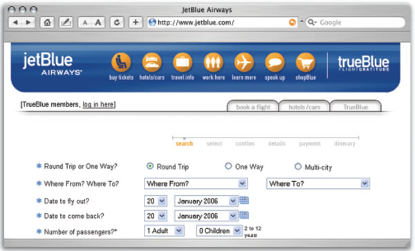
Task data can serve as a starting point in developing an information architecture, mental model, and navigation design for a website. Some websites provide a relatively seamless translation from user tasks to content links using people-oriented verbs.
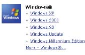
For other sites, organizing task-related information into hierarchical categories based on topics (see Figure 2), products (see Figure 3), or departments (see Figure 4), may complicate the progression from tasks to links. Also, trying to create links by user type is typically difficult because users can fit into many different roles. When a natural grouping is not evident, card sorting may help you find out how users would group and label pieces of information
or services.


Task analysis data come in handy again for pages deep within the site. Knowing the importance, frequency of use, and sequence of use can be valuable in defining the connections between pages in the entire site.
Grouping, ordering, and labeling navigation links based on user tasks has an additional benefit: it helps to remove “silos” among departments or organizations, because you can show site sponsors and stakeholders that you’re using an overall, rational approach to the problem.
For example, in one project, representatives of different types of home mortgage loans were understandably defensive about changing the names of their programs for a new portal page. In the past, users went to specific websites for various types of mortgages— mortgages in rural areas, mortgages for military veterans, or mortgages in general. In each case, the users knew the context. However, when all the loan options were listed together on one page, the context was lost. The designers needed to change the wording of the link names—for example, by adding the word “rural.” Otherwise, users would not be able to find what they wanted and might go down unsuccessful paths (see Figure 5). The site sponsors saw the benefit immediately, and they renamed their programs in light of user needs in the new context.

Task data can provide other benefits as well. It is often helpful to post the user task list or flowchart in a design workroom (actual or virtual). Doing so lets designers refer back to what the users wanted or needed to do and to check that they are, in fact, staying true to users’ needs.
When it comes time to do usability testing, the same task list can provide a framework from which to develop questions that correctly sample the range of tasks that users will perform on the website. We’ve seen some projects in which clients over- or under-sampled certain tasks. Having the task analysis as a reference helped them quickly see whether other test questions were more appropriate.
Reasons Why Task Analysis is Not Done
If task analysis can be so easy to do and is such a good thing, why do clients, and even some usability or human factors professionals, stare blankly when asked about it?
Reason 1: Unaware of value of performing task analysis
It is not within the scope of this article to address return on investment (ROI) from task analysis. However, by showing you how easy it can be to do, and in how many ways it can be useful, we hope to provide you with useful stories that can help you to convince others of the benefits.
Reason 2: Access to users is denied
This statement is always scary to hear from clients. With the increased focus on users and customers, however, we hear less often that our clients are not allowed to talk to their customers. We do still hear that they are concerned about how much it costs to do user interviews.
However, as Jakob Nielsen so aptly put it in one of his Alertboxes, “The most striking truth…is that zero users give zero insights. As soon as you collect data from a single test user, your insights shoot up and you have already learned almost a third of all there is to know about the usability of the design. The difference between zero and even a little bit of data is astounding.”
By interviewing users in person, you can really see what the user does, rather than guess as to the user’s actual past or future performance. You can be less concerned about the mismatch between what they say they would do and what they actually do. A colleague once said, “Users may not know what they want, but they know what they do.”
Reason 3: Results are too messy or complicated
A human factors professional offered one task analysis example for a defense system in which each task step had sixty-plus required database columns of related information. Sometimes you must analyze and document to this extent, but in most systems, you do not need this level of detail. Although user task data will guide you in developing prototypes, avoid overly complicated task analyses at this stage, or you risk “analysis paralysis.”
Reason 4: Too hard to translate task analysis
As usability professionals know, if the tasks cannot be translated into the design, the design will not serve the user’s needs. When designers report they are having trouble mapping user tasks to a design, they often have organizational constraints that are making it difficult to be objective about the user’s perspective.
In one extranet project for researchers, the client was stunned after launch that he was getting few complaints and many compliments regarding the user interface for the newly re-designed website. The task analysis team had asked users what they needed. They mocked up pages to support these needs, and they tested the mockups for usability. The sponsor’s staff then programmed and launched the site. All the task analysis team did was to provide the expert users with what they had asked for. The client’s surprise may indicate how rarely designers and developers just ask, listen, and respond to end users.
Reason 5: Too many other considerations in the design process
Yes, it is humbling to remember that your place in the world of website design is small. However, with the user more and more in the driver’s seat, a practical, cost-effective approach to task analysis can head off many potential design problems.
Create a Sample Task Analysis
Write down a list of things you need to know to pick a restaurant in a city with which you are not familiar. These might include the location of the restaurant, distance to the restaurant, directions, type of food, cost, and so on. Next to each item, put a number to reflect the order in which you want the information, either from most to least important, or from closest to farthest.
Next, go to live websites to see what restaurants you can find in the city of your choice. Try to do the task as you would in real life. How well do the websites you visit match your information needs? What site came closest to meeting your needs and why? What site was least satisfying and why? Did sites meet your expectations for performance—for example, in terms of the time it took? Did any site appear to work better for experts (those who know the city) than non-experts (like yourself)? In real life, of course, you would conduct one-on-one interviews with a half-dozen or more potential users, and not just rely on one user or yourself.
[bluebox]
Additional reading
- Hackos, J. T., & Redish, J. C. (1998). User and task analysis for interface design. New York, NY: John Wiley & Sons.
- Lewis, C., & Rieman, J. (1994). Task-centered user interface design.
- Luczak, H. (1997). Task analysis. In Salvendy, G. (Ed.), Handbook of human factors and ergonomics. New York, NY: John Wiley & Sons.
- Marcus, A. (2005). User interface design’s return on investment: Examples and statistics. In Bias, R. G., & Mayhew, D.J., (Eds.), Cost-justifying usability. San Francisco, CA: Elsevier. (Originally published as Marcus, A. (2002). Return on investment for usable UI design. User Experience, 1(3), 25-31.)
- Mayhew, D. J. (1999). The usability engineering lifecycle: A practitioner’s handbook for user interface design. San Diego, CA: Morgan Kaufman Publishers.
- Nielsen, J. (1994). Goal composition: Extending task analysis to predict things people may want to do.
- Nielsen, J. (2000). Why you only need to test with 5 users.
- Strybel, T. Z. (2005). Task analysis for the design of web applications. In Proctor, R. W., & Vu, K-P. L. (Eds.), Handbook of human factors in web design. Mahwah, New Jersey: Lawrence Erlbaum Associates, pp. 385-407.
[/bluebox]
