If you want to get a kick out of looking into the future of UX design, take a close look at the science fiction movies of the last 100 years. From the birth of film and television, producers needed to show human-computer interaction to make the stories believable and engaging. They had to “fill out” the scenes with hardware and user interfaces to complete the effect. One could even call the producers of the earliest sci-fi films “UX designers and prototypers.”
An early classic of this genre is Metropolis (1927, directed by Fritz Lang), which shows robots intended to replace factory workers (a television display two decades before its time), and scenes of “executive information systems” in the form of complex telephone plug-and-connect control boards (see Figure 1).

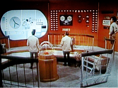
Ideas about control rooms on the ground and in spaceships favored the ever-present twirling digital tape reels and flashing lights. Typical of movies from the 1930s through the 1970s is Journey to the Center of Time (1967, directed by David L. Hewitt), which features a giant wall of displays that enable time travel (see Figure 2).

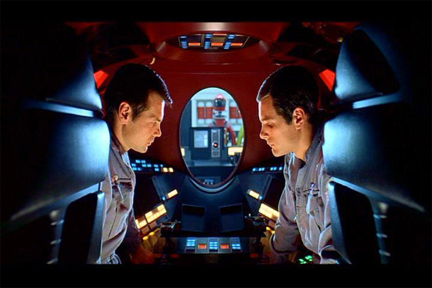
A breakthrough film and another classic of the genre is 2001: A Space Odyssey (1968, directed by Stanley Kubrick). This movie features computer-based user experiences throughout, including detailed interactions with technology and the idea of “rogue” computer systems (see Figure 3). The movie even shows one of the first comical scenes of UX design, during which an astronaut contemplates instructions for using a space toilet that are so long and complex that it is doubtful he is ever able to complete his mission. Interestingly, the movie does not anticipate the use of desktop computers, portable computers, or mobile phones.

The Star Wars films (1977-2008, directed by George Lucas) also achieved classic fame, but had relatively little UX innovation or detail. Most of the memorable scenes involved dirty spaceships, not the “brand new” clean ones of the 1930s-60s. Likewise, the Tron films (Tron, 1982, directed by Steven Lisberger; Tron Legacy, 2010, directed by Joseph Kosinski) focused on action and remarkable computer graphics effects, not the content of UX.
The Terminator film series (1984-2009, directed by James Cameron) shows much more inventiveness in UX design, including augmented reality displays (as used by the humanoid robot played in part by Arnold Schwarzenegger). Total Recall (1990, directed by Paul Verhoeven), also starring Schwarzenegger, features many UX scenes, including large video wall displays, wall-sized X-ray displays, and 3D virtual avatars.
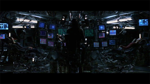
The Matrix trilogy (1999 and 2003, directed by the Wachowski Brothers) contains many innovative scenes of UX design, including an image of “raining alphanumeric symbols,” direct computer connection to the human nervous system, and the use of pills to aid in connecting to virtual worlds. Like many previous movies, the Matrix films feature many “unusable moments” such as scenes of a dedicated user looking at an imposing, but likely unintelligible, array of a dozen screens (see Figure 4). As with earlier films, certain themes of UX design, like these multiple screens, become the standard convention for high technology.

Recent movies have had a love affair with touch screens, gestures, and transparent displays. This latest UX design convention was kicked off in Minority Report (2002, directed by Steven Spielberg). Actor Tom Cruise has a memorable scene “dancing with data” using advanced “Michael Jackson data gloves” to move pictures around a large transparent display (see Figure 5). Similar technologies abound in movies like Ultraviolet (2006, directed by Kurt Wimmer) and Avatar (2009, directed by James Cameron). When it comes to graceful gestures with touch displays however, one can hardly top the alien cockroach-like creature in District 9 (2009, directed by Neill Blomkamp) interacting with its spaceship’s controls.

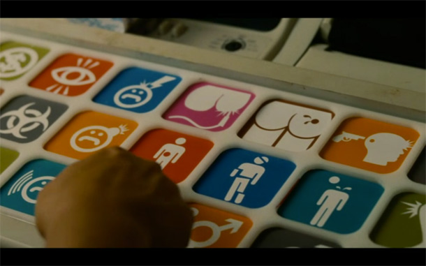
In sharp contrast to many optimistic views of the future and future UX, one must call out the hilariously depressing depiction of a dumbed-down world in the sci-fi comedy Idiocracy (2006, directed by Mike Judge), which features a mediocre individual transported 500 years into the future where he is acclaimed the smartest man on earth. A memorable UX scene shows a hospital attendant trying to classify the hero’s illness using a pictographic keyboard because no one can spell or read anymore (see Figure 6).

It is unclear what UX professionals the movie makers have hired as advisors or consultants to their films. They are rarely, if ever, cited in the movie credits. It seems likely that a more balanced, even more insightful, view of future UX design might emerge if UX professionals reached out to movie production centers. Who knows what the fruitful results of UX-movie interaction might be?文章全文为英文版전체 기사는 영어로만 제공됩니다.Se desejar ver o futuro do design de experiência do usuário, veja atentamente os filmes de ficção científica dos últimos 100 anos.
O artigo completo está disponível somente em inglês.原文は英語だけになりますSi quiere adentrarse en el futuro del diseño de UX, observe con más atención las películas de ciencia ficción de los últimos 100 años.
La versión completa de este artículo está sólo disponible en inglés.
