We have all been there before, you have a critical computer issue such as a boot error or hard drive malfunction and you urgently call customer support in the hopes of getting a quick resolution. Once there, you are presented with a very long introduction about the support offerings, advertisements for promotions, and a lengthy list of menu options. Your impatience grows as you try to remember which menu option was the correct one for your issue. After selecting your menu option, you are bombarded with a series of additional menu options and verifications. You are then asked by a robotic voice to describe your issue and the system checks for a solution—only to inform you it cannot understand what you are calling about. You finally decide to say “representative” in order to escape the menu options and speak with an advisor immediately, but are simply routed back to the main menu. You hang up in frustration.
What Are Voice User Interfaces and Interactive Voice Responses?
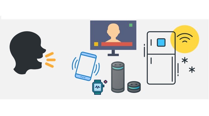
A voice user interface (VUI) allows users to interact with computers and devices through voice recognition technology. VUIs (as shown in Figure 1) are—in essence—discreet, hands-free, and eyes-free interfaces that may allow for more human-sounding and efficient interactions compared to visual interfaces, especially for obtaining basic information such as weather, news, or answers to simple questions. These forms of user interfaces have surged in popularity in recent years and can be found in our everyday devices such as smartphones, smart speakers, television sets, and smart watches. Figure 1. Voice user interfaces in our everyday devices.
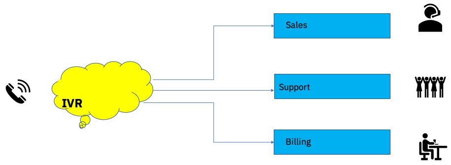
An interactive voice response (IVR; as shown in Figure 2) is a technology used in customer support call centers that consists of an automated telephone answering system that allows a user to navigate through a series of pre-recorded menu options using voice recognition or buttons. These systems were created to automate tasks so callers would not always need to speak to a live agent. Most customer-oriented businesses have made the transition from live operators to IVRs for routing phone calls to customer service agents for the cost savings they provide.

Figure 2. Interactive voice response system.
UX and Voice Interfaces
IVRs were becoming ubiquitous by the early 2000s. Customers were using IVRs for everyday tasks such as booking flights, receiving stock quotes, and banking. However, the IVRs at this time were poorly designed, and the user experience was mainly considered as an afterthought. Many IVRs at the time contained long winded welcome messages, uninterpretable jargon, numerous and confusing menu options, and deep level menu branching. Many callers were frustrated by the poorly designed IVRs and tried to find direct ways of getting transferred immediately to an operator. By the mid-2000s, the importance of UX and IVR design was beginning to be realized amongst organizations and designers. This was mostly due to high levels of caller traffic going straight to an advisor in order to bypass the IVR, creating long wait times. Customer complaints and a loss in business also played a factor in the realization that IVRs were poorly designed and needed to be more customer centric.
In an article in Small Business Trends, Michael Guta highlighted a recent study by Vonage that revealed how detrimental a poorly designed IVR can be to a business. This article states that “this poor experience is responsible for more than half (51%) of consumers abandoning a business because of an IVR system. And this has resulted in companies losing $262 per customer every year.”
Challenges in Designing IVRs for Users
Designing great voice interactive user experiences presents many design challenges that are different from graphical user interfaces—being that IVRs are designed for users’ ears and not for their eyes. The information received by users in auditory format is serial in nature and forces them to rely on their auditory short-term memory for audio prompts. The menu items presented at the beginning and end of the auditory prompts will generally be better remembered than those that appear in the middle, which is consistent with prior research on the recency and primacy effect in auditory short-term memory that Bennet Murdock, Jr. highlighted in his 1962 article “The Serial Position Effect in Free Recall.” Also, due to the limits of auditory short-term memory demonstrated in prior research, callers can typically only recall about 5-7 items with high accuracy. However, in a visual interface, users will generally most accurately recall the information they have seen most recently on the interface that has entered their brief visual memory. It is therefore important to consider how users read information when designing for a visual interface and what draws their visual attention. Using voice user interfaces also puts users at risk of potential interference from environmental noise and other verbal communication issues such as accents, pitch, speed of talking, and an understanding of high-level language concepts such as idioms and metaphors that are not relevant to visual interfaces.
When interacting with voice user interfaces, users generally expect them to behave as if they were engaged in a conversation with another person, as highlighted in an article by Vicky Weng, rather than simply using a technology. An understanding of human conversations therefore needs to be applied to the design of the voice user interface. The VUI should pause between sentences, allow for interruption when the user tries to barge in during a sentence or long list of options, and be sensitive to a user’s accent, speed of speech, and choice of words used.
The Importance of Conducting User Research when Designing IVRs
In his book, Practical Speech User Interface Design, Jim Lewis noted that there has been an increasing trend in the voice user interface design community toward using more research- and data-driven design of voice interfaces. Best practices in voice interface design that are backed by empirical evaluation, such as usability studies, and user data, such as the number of errors in utterances and menu selections, are critical to the advancement of the field and help to ensure that voice user interfaces are consistent and provide good user experiences. Similar to designing visual interfaces, it is important to conduct user research early in the design process when designing voice user interfaces and IVRs. The user research should also collect demographic data from potential users of the voice user interface, such as their job role, work environment, reasons for using the VUIs or IVRs, experience using VUIs or IVRs, alternative methods of interaction or support they are currently using, and geographical location and language.
The IVR UX Design Challenge
As UX practitioners working on the IBM Technical Support Phone System for IBM employees, we were asked to redesign the IVR so that it would be more user friendly and efficient for callers. This large endeavor raised many questions for UX practitioners. First, what were the notable usability problems with the original design? Second, how should we design and test the new IVR call flow, menu options, and voice prompts?
How Did We Do It?
We began by mapping out the current call flow and tagging all the points that received low menu selections, as well as points that received a very high number of menu selections from monthly metrics. We then created a different proposed call flow based on eliminating menu options that received a low number of selections, as well as maintaining some menu options in the call flow that received a high frequency of use. We researched best practices in IVR design and applied some of these principles to the new designs where applicable. Particularly useful resources for best practices in IVR design were the books Practical Speech User Interface Design by Jim Lewis and How to Build a Speech Recognition Application by Bruce Balentine and David Morgan, as well as the design best practices created for Amazon’s Alexa and Google Home for designing voice interfaces. These best practices included when to use speech input versus touchtone input, how to design for the ears and not for the eyes, how to design for simplicity and limited attention, and how to create an effective welcome message to name a few. Next, we used a tool called Lucidchart for sketching out the IVR call flows. Using this tool, flow diagrams for the call routing and various menu options can be sketched out and dialogue can be written into the diagram shapes as well as the audio prompts for the menu selections. While creating the audio prompts, we considered the user’s response modality, work environment, typical responses, edge cases, and error conditions for a few typical user scenarios for technical support. These scenarios included resetting an IBM email or VPN password. Once the audio prompts had been written and finalized on their content and style, we then recorded them into audio files using recording software in our preferred voice from the available options.
How Did We Test the User and What Did We Measure?
We then tested the call flows, menu options, and audio prompts by playing the appropriate audio files to participants remotely using a Wizard of Oz technique. Using this method, participants interact with a system that they believe is behaving autonomously but is actually being operated by the researcher. For example, participants were taken through the audio prompts for a particular call flow and then told the researcher their menu selection verbally; the researcher then manually played the appropriate menu prompt. We generally tested four to six scenarios per round of user testing and tested eight to ten users in one-on-one sessions per user test. In each round of testing, we measured scenario completion rates, scenario errors (incorrect menu selections and utterances), scenario completion times through the IVR to complete each scenario, and satisfaction ratings regarding the overall experience with the IVR and with its ease of use through two online surveys. Participants were also asked additional questions about each call flow at the end of the scenarios to help clarify their understanding of the call flow and the errors they made.
What Did We Find and What Did We Recommend?
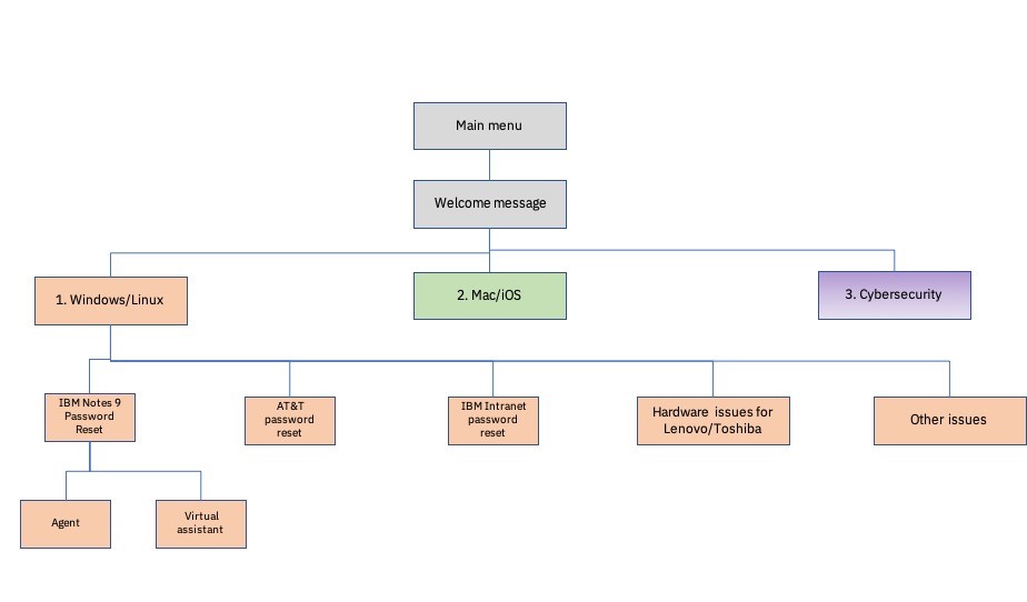
As shown in Figure 3, depicting a flow diagram of the previous call flow, the top call drivers based on the call data were not being represented at the top level of the menu structure. This was noted by some of the participants in the research, as they had to wait for several less frequently used menu options to be listed before they could hear the appropriate menu options for their more frequently used selection. It is a best practice to present frequently used menu options before less frequently used ones and more specific menu items before more general ones.

Figure 3. Initial IBM technical support phone system flow.
Figure 4 depicts the improved IVR design based on user feedback from the first round of user testing and best practices. Participants preferred the shallower branching with a more direct path to the most frequent issues such as IBM Notes 9 password reset and AT&T password reset, and preferred simpler and fewer menu options compared to the previous IVR flow shown in Figure 3. In the revised call flow depicted in Figure 4, we decided to retain the operating system at the top level of the menu structure because participants were used to having this at the beginning of the call flow. Participants also appreciated having the order of menu options reflect the frequency of the issue; the two most frequently used menu selections (i.e., IBM Notes 9 password reset and AT&T password reset) were the first two menu selections after choosing an operating system.

Figure 4. Simplified flowchart for the IBM technical support phone system.
What Types of Prompts Work Best?
Another best practice is to begin by using speech prompts and to use key presses only if callers had difficulty with the speech prompts, were in a high noise environment, or were entering in sensitive information such as PIN numbers. During the user test, some participants were not always certain they could interrupt and waited for all the voice prompts to finish before speaking. The new welcome message was revised to be much shorter and informed the caller that they could interrupt the voice prompts at any time.
IVR Call Voice, Wait Music Type, and a Call Back Feature?
We also tested participant preferences for IVR call voice and wait music selection type when put on hold. Overall, the majority of participants preferred more human sounding voices compared to automated and robotic sounding voicesmainly because listening to a voice that sounded more human was viewed as more genuine and more sympathetic to the issue they were experiencing. They also preferred listening to wait music while on hold versus having nothing playing in the background and preferred the sound of modern sounding music that was calm and pleasant to listen to. Participants were also asked to try a call back option instead of waiting on hold for an advisor when wait times were more than five minutes. The majority of participants noted that they preferred to use the call back option instead of waiting on hold for more than five minutes but wanted more information regarding the specific time of their call back. This was mainly because their expectation was that the call back option would be faster than waiting more than five minutes for an advisor and that they would receive assistance faster. The call voice was revised to sound more human-like, and the call back feature was implemented with the preferred wait music.
Would a Virtual Advisor Be Better than a Human Advisor?
Using a virtual assistant offers many advantages over human advisors within an IVR. These include faster and more efficient interactions with callers than human agents, no wait times as with human agents, and a cost savings in the long run. Virtual advisors have previously been shown to work better for routine, common caller issues but have been less effective at resolving complex issues, edge cases, and anomalies compared to human advisors. As a separate effort to redesigning the IVR, we also designed solutions for our virtual assistant to deflect calls away from human advisors. As shown in Figure 4, we were specifically interested in learning whether callers preferred having a choice to speak with either a virtual assistant or a human advisor or only be offered the virtual assistant. We had participants proceed through call scenarios that ranged from more urgent issues, such as reinstalling the Mac operating system, to less critical issues, such as replicating email software. The scenarios ranged from medium to lower complexity and also varied in their number of required steps. The majority of participants preferred going straight to the virtual assistant and noted that they would only want a human advisor for a more urgent issue such as an operating system reinstall. Some participants even mentioned that they would want to interact with the virtual assistant right at the beginning of their call and not have to proceed through the IVR first to narrow down their issue. The strong preference for using a virtual assistant from the start led to an improved design that could screen calls at the beginning to determine if they could be handled by the virtual assistant with an option offered to speak with an advisor at any time if needed.
How Should the Virtual Assistant Provide a Solution to the Caller?
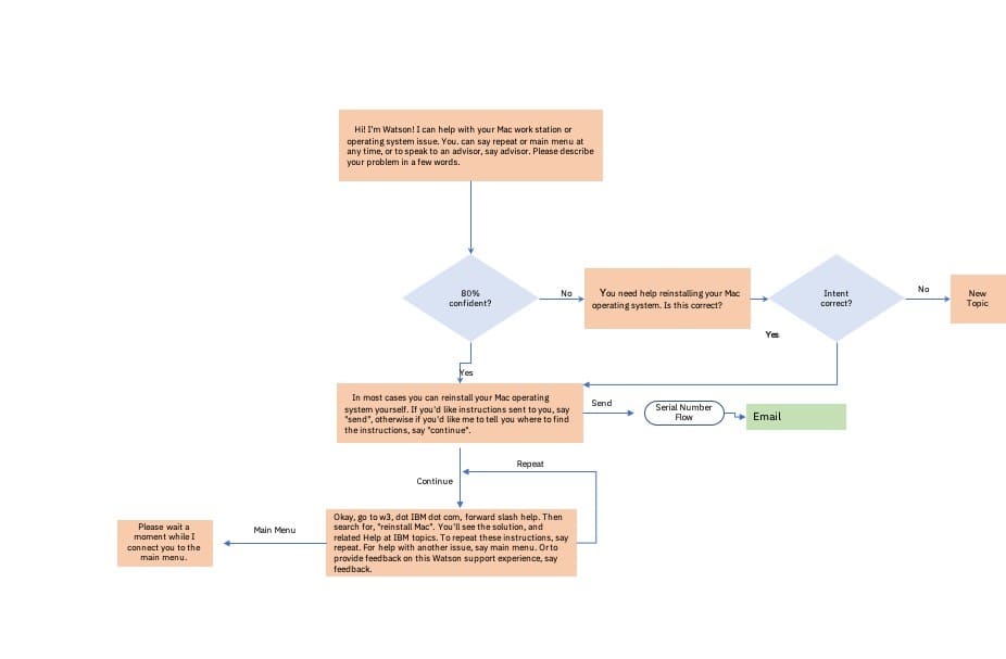
We were also interested in whether participants preferred getting the solutions by voice over the telephone or through email (see Figure 5). The virtual assistant always provided the option to the participant to provide the solution over the phone or through email. Many participants preferred a voice solution over an email solution for simpler problems with a smaller number of steps, as it was easier to listen to the solution than to toggle screens. For more complex solutions with a larger number of steps, such as more than six steps, email was noted by some participants to be a better format as they could refer to it later on. Some participants always wanted both a phone solution with an email solution so they could refer to the email solution later or use the voice solution in case they could not get onto the network.

Figure 5. Virtual assistant call flowchart.
Challenges with Using a Virtual Assistant
During testing of the virtual assistant, we noted some issues mentioned by participants that were helpful for improving the design of the virtual assistant. The virtual assistant, as noted by some participants, did not always pick up their utterance if the exact words were not used (for example, “reset net client password”). Some participants noted that the solutions provided by the virtual assistant were too wordy, especially the welcome message, and that some of the solutions were redundant with an already existing help website that they may have visited before calling. Understanding URLs by voice was also challenging for some participants who noted that they were spoken too quickly or the special characters were unclear. Improvements were made to the virtual assistant so that it was more flexible to the utterance spoken and would recognize a wider vocabulary. For example, if the caller said “Wi-Fi” instead of “network,” it would recognize it as the same menu selection. Information was provided upfront to the caller in the event that the provided solution was too similar to information they may have already seen. The welcome message and solutions were further revised for clarity and made more concise. URLs provided by voice were spoken more slowly and emphasized special characters that were problematic.
Putting It All Together
When designing for voice, it is important that you user test the voice interactions early in the design process, focusing on the quality of the two-way conversations and the experience of the user or caller. After each user test session, incorporate the findings into a new and improved design. Ensure your voice user interface takes into account and respects the caller’s expectations, usage environments, and abilities. Ensure that best practices for designing voice user interfaces are followed in your design as much as possible.
