Medical facilities in general, and hospitals in particular, are often seen as unfriendly places. Visits can be a cause of stress for patients and the general public because of the nature of the visits and the unfamiliarity of the setting. New staff, volunteers, and even existing staff who have been accustomed to their own areas, may not be comfortable navigating the facility, or the parts of it that are unfamiliar to them. During research by the NHS Estates in the U.K., 20 percent of patients and visitors said they were “very worried” or “quite worried” when they were at a healthcare site. Some complained about “getting angry because the directions weren’t clear.”
The anger and frustration is understandable when a person faces the labyrinthine routes common to hospitals that have a grown and expanded over time. The stress is great enough when you can speak the native language and can read the sometimes inadequte directional signs. But when you do not speak that language, it is much easier to feel isolated and to get lost, adding to the stress level.
In January 2003, JRC Design was tasked by Hablamos Juntos with developing recommendations for program standards for signage to best serve Limited English Proficiency (LEP) patients in a variety of healthcare settings. While the national program specifically mentions “Communication for Latinos,” JRC Design’s scope of work stated that, “the signage materials should not require literacy in order to be understood, and should be understandable to people regardless of their country of origin, primary language, education, socio-economic status, etc.”
The report showed that symbol signage is an effective means to communicate across language and cultures. However, the emphasis of existing, tested symbols has only been on transportation, recreation, and sports. And none of these systems were tested in the United States.
A collection of hospital symbols needed to be collected and tested per the standards developed by the International Organization for Standardization (ISO). This would require the use of facilities and significant expenditures of time and money.
Six Recommendations
The report outlined six steps that formed the basis for the symbol development project. They were:
1. Define a common terminology.
There is no standard for terminology, let alone, symbol usage, particularly when it comes to healthcare. One way to make this effective is to start with common nomenclature for room and department identity and symbol usage.
Telling family members to meet a post-surgical patient in the “PACU,” advising someone to come for an appointment in the “Imaging Department,” or telling a hospital patient that her room will be cleaned by “Environmental Services,” may leave patients and visitors scratching their heads. Part of the successful wayfinding is understanding the meaning of destination names and landmarks. Clear, widely understandable terminology will make it easier for patients and visitors to navigate in, and around, complex health facilities.
2. Develop a healthcare symbol system and test it per ISO testing methods.
Based upon the adopted common terminology, have a group of designers, medical professionals, and lay people select existing designs that are reusable in a healthcare context, and design new symbols as needed, testing them for comprehensibility.
3. Develop a translation pool for the terms.
Once common terminology (the referents) is decided upon, it should be translated into as many languages as are likely to be encountered throughout the United States. The U.S. Department of Health and Human Services’ Office of Minority Health (OMH) issued fourteen “Culturally and Linguistically Appropriate Services” (CLAS) standards to aid LEP people using the healthcare system. Standards seven and eight are the most applicable to signage:
[greybox]
Standard 7: Provide oral and written notices, including trans- lated signage, at key points of contact to clients in their primary language informing them of their right to receive interpreter services free of charge.
Standard 8: Translate and make available signage and commonly used written patient educational material and other materials for members of the predominant language groups in service areas.
[/greybox]
The costs of translations have been points of concern for many people. In a report on Health and Human Services requirements for cultural and linguistic standards, the Texas Association for Home Care, Inc., said:
Placing the burden on healthcare providers to obtain accu- rate translations of medical and/or legal documents is a very high standard. Cost-effective resources may not be easily accessible to home care agencies and other healthcare providers to have materials accurately translated.
The common terminology, and their related symbols and translations, will be combined to start an effective multi-language “pool” of commonly used terminology, symbols, and translations for public use. Free access to this common pool will make the use of symbol signs easier to use and more attractive to medical facilities and designers alike. It is expected that over time, this pool should grow as new terms and needs are encountered.
4. Develop user standards for the symbols’ use.
Implementation standards for both signage and uses of the termi- nology, symbols, and translations should be developed. Standards will have to be developed so that when symbols are used, they will be used in a manner appropriate for maximum effec- tiveness. The standards should show the adopted symbols, their English terminology and their translations, examples of typical uses, do’s and don’ts, and an explanation of how the system works. There should also be examples of typical uses for translation leaflets and maps, and how they are an effective tool of the entire multilingual symbol and wayfinding system. These standards should not define a particular signage system. The sign design should be specific for each individual facility.
5. Educate medical and design professionals about the system.
This combination of terminology, symbols, and translations should be announced to the various organizations that can most benefit from and use them: medical administrators and facilities man- agers such as the American Hospital Association; graphic designers and wayfinding experts such as members of the Society of Environmental Graphic Design (SEGD), the American Institute of Graphic Arts (AIGA); and architects, interior designers, and plan- ners, including members of the American Institute of Architects (AIA), the American Society of Interior Designers (ASID), and the American Planning Association (APA). Having these and other related groups involved will help to ensure the use and success of the program and its adoption in other locations throughout the country.
6. Educate the public about the system.
Once the new multilingual symbol system has been created, the public must be informed of its use. The final designs should be collected in booklet form, translated into the most popular languages, and distributed to schools, adult centers, and organizations that cater to communities with large LEP populations. Educating the public, both English-speaking and LEP, will play a key part in making the project successful. Locally and nationally, communities should be told about the implementation of this new system. On the local level, opportunities include community centers, church groups, schools, etc. Both locally and nationally, media outlets—television, radio, and newspapers—should be contacted, and may provide free airtime or space through public service announcements. The more people realize that such a system exists, the more they may request that their local healthcare facilities adopt it. The attention to individual language groups should reflect well upon the local healthcare facilities.
The development of the above information, including any maps, should be done by graphic design professionals, maintained by one department within the healthcare facility, and used by all other departments for the sake of consistency and effectiveness.
What Happened
By March 2004, Hablamos Juntos and JRC Design signed a pro- posal to proceed with development of the symbols based upon the above recommendations. A design team consisting of six design firms, including JRC Design, was organized. Wendy Olmstead of Ivy Tech Community College was retained to review and compile the testing results. SEGD was brought in for on-site testing and maintenance of the final product.
Both Hablamos Juntos and SEGD had technical advisory committees. In mid-June, 2004, JRC Design sent a survey to the administrators of the ten grantee sites (Molina Healthcare, Inc., Long Beach, CA; Inova Health System, Falls Church, VA; Temple University Health System, Philadelphia, PA; Central Nebraska Area Health Education Center, Inc., Grand Island, NE; En Español, Birmingham, AL; Greenville Hospital System Foundation, Inc., Greenville, SC; School of Public Health–University of North Texas Health Science Center, Fort Worth, TX; Regional Medical Center at Memphis, Memphis, TN; Choice Regional Health Network, Olympia, WA; and Neighborhood Health Plan of Rhode Island, Providence, RI).
The instructions stated:
[greybox]
Through this survey we are looking for an understanding of the public use of your facilities. The following two page survey should be filled out by persons who help guide visitors, or those with a global view of patient flow throughout the facility. This includes clinical and administrative staff.
PLEASE FIRST: Read all 58 place/service/specialty referents.
SECOND: Select up to 30 of the most common place/service/specialty referents in your facility. Indicate the term used in your facility to describe these place/service/specialty referents by marking the appropriate box, or filling the space marked ‘Other.’
NOTE: Use spaces 59-65 for terms that may not have been addressed through the rest of the survey.
[/greybox]
The surveys were sent back to JRC Design at the end of the first week of July. The results were tallied and what emerged were three tiers of referents:
- Those that can be seen from a vehicle (Emergency and Ambulance Entrance)
- Those that are services (Medical Records, Registration, Billing Department, Waiting Room)
- Those that are medical terms (Cardiology, Mammography).
Thirty referents were selected for symbol development. They were:
Medical Records, Emergency, Care Staff Area, Laboratory, Social Services, Billing Department, Pharmacy, Registration, Ambulance Entrance, Radiology, Surgery, Pediatrics, Intensive Care Unit, Family Practice Clinic, Waiting Area, Immunizations, Internal Medicine, OB Clinic, Cardiology, Diabetes, Physical Therapy, Chapel, OB/GYN, Oncology, Outpatient, Infectious Diseases, Mammography, Interpreter Services, Alcohol and Drug Abuse, and WIC (Women, Infants, Children).
The design team was given this list and asked to develop symbols based on the Department of Transportation (DOT) “look” as a starting point.
- Wendy Olmstead provided approximately 300 symbols that she had collected from other symbol sets during her study for her masters in graphic design.
- JRC Design also provided approximately one hundred symbols they had collected from their research for the Hablamos Juntos report.
The design team developed another 200 symbols. The team met in Paradise Valley, Arizona, on August 21, 2004 to review each other’s symbols and to select five or six for each referent that would be tested. At this meeting, two of the referents were dropped from the list. These were Alcohol and Drug Abuse and WIC (Women, Infants, Children)—the former because it encompasses a variety of activities that would require further analysis and the latter because it is a government program that does not need an additional symbol.
Through a series of tests on October 2004, December 2004, January 2005, and March 2005, the remaining twenty-eight referents’ symbols were accepted or rejected, revised, or completely redesigned.
Field testing was done at four sites throughout the country: Sommerville, Massachusetts; Grand Island, Nebraska; San Francisco, California; and Atlanta, Georgia. These sites were chosen because they were large urban areas, mid-sized cities, suburbs of a large city, or suburbs of a small city.
Test results validated that the symbols helped people, particularly LEP people, to navigate the sites more quickly and with more confidence. With the completion of the final round of tests, seventeen symbols were found to have a comprehensibility rating of greater than 87 percent, meaning they bested the criterion for acceptance per ISO standards. These symbols were then redrawn to maintain consistency to the overall look of the symbol set. The eleven remaining symbols were redesigned by the design team and the technical advisory committees, using information from the tests to guide the new designs and revisions.
[bluebox]
Our Design Strategy
What were the elements of the design strategy?
The symbols were to be based upon DOT standards using a grid developed for The International Pictograms Standard. They were to be tested to validate their usefulness.
How did the design solution support project requirements?
It pointed to symbols being selected by the public, not by designers.
How were end-users involved in the process?
The ten grantee sites include hospitals, medical centers, and health programs. They were very involved in selecting the twenty-eight referents. They hosted the testing while other medical sites did the field testing. As noted, the public helped to select the final symbols.
What is unique about the user experiences?
There was a broader use, and more awareness of, cultures when the symbols were designed and selected.
What were the constraints of the solution?
We always understood that we would not reach acceptance through testing for all the symbols.
How was business and culture affected as a result?
We have had several companies and hospitals call us, anxious to use the symbols as soon as they are completed. As they are implemented into healthcare sign systems, we expect that people of other cultures may be surprised to see that their needs are being more directly addressed.
[/bluebox]
What Didn’t Happen
As noted above, testing of the symbols would be critical in helping to validate which symbols should be used. A testing method developed by Harm Zwaga, researcher and teacher at the Psychological Laboratory of Utrecht University in The Netherlands (who was known for his work on information design, wayfinding, and signage systems), became our standard testing instrument.
Ideally, for these symbols to be truly “universal” in acceptance, they should be tested in various countries using indigenous populations. There was no time, money, or facilities to do that. Testing people who are LEP is, at best, an approximation. It is not known how much assimilation with American culture each participant had, although it could be argued that in many other countries, the American culture is difficult to avoid.
Timing also became a concern as the last paper tests were being conducted at the same time the field tests started. Better coordination would have allowed more testing of the eleven symbols that tested equal to, or lower than, 87 percent.
A fourth round of testing would also have been useful. As noted above, the seventeen top symbols are being redrawn. It would be helpful to find out if that step affects their test scores. It would also have been good to do another round of tests for the eleven redesigned symbols.
How We Decided on Our Process
Having worked on several hospital and medical facility projects, we were well aware of the lack of symbols available for healthcare. When this project came to us, we were able to convey to Hablamos Juntos our enthusiasm and the great potential this project had to benefit the population. During our research, we learned about the ISO testing methods. Those methods seemed comprehensive and would serve to validate the symbols ultimately used in the set. Our research also led us to Wendy Olmstead’s masters thesis, Comprehensibility Estimates of Symbols for Public Information Signs in Health Care Facilities. The information proved invaluable and allowed us to create an even better informed report. We knew there would be several referents that would defy immediate comprehension—and thus test poorly—no matter what we did, and that education would be the key to the overall success of the project. We were expecting about 50 percent success. Instead we achieved nearly 61 percent success with all the symbols.
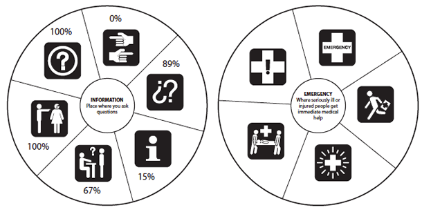
Test Materials
The original tests consisted of a five- or six-spoked wheel approximately seven inches in diameter. At the center of the wheel was another circle two inches in diameter. This circle had the definition of the referent. Each spoke contained a white symbol within a black, one-and-five-sixteenths-inch square. At the top of each sheet were the instructions:
For each healthcare symbol shown, please estimate the percent- age (%) of the United States population you think will understand what it means. 100% means everyone, and 0% means no one.
Each person was given a test form of twenty-nine pages, one for each referent and a cover instruction page. The tests were available in English and Spanish, and translators were available for other language groups. The tests were administered by the ten grantee sites. Each round was to have ten participants: two English speaking, two Spanish speaking, three speaking Asian languages, and three speaking European languages.
Field testing included placing symbols over existing signs, directory mockups using symbols and text, and matching tests. Participants were asked to navigate a trail using the existing sign system only, a paper map with symbols to match the mockups, a paper with only the symbols, and a combination of all three. They were timed as they walked each path.
The final set of symbols may be downloaded at either www.hablamosjuntos.org or http://www.segd.org/resources/symbols.html.
The Future of the Symbols
The concept of a set of symbols specific to healthcare has met with great interest from both the design and medical fields. The set is cohe- sive in look, and as the ancillary materials are written, the set should be comprehensive in scope.
It is not a complete set, however. We recognize about fifteen to twenty additional referents that may be useful to add in the future. SEGD is working with several universities to assist in the research and testing needed for this next step.
For the future symbols, testing is invaluable. It helps to eliminate bad symbols and emphasizes the good symbols. But “bad” and “good” have different meanings in this case. They represent whether a symbol is comprehensible and meaningful to the general public. We found that the public tends to respond to more information in a symbol, particularly if there is any ambiguity within the design.
For any new symbols, several steps are recommended:
- User research. Prior to any drawing, the general public should be surveyed, asking their opinions as to what a referent should look like.
- Broader pool of designers. The designers seemed to lock on to certain concepts early in the process. Any revisions were often minor. Changing designers after each round of testing may open up the design options.
- Additional testing for symbols that tested equal to, or lower than, 87 percent. Matching tests may allow for additional acceptance of symbols testing below the baseline.