Practicing designers can tell you that designing mobile touchscreen apps for children is different than for adult users. Still, what does science tell us about what interface differences are critical to remember? We are engaged in the science of child-computer interaction. Our empirical research has focused on capturing how the cognitive and physical traits of young children under the age of 10 affect the success of their interactions with touchscreen interfaces. We, and others, have produced research-driven design recommendations to consider. Here, we share our top seven guidelines for designing for children under the age of 10 and the evidence that led to them.
Designing Interactive Experiences for Children
Children can be a delight to design for when creating interactive touchscreen apps. Their excitement and interest in apps with bright colors, fun characters, and their natural propensity for wanting to play can be a rewarding space for designers to explore. However, the standard methods and techniques of designers that are used for adults may not always apply, or may have to be adapted to work with children. In particular, children’s rapid development, both physically and cognitively, can make design work a constantly moving target. What works well for a 4-year-old, can be drastically different from what engages an 8-year-old. A minor usability problem for an adult can make an app completely unusable for a child. What is more, the varying literacy abilities of children means you may need multiple methods of engaging children, or to stretch your thinking beyond your typical toolbox of design patterns, menus, and icons when generating touchscreen interface designs.
Children’s ability to participate in standard user-centered design methods, like interviews, surveys, and usability studies, is also quite different, and more care needs to be taken to ensure that designs are appropriate for children. The good news is that by learning to design for children, you will likely make applications easier and more delightful for all, so it is well worth the effort. Allison Druin, a founding figure in the science of designing for child-computer interaction, outlines four ways that children can be engaged in the technology design process, each with varying degrees of involvement:
1. Children as users
2. Children as testers
3. Children as informants
4. Children as design partners or co-designers
While “children as design partners” is the most involved method for engaging children, it is also the one with the biggest payoff. Design studios that focus on children often form co-design teams with children, who help adult designers come up with new ideas, sketch, and mockup prototypes on an ongoing basis. If you can’t create your own co-design team, you can still work with children as part of this process, either by studying them as users or engaging them as informants or usability testers. While we hope that the guidelines below can provide a shortcut to designing great experiences for younger children, nothing will replace engaging them as part of your design process.
Designing for Children’s Physical Capabilities
Anyone who has watched a small child try to use a fork or draw with a pencil can understand that children’s motor skills are not always up to the task. Gross and fine motor coordination develops in phases over the course of a child’s first 10 years of life. Gross coordination, such as reaching one’s arm out and grasping a cup with two hands, is fairly well-established behavior by age 4 to 5 months. Meanwhile, the fine motor dexterity required to hold a pencil, assemble and disassemble small LEGO blocks, or braid someone’s hair, takes several more years to develop.
Using touchscreen devices like smartphones and tablets calls on more fine motor control than gross, especially given that on-screen widgets are often quite small. You might assume that little fingers would have an easy time touching little targets (for instance, children don’t have the “fat finger” problem so often cited in mobile app design for adults, in which one’s finger obscures a significant portion of the surrounding content on screen). However, the dominant factor in hitting these targets is the fine motor skills required to zero-in on the target and touch it successfully. Our work has shown this effect is true regardless of target size or screen real estate. In human-computer interaction, Fitts’ Law dictates that the time it takes to successfully hit an on-screen target is a function of the distance to the target and the size of the target. As the size increases, the time decreases. Children’s developing motor skills make smaller targets too challenging, leading to our first design recommendation:
Guideline 1: Use larger on-screen widgets for children; the younger the child, the larger the target
A child’s motor skills development also affects their ability to perform expected interactions in touchscreen apps, like drag and drop, or other gestures. Our work and that of others has shown that children under the age of 5 cannot use drag-and-drop interactions effectively: They often accidentally stop making contact with the device during the drag, losing their progress. A more successful approach with this age group is “tap-and-tap,” that is, allowing them to tap the item to be moved first, then tapping where they want to move it. Thus, our second design recommendation based on children’s physical capabilities is:
Guideline 2: Don’t use drag and drop for children under the age of 5; provide alternatives like “tap-and-tap”
Research on child-computer interaction has also explored children’s use of gestures such as tap, swipe, zoom, and rotate. While children as young as 4 can easily perform simple gestures like tap and swipe, more complex gestures like zoom in, zoom out, and rotate are more difficult for children to use even up to the age of 8. In our work, we have also examined shape-based gestures such as squares, circles, arrows, and letters or numbers. Children might be asked to use these gestures in apps to select items or to practice their writing skills. Our work has shown that gesture interaction like this often requires too-fine motor control for children under the age of 6 or 7.
Decades of child development science have resulted in the creation of neuropsychological tests of visual-motor integration skills. Here, children are only expected to begin to be able to spontaneously draw certain shapes as they pass through developmental milestones. For example, at ages 3 to 4, children may only be scribbling; by ages 5 to 7 they can create shapes like circles and squares; by about 7 to 10, children are able to produce well-formed geometric shapes. Providing tracing guidelines and being tolerant of children losing contact with the device during their gesture can help children make some of these gestures more successfully. This leads to our third design recommendation:
Guideline 3: Avoid complex shape-based gestures for children; either provide tracing guides or use simpler gestures without tight corners and long paths.
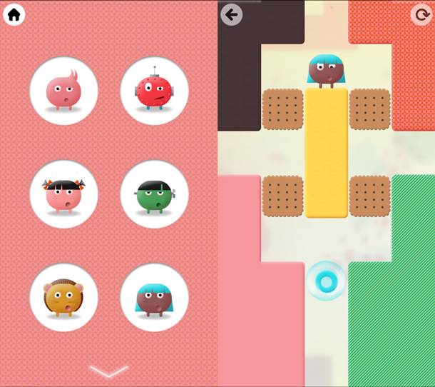
Finally, on the motor skills side, our work has shown that children’s slower reaction times affect their interactions throughout the interface in various ways. For example, across our studies, we have consistently found that children tend to be slow to notice when an on-screen widget has been activated, leading to held-over touches, double-taps, and unintentional interactions. We have also seen that these behaviors are amplified as more and more visual information (for example, animations and graphics) is available onscreen. Figure 1 shows Thinkrolls, an app that has higher tolerances. Combined with young children’s higher level of inaccuracy in tapping onscreen targets (for instance, tapping just outside the bounds of the target), this leads to our fourth design recommendation:
Guideline 4: Increase tolerance in time and space for children’s slower reaction times and inaccuracies in their interactions.
Designing experiences that are physically appropriate for young children is not enough. While preschoolers may have no physical barriers preventing them from watching Game of Thrones, its content was not designed to be cognitively or emotionally accessible to this audience. Through our reviews of content for children in app marketplaces, we have found that designers targeting young children routinely draw on design paradigms developed for adult users, not all of which are a good match for children.
As we described earlier, designing interactions driven by gestures that children can perform is an important component of creating apps they will be able to use. Nevertheless, it is equally important to help them understand what gesture to perform and when. In one study we looked at the age when children begin to understand common types of prompts and instructions embedded in the apps they use (for example, common design patterns such as audio instructions, blinking items on screen, or a cartoon hand demonstrating an action). Children under 3 were only able to interpret instructions when they came from an adult model. However, children made rapid gains between the ages of 3 and 3-and-a-half, at which point they were able to follow certain types of in-app prompts users are likely to encounter.
In this work, we did not uncover systematic techniques that enabled our youngest participants to understand app directions unless they were supported by an adult. For 2- and 2-year-olds, designing experiences that encourage adults to participate and help children figure out what to do is especially useful. Apps that support exploration and do not require children to figure out the one “right” action are also a good match. These findings lead to our next design recommendation:
Guideline 5: Encourage adult modeling of interactions for children under 3. Later, audio or onscreen demonstrations can be used. Avoid visual effects for teaching gestures and interactions.

Still, children do more than just manipulate onscreen objects; they also need to interpret the content on-screen and make sense of what it means. Decades ago, psychologists realized that young children gradually develop the ability to link symbols to the objects they represent. For example, the ability to see one object (a globe) and know that it is two things at once (a cardboard sphere and a representation of Earth) is a skill that takes children several years to master.
Why does this matter for app designers? In a review of popular apps for children under 5, we saw that about half used symbols as an important part of the interface, in the form of progress bars, badges, maps, and other representations. For example, Figure 3 shows two versions of a mini-game in which the player fills a cup with water from a faucet. In both cases, each time the child taps the faucet, a small amount of water pours in. In the version shown on the left, the water can be tracked through direct observation, while the version shown on the right requires the player to interpret a symbolic progress bar. We saw that even children as young as 2 years of age could easily detect when the cup was full if they could also track the water directly. Still, children were nearly 4 years old before they robustly understood that a full progress bar meant the water had reached the top. This leads to our next design recommendation:
Guideline 6: Avoid symbolic representation in apps for children under 4. For older preschoolers, make symbols as literal as possible (for example, represent the cars they have collected with tiny car icons, not stars).

Finally, when families choose content for children, they consider more than just usability. For many parents, the way in which an app, a game, or a video fits into daily life is at least as important as how it’s played. In interviews, parents have consistently told us that one of the main reasons their young child used apps and games was because it freed parents to take care of other essential chores, work, and self-care. They also said that although they thought this was a “win-win” situation that benefited the whole family, it can sometimes be a struggle to set boundaries and they wished it were easier for children to set down apps, games, and videos. In exploring this further, we have found that families find it easiest to align their boundaries with natural stopping points within a game or app. Like chapters in a book, natural stopping points make it easy for families to take stock of how the app fits their current situation and decide whether it makes sense to continue engaging or set the experience aside, leading to our final design recommendation:
Guideline 7: Design for natural stopping points within the game to encourage children’s self-regulation and ability to transition off screen-based media. Avoid including features that auto-play or advance new content that children select without taking breaks.
Conclusions
The evidence is clear: Children under the age of 10 need different interaction support than other age groups. Referring to these seven guidelines will help you design children’s touchscreen apps that are more successful for this age group by supporting their natural development and growth. Moreover, including children as part of the design process—whether they as testers, informants, or co-designers—will ensure a better experience for all. By considering these tips, we hope you will be able to focus on the fun factor of designing for kids!
If you’re interested in learning more, such as the best font choices and colors for children’s apps, we highly recommend Sesame Workshop’s Best Practices: Designing Touch Tablet Experiences for Preschoolers.