Data for data’s sake is pointless.
If you have a website, that usually means that at some point you will implement some kind of web analytics. You’ll do this to gather data about your users’ behavior and to see whether you need to make changes to your website. The information you get from analytics is crucial for learning not just how to improve the UX of your site, but for improving other areas necessary for a successful online business, such as effective sales.
Unfortunately, figuring out how to make meaningful changes based off analytics is not as easy as it sounds. The truth is that most people do not know what to do with analytics. Even if they can read and understand them, they often struggle to translate the data into decisions that will move the needle.
If you are a web analyst you probably understand how to read the data and make data-driven recommendations. But can you clearly communicate your findings and encourage your team to take action? If you think you will be granted everything you need (for example, money, resources, tools, and responsibilities) just because you understand the value of web analytics, you’ll be in for a surprise. It simply does not work like that. Remember that your team may not be able to understand analytics reports just by reading them. Take the advice of Ernest Hemingway: “Show the readers everything, tell them nothing.”
How to Eliminate Opinions
Turning data into action can be a tricky process. In opposition to the hard facts of analytics, there are opinions that everyone on your team is bound to have. You will need to deal with these and that can be a dirty game. Everyone thinks that their ideas for how to improve the website are the best. To sort out the good opinions from the bad and turn good opinions into actions, you will need proper support.
Figure 1 shows the complete diagram of the steps required to move from data to actual change. The business value increases as we go from collecting the data to making change happen.

Traditional web analytics tools can be incredibly insufficient for helping you to transform your data into actionable results. For example, Google Analytics provides you with an overview of how your website or mobile application is performing based on Key Performance Indicators (KPIs), but it fails to explain why certain actions are taking place. As Simon Sinek illustrates in his book, Start with Why, and spoke about in his legendary TED talk of the same name, the why is the most influential part of any message.
To silence the opinions in the room and amplify the why behind the data, you will need tools that can help you communicate your message. Tools can come in a variety of forms, but some of the best are the ones that help you visualize the data. The tools that I am recommending make your data tangible and aim to show the why in your user data so your team can make data-driven decisions.
Why Data Visualization Works
Visualizations allow our brains to digest large amounts of data in a comprehensive and understandable way. With interactive reports, you do not need to be an expert at numbers since insights come in the form of charts, overlays, and user replays.
According to British data journalist David McCandless, “By visualizing information, we turn it into a landscape that you can explore with your eyes, a sort of information map. And when you’re lost in information, an information map is kind of useful.”
This is where visual analytics come in
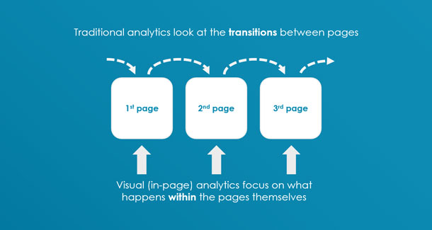
Visual analytics are different from traditional web analytics that only focus on visitor movement between pages because visual analytics focus on the behavior exhibited on one particular page. Figure 2 shows the difference between traditional analytics and visual analytics.

The Tools
Various visual analytics tools can provide you with whatever data you need. The important thing here is choosing one to fit your purpose and knowing how to use it properly. When visual analytics is done right you can make your data sing and facilitate a faster and more accurate decision-making process.
Typical visual analytics software includes tools such as:
- Click-tracking heatmaps
- Session replay
- Form analysis
In addition, many of them produce an aggregated view of the areas of a webpage that receive the most visitor attention.
These tools allow you to understand the behavior(s) of your website visitors so you can optimize their user experience and therefore the conversion rates. The users of the tools can analyze the data successfully as it is visualized in an intuitive way for them.
Tool 1: Click-tracking Heatmaps
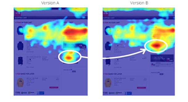
Click-tracking heatmaps are incredibly useful tools for collecting data about your site visitors. Their biggest advantages are that they are easy to implement and do not require much of an investment in either time or money. The tool visualizes your site visitors’ clicks in the form of a heatmap, where the areas that receive most attention are hotter (see Figure 3). With that information, you can judge which areas are most “attractive” for your visitors.

Tool 2: Session Replay
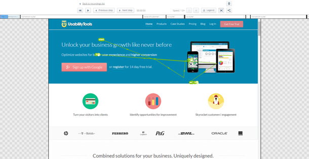
Session replay allows you to watch your website visitors and their actions. Using this tool, you can see all their mouse movements, scrolls, keystrokes, and clicks on a website or application. Session replay (see Figure 4) is a great way to study the step-by-step movements of your users to be able to find the pain points they are facing.

Tool 3: Form Analysis
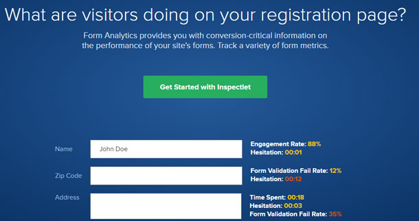
Marketers, researchers, and business owners should recognize that forms are a vital part of their website. As shown in Figure 5, with web form testing and analysis it is possible to judge which customer pain points are responsible for a high bounce rate. Web forms can feature fields that make customers abandon a form, such as fields that take too much time to fill out or fields that are unclear in their goal. You can diagnose and fix these form usability issues with form testing and analysis.

Case Study: Visual Analytics Tools
UsabilityTools published a case study showing how you can optimize conversion by uncovering the why in the data. OptimalEnergy, an online price comparison website, wanted to find out more about the conversion funnel on their website. Their website featured a slider with images that were not clickable. Data gathered with the click-tracking tool and visualized using heatmaps revealed that 24 percent of the clicks were directed to the non-clickable items (see Figure 6).

A further inspection with the form analysis tool also showed which fields caused 81% of users to leave the process without completing the order submission form.
As a result, the effectiveness of call-to-action elements increased by 66%, and the conversion rate increased by 122%, all thanks to successful click-tracking heatmaps and form analysis studies.
Combining All of the Tools
Armed with your visual analytics, you now have a complete picture of how users engage with your website or mobile application. By exploring these visuals with your team, you can begin to understand the reasons behind their actions, the why, and what steps need to be taken to improve user retention and the overall UX of your site. There are many tools available to help you discover technical problems that can be corrected by developers, but the problems with UX are more nuanced and require a deeper exploration that visual analysis tools can help provide.
“Web analytics is like gardening: you need different tools, each having a specific purpose. You cannot do gardening with just a shovel. Have you ever tried to cut hedges with a shovel (even if the most expensive one)? It is the same with web analytics where you need different tools for different purposes: for measuring clickstream data, voice of the customer, competitive intelligence, social media, testing, and others. The number of tools is not important—it is what you do with them.” —Michaël Notté
Visual analytics tools are opinion killers but they kill for a good cause. They eliminate uncertainty and replace it with tangible data that serves as an informed basis for any future improvement on your website. Following hunches and intuition works in some cases, but it is unreliable and difficult to defend. Click-tracking heatmaps, session replay, and web form testing are valuable tools that show user behavioral data in an understandable and adoptable format. The accessibility of these tools makes them a great option for those who want to start introducing improvements on their website, and as a result, increase conversions. As they say, a picture is worth a thousand words.
[bluebox]
More Reading
Start With Why by Simon Sinek
Data Visualization: Why does it matter to your business? by Pradeep
19 Things We Can Learn From Numerous Heatmap Tests by Jaan-Matti Lillevälja
Visual Analytics: A picture is worth a thousand words by Bartosz Mozyrko
Your Guide to Online Research and Testing Tools by Bartosz Mozyrko
3 Ways To Use Heat Map Software to Understand Your Visitors by Ewa Puchalska
[/bluebox]
