Let’s pretend for a moment that you are a UX designer at a technology company building a brand new product. Things are going great; you’ve designed and launched a product your customers find useful and easy to use. But when you dig into the metrics, you find one you wish was a little higher. Perhaps there is one action you want to nudge your users to do more often. Maybe it’s inviting more of their friends, uploading more photos, or reviewing more books.
There are many ways to persuade people to perform behaviors; great ideas are coming from the fields of behavioral science, psychology, economics, and game mechanics. Many nudging techniques are logical, like providing rewards or removing unnecessary obstacles. However, contrary to conventional thinking, limiting the action you want users to perform can actually be one of the most effective ways to encourage that behavior.
Examples of limits are relatively scarce in the UX field because they don’t happen naturally. Digital products don’t suffer from the inherent limitations that come with physicality: iPhone apps aren’t put on backorder; websites don’t go bad and become waste; users don’t stand in line all day awaiting the next software release.
However, there are some applications that set restrictions, especially as a method for controlling the pace of new product releases. In its first couple of years, Facebook only allowed college students to join. Gmail was open by invite only and each user was given only ten invitations to share. Mailbox limited the number of people granted access to their product each day, and you were placed on a waitlist before you could use it. These limits were likely set in place to roll out products in a controlled way, but the limits may have helped generate user demand as well.
There are also digital products that set rather unusual limits, ones that define and differentiate them. Examples include Twitter, whose product limits the number of characters you can include in a tweet, and Snapchat, which limits the lifespan of a photo. By imposing limits, these applications are motivating particular user behavior and creating new user interactions.
The Proof is in the Soup
In 1998, psychology researchers at Cornell University looked at whether limits set on soup purchase quantity (“Limit 10 Cans Per Person”) affected consumer purchasing decisions. The study had three groups of participants: one group of participants encountered a soup sale with no purchase limit; another group saw a sign that said they were limited to four cans per person; the final group was limited to ten cans per person.
Impact of Purchase Limits on Soup Sold
| No Limit | Limit 4 | Limit 10 | |
|---|---|---|---|
| Purchase Quantity Per Buyer | 3.3 | 3.5 | 7 |
| Shoppers Who Made Purchases | 7% | 10% | 9% |
| Total Units Sold | 73 | 106 | 188 |
Telling customers they were limited as to how much soup they could purchase increased both the percentage of customers who purchased soup as well as the amount of soup those customers purchased. While both groups handily outsold the no-limit group, the group shown the higher limit of ten cans sold the most soup, with only a slightly lower purchase amount than the group with the lower limit of four cans. And this is not an isolated finding; there are a number of similar studies looking at a variety of physical goods that suggest that purchase limits actually increase purchase amounts.
Why Limits Drive Behavior
Limits are effective at driving behavior because they play upon a number of different drivers of subconscious human behavior.
Herding
Humans beings are faced with thousands of decisions every day, and thinking through each one individually would be cognitively overwhelming and nearly impossible. Our brains have developed a cognitive shortcut called herding, where we tend to follow along with what other people do to help us make unimportant decisions quickly and effortlessly. Seeing what other people do helps us define what is normal and what we should do.
Who really knows what a normal amount of soup to purchase is when on sale? Do we buy one at a time or should we buy ten cans and hold on to them? We could consider the pros and cons of each, but that’s time consuming and takes mental effort that’s probably best invested in more important matters. Instead we take cues from our peers around us. A limit of ten cans of soup implies that some people want to buy even more, so we surmise that getting at least a few cans seems reasonable.
Signaling of Goodness
How do you know if something is a good deal? The clearest way is to compare the deal to deals elsewhere, or to its historical cost. Often people don’t know, can’t remember, don’t care enough to look, or have nothing to compare to. In these cases we use other signals or cues to figure out if it’s a good deal or not.
Setting the soup purchase limit may have signified that the deal is so appealing the store has to limit purchases lest they run out of stock or lose money on the transaction. Whereas the most price-conscious consumers may know the usual cost of soup off-hand, most don’t or won’t take the time to look it up. When people know very little and must place a greater reliance on social signals, this method proves very effective.
Reduced Choice
When asked, most consumers would say they desire more choices, but in actuality, an abundance of options is fatiguing and can lead to “analysis paralysis,” the inability to choose anything due to the sheer number of options. Limiting options can make people more likely to act. When the decision maker finally makes a selection, having fewer choices can foster a higher level of satisfaction in their decision.
Although not the most effective example of reduced choice, the soup purchase limit provides guidance by reducing the available options, lessening the burden of deciding just how many soup cans one should purchase.
Scarcity
Humans are very interested in keeping options open because we are poor predictors of our future wants and needs. Because of this, we place more value on items that are scarce, knowing that if we do not acquire them now we may never be able to. It’s also far more exciting to have access to something rare, as it provides a sense of status and strokes our ego.
The restriction on soup suggests there may be a limited amount of soup generally available and the potential to run out, even temporarily, may have nudged some customers to purchase.
Anchoring
Humans rely heavily on the first piece of information offered when making decisions. In the case of limits, the suggested limit becomes the anchor and our purchase decisions are influenced by seeing this high number up front. Even if an initial value is completely unreasonable, it serves as an anchor from which everything else seems much more reasonable. This is commonly seen in negotiations and used car sales.
If the first thing a person sees is a sign that mentions a limit of ten soup cans, this subconsciously becomes the anchor. Once this anchor is in place a customer may feel that five cans is a reasonable amount to buy, since the first thing they registered was the idea of purchasing ten cans.
Leaving options open
Humans are generally poor judges of our future selves. This makes us averse to cutting off options—even ones that we are currently not at all interested in—as we may be interested in the future. Limiting a person’s ability to leave an option open can be a very strong motivational tool.
One great example of this is return policies. The idea that you can always return an item comforts you in your decision, even if you have no plan to return it. Whereas we’re unsure of the return policy on soup cans, it might make the customer comfortable with buying more cans than they otherwise would.
Exploring The Use of Limits in UX Design
Today, limits are most commonly used to regulate application sign-ups, but there are many opportunities for UX designers to creatively apply limits to digital products in new and unexplored ways. Here are a few of examples of how limits could drive, or fundamentally change, user behavior:
1.Self-destructing invitation
When users get invited to try this application by their friends, they only have twenty-four hours to accept the invitation, otherwise it expires and they can’t join (see Figure 1). Will this limit get more on-the-fence users to join since they don’t want to lose the option of trying the application?

2. Limited inbox
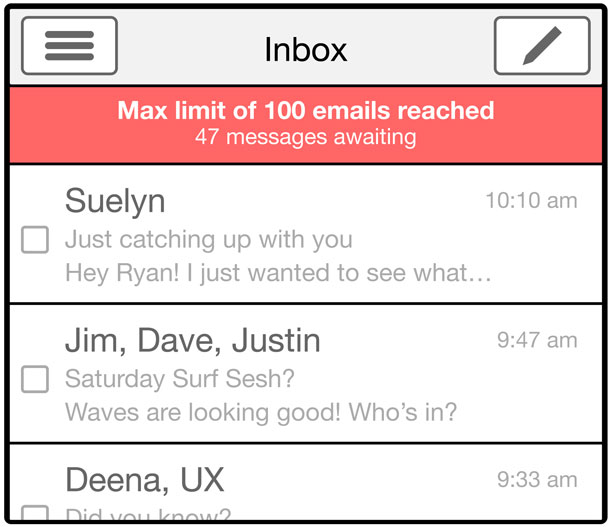
Consider an email inbox that allows only 100 emails to be viewed at once. Sorting or deleting an email grants access to the next one (see Figure 2). Will this drive users to better manage their inbox?
3. Premium users get first access to new features
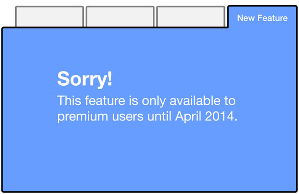
When a new feature of an application is released, it’s locked to all users except premium users for a period of time (see Figure 3). Will this make premium users feel special and appreciated? Does this re-frame the feature as something users want to get, instead of something forced on them?
4. Online dating message counter
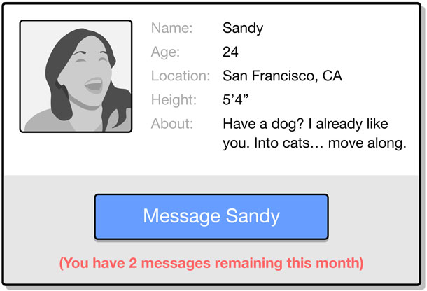
Imagine an online dating service where you can only send, for example, ten messages a month (see Figure 4). Will this restriction encourage quicker face-to-face meetings because people want to save their limited message supply? Will message recipients appreciate and read more messages, since messages are scarce?
5. Timed access
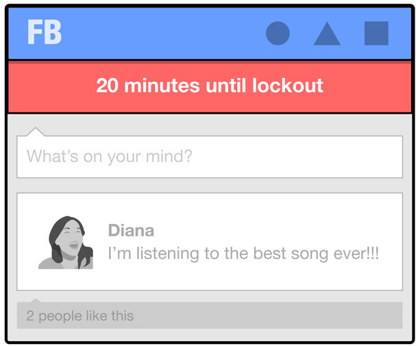
Envision a social media application that is accessible only for a limited amount of time—maybe just one hour per day (see Figure 5). Does this limited availability encourage users to use the application in a different, perhaps more meaningful way?
6. Limited commentary
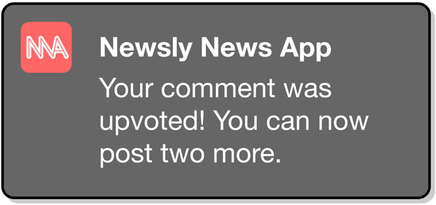
What if your comments on news sites are limited to five per month? If other users find your comment useful or helpful, you’re rewarded by being allowed to write more comments (see Figure 6). Will the limit improve the quality of comments people leave? Will the limit act as an anchor that encourages new users to comment?
Using Limits in Product Design
Using limits to design digital products introduces a set of unique advantages and challenges that should be considered.
Limits save development time
When a new feature is built, there is significant time spent designing and building for unlikely edge cases, for instance: “But what if a user uploads 10,000 high-resolution photos?” Limiting user behavior cuts off a number of edge cases, which means your team won’t spend time focusing on a product experience for a few select users. Not focusing on the crazy “what ifs” saves your company time across the board: product management, design, development, support, documentation, and operations. Time that can be spent creating a more delightful experience for your core customers.
Limits will get stakeholder pushback
You will notice there are few applications that intentionally limit user behavior, most likely because it runs completely counter to our intuition. Think about how crazy it seems to propose to your team, “Our goal is to sell as many widgets as possible, so let’s limit every person to only ten widgets!” Even when people are initially receptive to the idea of imposing limits, a client or stakeholder will invariably veto it in the chance that a customer wants to buy hundreds of widgets.
There are a couple ways to assuage this concern. First, encourage your stakeholders to focus on real user behavior, not ideal user behavior. It’s tempting to dream that your application will be wildly successful and users will buy hundreds of widgets on launch day, but realistically this won’t happen. Also, promote the engineering advantages and focus that setting limits provides. Focusing on the most predominant use cases will help you to launch early and determine if your initial assumptions were correct. This is a familiar concept to organizations using Agile or Lean development. Finally, use limits as an opportunity to provide a personalized and delightful outcome for the small number of power users who go beyond the limit and have a less positive experience. This could be as simple as the product manager sending a personal email to thank your limit-breaking users and to ask if they wish to upload more photos or buy more widgets. It’s unlikely there are many of these people, so this can be a manageable opportunity to make them feel special and valued.
Limits need to be tested
Like any new feature, features with limits are best tested early and often. This allows you to learn as much as possible before launching to a larger user base. Explore opportunities to prototype and test the limit without having to build it into the product. Launch with a small number of users or run an A/B test. Observe how the limit affects key metrics, and run qualitative research with these users to better understand how limits affected their overall user experience.
Limits should not compromise the user experience
Although limits and other behavioral science techniques are interesting to experiment with, it is important to be thoughtful of how limits affect the overall user experience. If limits confuse or frustrate the user by keeping her from achieving what she came for, they are a failure. Hitting a near-term metric to the detriment of overall user experience is short-sighted and will result in a crummy product and failed business.
Limitless possibilities
Digital technology has enabled us to store a near infinite amount of information. You can keep every photo you take, save every email, and have more “friends” than people you know. This unlimited nature is undoubtedly useful, but it can also overwhelm, confuse, and reduce our passion for these products. Limits can help. Limits can clarify and motivate people to take action. Limits can create value and make people appreciate functionality they might otherwise take for granted. As UX designers, the time is now to explore this in our work—explore limits as a way to motivate users and as a way to create unique and wonderful interactions. The possibilities are limitless.与传统思维恰恰相反,限制您想要用户执行的操作实际上可能是鼓励这种行为最有效的方法之一。可以设置限制以便以可控的方式推出产品,而实施限制也可以帮助创造用户需求。限制可以突显价值,并帮助人们珍视他们原本可能以为理所当然的功能。用户体验设计人员应该考虑通过有意实施限制来激发人们采取行动。
文章全文为英文版종래의 사고와는 달리, 사용자가 시행했으면 하는 행동을 제한하는 것은 실제로 이러한 행동을 장려하는 가장 효과적인 방식의 하나일 수 있습니다. 제품을 통제된 방식으로 대량 생산하기 위해 제한적인 조치가 마련될 수 있지만, 제한 조치의 생성은 또한 사용자 요구 생성에도 유용할 수 있습니다. 제한 조치는 가치를 부각하고 당연하게 여길 수 있는 기능성을 제대로 인식하도록 하는 데 도움을 줄 수 있습니다. UX 디자이너라면 사람들이 행동으로 옮기도록 동기를 부여하기 위해 의도적으로 제한 조치를 생성하는 방안을 고려해야 합니다.
전체 기사는 영어로만 제공됩니다.Ao contrário do pensamento convencional, limitar a ação que você deseja que os usuários executem pode, na realidade, ser uma das formas mais eficazes de promover este comportamento. Os limites podem ser definidos para apresentar produtos de forma controlada, mas a criação de limites também pode ajudar a criar a demanda do usuário. Os limites podem destacar valor e ajudar as pessoas a apreciar a funcionalidade que elas poderiam aceitar como natural, se os limites não fossem definidos. Os designers da UX devem considerar a criação deliberada de limites para motivar o público a agir.
O artigo completo está disponível somente em inglês.従来の考え方とは異なり、ユーザーに望む行動を制限することは、実際のところその行動を促進するための最も効果的な方法であり得る。製品を制御された方法で展開するために制限を設定する場合もあるが、制限を設定することは、ユーザーからの需要を生み出すことにもなる。制限によりその価値が強調され、さもなければ人々が当然とみなすような機能性が高く評価されるのに役立つ。UXデザイナーは、人々が行動を起こす気になるように、慎重に制限を設けるべきである。
原文は英語だけになりますContrariamente a la creencia popular, limitar la acción que se desea que ejecuten los usuarios puede ser en realidad una de las formas más efectivas de alentar dicha conducta. Los límites se pueden usar para controlar el lanzamiento de versiones de producto, pero también pueden ayudar a generar demanda. Los límites pueden resaltar el valor y ayudar a que la gente aprecie una funcionalidad que de otro modo darían por sentada. Los diseñadores de UX deberían considerar crear límites deliberadamente para motivar a la gente a actuar.
La versión completa de este artículo está sólo disponible en inglés
