
We spend a lot of time identifying trustworthiness in our day-to-day lives. We constantly evaluate trustworthiness in both the people that we meet and in the products and services that we decide to interact with. In evaluating that trustworthiness, we found in our research that the following three elements come into play most often:
- Integrity to do the job with the best intentions at heart.
- Competence to handle the job and the challenges it may bring.
- Capability to deliver the results on time and at the expected level of finish.
These three elements can easily be applied to both people and products with the same results. Since these elements shape the decisions our users are making on a day-to-day basis, we should be able to successfully apply them to our designs to create experiences that our users feel are trustworthy enough to interact with. Creating this trustworthiness means that our users will feel confident sharing their data with us and allow us to use that data to create value for them.

Integrity
Like any new relationship, using new software starts with a little bit of anxiety. In software products, this anxiety is felt the first time a user engages with your product. You’re asking them to do something they’ve never done before and it requires a level of faith in your product. As designers, we must keep the user informed every step of the way and make sure that we anticipate the answers to any questions that might arise in their minds, all while helping them step into the unknown.
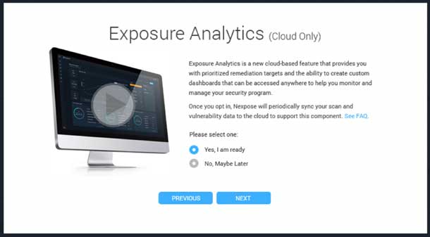
Imagine for a moment that you work as a designer on an information security product that has traditionally been run on premise, meaning that it’s installed and runs on machines at the clients’ location. Let’s say that to deliver newer, more powerful features, you need to take your clients’ data to the cloud. How would you design the migration flow to put them at ease? You might explain exactly why this change in data management is necessary and allow them to read detailed FAQ’s about it. You might also allow them to opt-out, decide later, and perhaps choose the exact geographic location the data will be stored at to help them comply with policies or preferences on data storage. No matter what you decide to do, you must be transparent and honest with your users. That honesty and transparency will help you build a lasting relationship with them.
Another way to build that lasting relationship–just as you would with another person–is through healthy and productive communication. Communication with our users starts at their very first contact with our company. For some that might be a sales call; for others the company website. Since we don’t always have the luxury of a person-to-person call to open that communication with our users, the website has become the de-facto face of our organization. We take the opportunity to demonstrate our intent and integrity to users by clearly communicating our practices around storing customer data, what we do with that data, and how we secure that data from malicious entities.
For example, our information security product which is migrating to a cloud-based platform. What a perfect opportunity to both communicate and be completely transparent about what will happen to users’ data when they migrate. Not only will existing customers understand the implications of this new technology, but future customers will be able to choose a company that respects their data based on this public information.
Competence
Once we’ve gotten past the ice-breaker in our relationship and the initial anxiety is gone, we can enter what might be called a “trusted zone.” Our user has decided to trust us with their data and at this crucial moment, so it’s extremely important for us to:
- Secure their data in every possible way
- Make sure their data is always available
- Provide them value and “Do Good Things” with that data
Let’s take a minute to talk about these points in deeper detail.
Secure customer data as if it’s your own personal data. This is the most critical piece of trust building. This means having a top-notch security and dev ops team that have the skills and practice to protect your users’ data. When a data breach impacts a business, even the best experience design will find it hard to rebuild trust. If the worst happens, we can only hope to show our users that in the future we’ll do good things with their data and rebuild that relationship with learning over time.
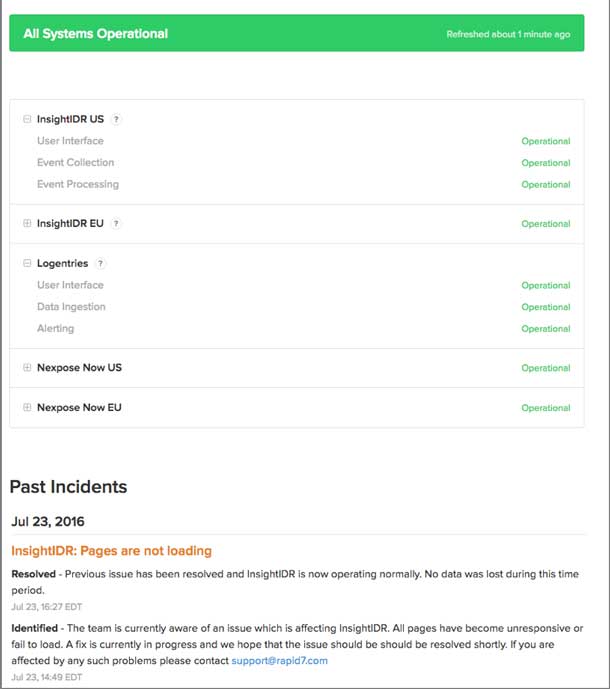
Make sure their data is always available. 99.999% uptime is what’s expected these days. Not only should we aim for the highest possible uptime, we should be communicative about scheduled downtime and transparent when our service might be unavailable due to unscheduled complications. A web address like status.yourDomainName.biz lets your users check service availability and helps build trust when they don’t need to contact you to find out what’s going on.
Do good things with their data. “With great power comes great responsibility.” At this point our users have placed their trust in us. As guardians of their data, we take this trust one step further and provide them with something they never even knew they needed: something we call anangel pattern. Think of it as a design pattern that looks out for each user above and beyond their expectations.
Angel Patterns

Harry Brignull, UX practitioner and curator of darkpatterns.org, talks about how some user interfaces are carefully designed to trick users into doing things they might not otherwise do, such as buying insurance along with their purchase or signing up for future recurring bills. While researching dark patterns, we realized their effect and impact and how easily and often users fall victim to them. As designers, it got us thinking how could we turn this pattern on its head. How could we create the yang to the dark patterns’ yin? Our answer was angel patterns.
Imagine that you’re like Tarzan in the jungle; you’re trying to navigate your way through products and services using the vines that hang in your path. Each vine either helps or hinders your path forward. Some are stronger than others and help you swing a far distance quickly and effectively (angel patterns).. Others are actually snakes masquerading as vines. You reach out to grab hold and instead get bitten, releasing your grip and falling to the ground (Dark Patterns). As a user swinging through the jungle of products and services, it’s easy to mistake a snake for a vine and end up lost on the ground. As designers, we need to do everything we can to make the vines of angel patterns obvious and remove the dark pattern snakes from the user’s path.
For Angel Patterns to work, however, we needed to take something dark and bring it back into the light. We started with the dark pattern as defined on darkpatterns.org and looked for scenarios where an alternate, opposite pattern could replace it. Here are the angel patterns we came up with:
From Bait and Switch to Allure and Engage
A Bait and Switch scenario is defined as when “the user sets out to do one thing but a different, undesirable thing happens instead.” We see examples of this all over the Internet. Imagine an operating system prompting you that an update is available. You click the X to dismiss the message but instead the update is initialized on your system! Conversely, let’s imagine an information security software scenario where you’re not baited at all. Upon login, the software alerts you that you’re only using ten of your possible fifty event listeners, and if you add ten more you’ll get a badge for your completeness level that can be publicly displayed. The badge shows progress, rewards you for your efforts, and allows you to show others how valuable the deeper engagement with the feature is.
Here we’ve created an alluring benefit for the user and engaged them with a bit of gamification to spice up their day-to-day tasks. We not only provided them with something they expect from their software, we’ve also given them a bit of pleasure in the process. An angel pattern, indeed, and one that can be shared.
From Hidden Costs to Explicit Gains
Darkpatterns.org defines a Hidden Costs scenario as a situation where “a user gets to the last step of the checkout process only to discover some unexpected charges have appeared, e.g. delivery charges, tax, etc.” We’ve certainly seen that in many shopping experiences, for example, that super-cheap tablet where the basic shipping costs is double the normal amount. Or those airline flights to another continent that seem to have an incredible price point until you realize the strange tax that makes it not-so-cheap anymore. As designers, this goes against our views of clear communication and full transparency. The angel pattern in this case is to show very clear “Explicit Gains, and alert the user that with a minimal amount of effort, they can achieve a maximum amount of gain. If we look again to our information security software example, we can see the explicit gain in action: “Joe User, if you can remediate these 10 vulnerabilities in your network, you can bring your compliance level up by 25%!”
From Misdirection to Orientation
Rather than the ”attention of the user being focused on one thing in order to distract its attention from another,” we can create an angel pattern to clearly guide the user to take actions that will provide direct and immediate benefit. Whether it’s their first time using the product, first time using a feature, or if they’ve overlooked functionality that might help them, we can orient the user to a better outcome. We need to use the data that we have about our users and map that in a meaningful way to provide them even greater value.
For example, in our information security software, we know that 90% of our users with more than 1,000 assets in their system find value using our dashboards to visualize the large number of assets. With this information, we can prompt other users who are not using dashboards and quickly get them the insights. We can also improve their first-time experience with the product and it’s features by using their demographic information (size of company, number of assets, business sector, and more) to direct them towards setups being utilized by successful users with similar demographics. Data is our greatest asset and we can use it to create maps of user behavior to orient user experience in our products.
From Trick Question to Treat Question
In this scenario, we’re taking something truly nefarious and flipping it on its head to bring something angelic out of it. In the dark patterns world, the Trick Question is when a “user is required to respond to a question (typically in the checkout process), which, when glanced upon quickly, appears to ask one thing, but if read carefully, asks another thing entirely.” We, on the other hand, would like to present a question so clear and obviously beneficial to the user that the answer is a no-brainer. Let’s reach back to our trusty information security software example and pose a Treat Question to our users: “We see that you output the results of this dashboard into a PDF every Friday. Would you like us to go ahead and automate that for you?” Who could say no to that? How wonderful that the software they’re paying good money to use is intelligent enough to take over the situation for them!
From Roach Motel to Data Spa
The Roach Motel dark pattern is one that should be easy enough for most to understand. “It makes it very easy for a user to get into a certain situation, but then makes it hard for them to get out of it when they realize it is undesirable.” Newsletter subscriptions, marketing email opt-outs, and “free” toolbar installs that get bundled into your downloads are examples of a roach motel that we’ve all experienced.
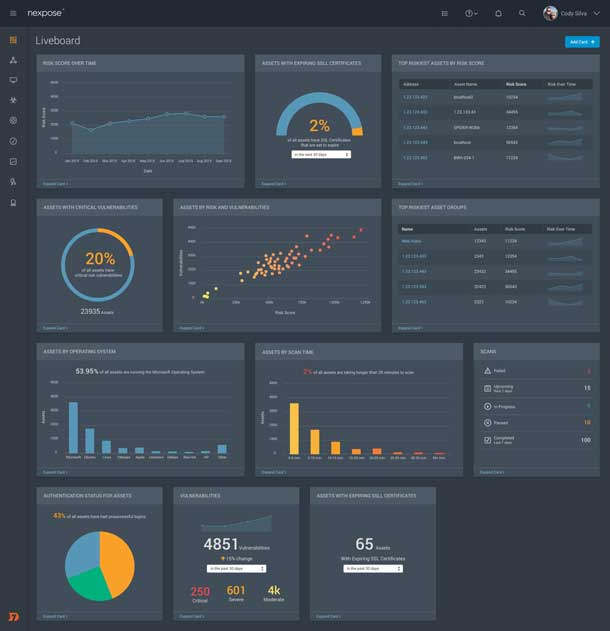
Bringing this dark pattern into the light is about enticing users to a place where all their data is on display for them, where we help them engage with the product, and invite them to stick around for as long as they wish. Since our brains process graphical representations much faster than pure data, we enable this by offering a “spa” experience for the user—letting them take a quasi-mental break from having to parse through table after table of numerical data. We represent their data in an appropriate graphical context and make it easy for them to understand and absorb. For example, offering the user a bubble or node browser showing all the assets in their system and how they’re connected, and letting them explore those connections as thoroughly as they like.
Rethinking the Role of Designers
Every day we hear about another data breach and how the personal data of millions of users was compromised. In this environment, it’s no wonder that people are more and more reluctant to trust companies with their information. As designers, we must do all that we can to restore the faith of users in our products. We must be truthful and transparent with how we store and use their data, always keep their data secure and available, and create added value for the user as they interact with our products. We must take the dark patterns that have caught them off-guard in the past and, instead, create angel patterns that look out for users, and help orient, persuade, and support them to take meaningful actions that best serve their interests. No matter what industry you’re in, you can apply these patterns in your designs and test the way your users react. We’d love to hear about it!

Michael Kriskovic heads up the UX engineering group at Rapid7. He’s engineered interfaces for media companies, online banks, international hotel conglomerates, and now information security products. He likes to balance all that engineering time with plenty of time behind the lens pursuing his passion for photography. Twitter: @smallbloc

Saurabh Dutta is the director of user experience team at Rapid7. He’s worked in design and usability domains across physical and virtual products for over 14 years. Saurabh has published papers and presented at various usability conferences, including UXPA, HFES, AHFE, and HCII. Twitter: @saurabhdutta

Jay Brewer is the senior director of UX at Rapid7, creating next generation security products. He has been working in design and technology for 20-plus years. He was the lead user interface and experience designer for Lord of the Rings Online and Dungeons and Dragons Online at Turbine, Inc. Twitter: @jaybrewer