People often go a bit faint when you mention accessibility. Visions of text-only websites, monochrome designs, and static content swirl in their heads. They grit their teeth and prepare excuses. Battle conditions ensue.
The reality is that accessibility is simply a key part of UX. A truly outstanding digital experience is a fusion of accessibility, usability, creativity, and technology. The trick to successfully weaving these things together requires a cross-pollination of skills and expertise.
The good news is that accessibility is simply usability under a magnifying glass. If you’re thinking about great usability, chances are that you’re already thinking about great accessibility, too.
Meaningful Reading Order
It’s a curiosity of web design that the visual order of content doesn’t have to match the order of content in the underlying HTML code. With the separation of HTML (for structure) and CSS (for visual design), it became possible to change the visual arrangement of content without disturbing the underlying HTML.
This is handy for web developers because they can easily make cosmetic changes to a web page without rewriting the HTML code. Used wisely, it’s also something that can help create web pages that work well for both sighted and non-sighted people.
Most people don’t know that HTML exists, let alone that it’s the key to the way their browser controls the structure of information on the page. That’s the way it should be, of course. Providing the page is laid out in a logical way, most people will experience the site without giving the slightest thought to what’s going on under the hood.
For blind people who use screen readers to access their computers, the HTML is a bit more important. Screen readers pay almost no attention to the way a page looks, but they do care a lot about the way it’s structured. While a sighted person might read the flow of content from top left to bottom right, a screen reader will read the content in the order the HTML presents it.
Let’s take a typical page with a header, footer, left-hand navigation, main content column, and right-hand column as an example. It’s a common page layout because it makes sense visually. A sighted person can focus on the area of the page they’re interested in, and, assuming they use a mouse, click on the relevant bit.
A screen reader user, on the other hand, would have to move through the header and the left-
hand navigation before reaching the main content column. Screen readers can only focus on one thing at a time, so they have to move through the page in order, and HTML governs that order.
Rearranging the page so that the header is immediately followed by the main content column, then by the navigation and related information columns, makes things much more convenient for screen reader users (see Figure 1). Visually, this layout wouldn’t be nearly as convenient for sighted people because it breaks the common convention of a left-hand navigation.
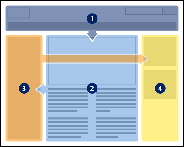
Here’s where the clever part comes in. When a web page is created, you can do both. You can have an HTML content order that works for screen reader users a visual content order that works for everyone else. The two don’t have to match, but they should both make sense in their own right. Of course, you’d never make the footer the first bit of content someone encountered, whether they could see the page or not.
So what does this mean for UX practitioners? The way content is ordered in your wireframes will influence the way it’s ordered when the page is translated into HTML code. Don’t worry, you don’t need to become a full-fledged web developer. However, it’s a good idea to understand the different ways people will engage with the content on the page. Also, bear in mind that the process of translating a wireframe into code may mean the resulting experience for a screen reader user is very different from that of a sighted person.
Consistency
When you create wireframes for a website, consistency will already be on your UX radar. What you may not realize is that you’ll also be thinking about an important aspect of accessibility.
When people with disabilities evaluate a website, it’s common to find that mild challenges for other people are tremendously magnified for people with disabilities. For example, a slight pause on a link might indicate the text isn’t helpful to someone. When that pause becomes a sustained break in the task for a person with a reading disability, suddenly the problem becomes much more evident.
Consistency is one of those areas where this magnification effect is very noticeable. Putting elements such as the logo or search facility in the same place on every page makes it easier for everyone to locate and identify them. Moving things around arbitrarily tends to confuse us.
For a partially sighted person using screen magnification, that kind of confusion can become a real problem. When the area of the screen you’re focused on is magnified multiple times, you don’t understand the whole screen at a glance. A common strategy is to look for key landmarks (signposts) on a page that you can use to orient yourself. Knowing the navigation is on the top part of the page makes it easy to move the magnified area to the extreme edge of the window, so you know immediately where you are (see Figure 2). Unless, of course, the navigation vanishes or moves elsewhere on the page.
Interaction consistency is also important for much the same reason. Each time you add a widget to a wireframe, it should behave the same way that it does everywhere else on the site. Changing the way someone is expected to interact with something takes us right back to general confusion for everyone.
But for someone with a cognitive disability, that kind of confusion may be a complete showstopper. Each time they encounter a particular widget (such as a search facility or content filter), they are forced to learn a whole new way of interacting with it. Ensuring that things look and behave consistently each time they’re used makes the experience possible for people in this group.
Form Controls
If you’re creating high-fidelity wireframes, another thing to consider is form and widget controls. It might sound obvious, but forms should have submit buttons and widgets should have controls.
Let’s take a dropdown used for navigation as an example. Technically speaking, the form doesn’t need a submit button. A mouse user might click on the field, scroll down through the options, and release the mouse button to indicate their selection. At that point, the chosen web page would load automatically.
For someone with a mobility impairment who doesn’t use a mouse, however, things get a bit more complicated. Opening the dropdown list of options isn’t a problem, but without a submit button the form has to work automatically. That means that as soon as keyboard focus lands on an option, the selected page will load in the browser. It’s too bad if you wanted anything other than the first option in the list. By including a submit button in your wireframes, you’re putting people in complete control of the action.
Including a submit button with an appropriate label is also helpful for people on the autism spectrum. Unless there is a very clear call to action, it might not be possible for someone on the autism spectrum to complete a task. A search form with no submit button, or with a submit button labeled “Go!” (go where exactly?) can make it next to impossible to complete the task.
Making room in your wireframes for widget controls is also a good idea. A revolving carousel is one example. For someone with a learning disability, it can be a monumental effort to try and read the content before it disappears. People on the autism spectrum may find the constantly moving content enough of a distraction that they have to leave the page entirely. Neither is a great experience. Including pause/play, next slide, and previous slide controls puts people in charge of the way they consume information.
Descriptive Links
Clear and concise link text is another key UX consideration, whether the links form part of the Information Architecture (IA) or sit within a piece of content. From an accessibility point of view, it’s even more important to choose link texts that are helpful (see Figure 3).
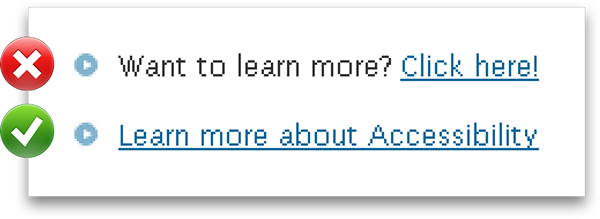
Many screen readers include the option to list all the links on a page, effectively removing them from the surrounding content. No distinction is made between links from the IA or links from body content. For this approach to work, link labels need to be understandable in their own right. A list containing fifteen “More…” links completely undermines the task.
Something similar happens for screen magnifier users. When a link is magnified multiple times it can take up most of the available viewing space. This makes it difficult to associate with the surrounding content. Unless the link text acts as an effective signpost, it takes some effort to explore the nearby content and discover where the link might actually lead.
Conclusion
You may be wondering whether this level of granularity is really within the realm of a UX practitioner. The reality is that the best practice you put in place now will influence the creative designers and developers that take your wireframes and evolve them into the finished website. Also, your decisions might affect the way other UX practitioners modify or update the website.
Accessibility is a journey and that journey starts as soon as a UX practitioner first considers how someone might use the web page, what it might contain, and how to best present it. By choosing to follow accessibility best practices, you ensure that accessibility, usability, creativity, and technology can come together to deliver an outstanding user experience!可及性经常会被误解、中伤或曲解。如果“可及性”这个词曾让你感到有点晕、让你咬牙切齿,或是让你感觉有些困惑,这不只是你一个人的感受。但要打造非凡的数字体验,可及性就必须与可用性、创造性和技术一同考虑。与可用性一样,可及性必须融入整个流程,意味着每个人都要对它有所了解。
本文介绍四个可及性概念:有意义的阅读顺序、一致的导航和布局、表格控制和说明性链接标签。可及性远非只是一个口号,它和我们的距离要比想象的近得多。
The full article is available only in English.접근성(Accessibility)은 종종 잘못 이해되고, 비난을 받으며 또는 잘못 해석됩니다. 만약 “A”로 시작하는 단어가 당신을 약간 어지럽게 하거나, 이를 갈고 싶게 하거나, 약간 당혹하게 느끼게 했다면, 당신은 혼자가 아닙니다. 우리가 만약 훌륭한 디지털 경험을 구현하고자 한다면, 접근성은 사용성, 창의성 그리고 기술과 하나로 합쳐져야 합니다. 사용성과 같이 접근성은 전 과정을 통해 엮어나가듯 만들어져야 하며 이는 모든 사람이 그에 대해 조금 더 알아야 한다는 것을 의미합니다.
본 논문은 네 가지 접근성 개념에 대해 관찰합니다. 의미 있는 읽기 순서, 지속적인 네비게이션과 레이아웃, 폼 컨트롤 그리고 기술적 링크 라벨 등입니다. 접근성은 나쁜 단어라기보다는 당신이 생각하는 것보다 훨씬 더 친숙해질 수 있는 단어입니다!
The full article is available only in English.Se a palavra “A” alguma vez fez você se sentir um pouco fraco, fez com que você quisesse ranger os dentes ou o deixou se sentindo levemente perplexo, você não está sozinho. Mesmo assim, se desejamos criar experiências digitais extraordinárias, a acessibilidade deve vir junto com a usabilidade, a criatividade e a tecnologia. Assim como a usabilidade, a acessibilidade deve permear todo o processo e isso significa que todo mundo deve conhecer um pouco sobre esse tema.
Este artigo trata de quatro conceitos de acessibilidade: ordem de leitura significativa, navegação e layout consistentes, controles de formulários e rótulos de link descritivos. Longe de ser um palavrão, a acessibilidade pode acabar sendo algo muito mais familiar do que você pensa!
O artigo completo está disponível somente em inglês.アクセシビリティは、しばしば、誤って理解され、非難を浴び、誤解されている。「ア」で始まるこのアクセシビリティという言葉が、少しでも目まいや歯ぎしりを生じさせたり、うろたえさせるとすれば、それはあなただけのことではない。だが、非常に優れたデジタルエクスペリエンスを作り出そうとすれば、アクセシビリティは、ユーザビリティや創造性、技術とともに欠かすことのできないものである。ユーザビリティと同様に、アクセシビリティはプロセス全体に組み込まれるべきもので、研究開発に携わるすべての人達がある程度知っておくべきことと言ってよい。
この記事では、意味ある読み順、一貫性のあるナビゲーションとレイアウト、コントロールウィジェットの形、記述的なリンク名という、アクセシビリティの4つのコンセプトを考察する。アクセシビリティは宣誓のような縁遠い言葉ではなく、あなたが思うよりとても身近なものであることがお分かりいただけるだろう。
The full article is available only in English.Si la dichosa palabra con “A” alguna vez lo hizo trastabillar un poco, lo tensionó o le dejó un poco desconcertado, no está solo. Pero, si queremos crear experiencias digitales extraordinarias, la accesibilidad debe ir de la mano de la usabilidad, la creatividad y la tecnología. Al igual que la usabilidad, la accesibilidad debe interponerse en todo el proceso y eso significa que todos deben saber un poco del tema.
En este artículo se tratan cuatro conceptos de la accesibilidad: orden significativo de lectura, navegación y estructura consistente, controles de formularios y etiquetas de enlaces descriptivas. Lejos de ser una mala palabra, es posible que la accesibilidad termine siendo una palabra más familiar de lo que usted piensa!
La versión completa de este artículo está sólo disponible en inglés.