Background
In terms of healthcare, a broken leg is relatively straightforward to manage. It is painful, inconvenient, and requires healing time, but most communities readily offer a seat on the bus, employers are likely to accommodate a request to work from home, and doctors can quickly diagnose and treat the injury.
The same cannot be said for abstract, invisible illnesses, such as chronic pain. Even with a diagnosis, it is challenging for patients to convey their need for accommodations if they appear healthy. They don’t necessarily rely on mobility aids like canes or wheelchairs. For instance, convincing another person to yield their seat on public transport during a fibromyalgia flare-up may be difficult. Moreover, obtaining a diagnosis for a condition of chronic pain can prove challenging.
Chronic pain can often strike without warning, apparent physical injury, or traumatic event. It can be sudden, unexplained discomfort. I experienced this firsthand at the age of 14 when I woke up one day with excruciating pain on the left side of my body from the top of the shoulder to the foot. My symptoms included sharp pain, tingling, burning, numbness, and a sensation of fluid in my leg. These symptoms persisted intensely for months, with occasional flare-ups still occurring over a decade later.
The most significant challenge I faced was that these sensations were so alien to me that I could not describe them; because I was experiencing discomfort, I kept telling my primary care physician that I was in “pain,” but the sensations were so much more complex than that. There were times when, for example, it was more that my leg felt like Jell-O®, and the absence of feeling or pain was what was unbearable.
During these appointments, I was asked to use conventional pain rating icon sets such as the Wong-Baker scale to describe pain intensity. Emoticons range from a smiling face to a frowning face (Figure 1). I found that the use of simplified emoticons was not a meaningful way to measure my pain as my responses would often be affected by other factors such as my mood. This was largely because I got used to the pain over time and just started feeling a general sense of malaise, even though the pain was not actually improving.
Other icon sets aided in the description of different pain sensations. For instance, a black-and-white drawing of flames would represent a burning sensation (Figure 2). I found that these illustrative icons would depict their associated adjective but not capture the actual sensation, minimizing their impact in clinical conversations I was having.
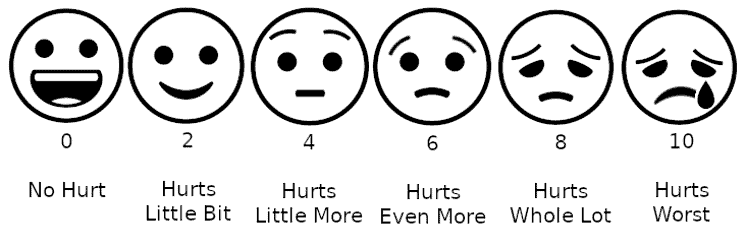
Figure 1. An example of a conventional pain scale using faces. (Credit: Lord Belbury via Wikimedia Creative Commons)

Figure 2. An example of a highly simplified burning pain icon. (Credit: Pike Picture via Noun Project Creative Commons)
The drawbacks of conventional pain scales are also discussed in Melissa Rach’s article for the Mayo Clinic, Pain Scales: Valuable Tools or Problematic Practice? She notes that they fail to account for meaningful variables such as pain tolerance, pain history, emotional state, pain changes with activity, and pain fluctuations over time. She also explains that numerical scales in particular can create “unrealistic expectations” and thus disappoint many patients by implying that their pain could one day reach a zero on the scale, which might not be the case. Rach also found that pain scales encourage the overuse of pain medication to mask pain and lower the reported number on the scale instead of treating or managing the underlying problem long-term.
When attempting to elaborate on my responses to these pain scales and icons, I had vivid visuals in my head of what I was experiencing, but I could not put them into words. Whenever I tried, my doctors would repeat back to me things like, “Ok, so you have a bit of a dull muscular ache,” which was the complete opposite of what I thought I described. The advice I received could seem very dismissive. “Try stretching a little or flip your mattress over; sometimes those can relieve aches…” did not account for symptoms such as the periodic loss of sensation and use of my left arm or my toes spontaneously twitching. Furthermore, without a formal diagnosis, I encountered skepticism from teachers and peers at school as I was frequently absent due to being bedridden by my symptoms and could not provide a definitive answer to “What’s wrong?” or “What illness do you have?”
To this day, I have never received a formal diagnosis or treatment plan, and I have ended up just managing my pain through medication, rest, and sports massages when experiencing flare-ups.
User Research
For my final degree project at the Rhode Island School of Design, I explored how color, shapes, motion, and sound could enhance the effectiveness of icons that represent pain. I hoped this could improve communication between patients with chronic pain and their healthcare providers (HCPs), family and friends, and the general public.
Pain Diary
To begin with, I maintained a visual pain diary over four weeks (Figure 3). A pain diary is typically a written record that tracks occurrences of pain, how bad the pain is, and whether treatment is helping. Diaries are often used in the initial stages of chronic pain diagnosis. For this exercise, I dedicated approximately 60 seconds a day to sketching any pain I experienced on Adobe® Illustrator®. This time constraint aimed to capture my intuitive use of colors, shapes, and gestures.
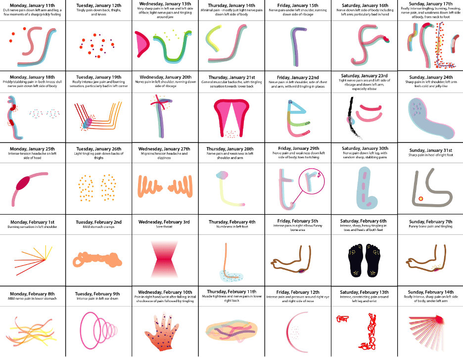
Figure 3. An example of my pain diary using graphic illustrations.
Once I completed the pain diary, I distilled the various gestures into icons representing ten common types of pain: burning, cramps, dull ache, freezing, migraine, neuralgia, numbness, stabbing, throbbing, and tingling. I then integrated sound effects and motion and distributed the icons to 20 participants with chronic pain via a digital questionnaire for user research purposes.
The questionnaire also covered participants’ general experiences with chronic pain and symptoms, their experiences with diagnosis and clinicians more broadly, their current treatment plans and activities they would be willing to try, and colors and sounds that relieved their pain.
Research Methods
My study was self-designed under the supervision of my thesis advisor, Nancy Skolos. I opted for a sample size of 20 individuals experiencing chronic pain due to the time constraints of my initial thesis project, which was limited to approximately 12 weeks. My goal was to gather a variety of responses while maintaining the depth and detail necessary to draw meaningful conclusions. After some consideration, I determined that a participant pool ranging from 15–30 individuals would provide a diverse, yet manageable dataset.
To recruit participants, I tapped into multiple sources, including mutual acquaintances and chronic pain support groups. I ensured that participants exhibited a broad spectrum of prominent symptoms and diagnoses, encompassing conditions such as injuries, multiple sclerosis, fibromyalgia, and migraines.
For the data collection method, I settled on a one-time digital questionnaire for several reasons. Time constraints played a significant role, but it was also during the peak of the COVID-19 pandemic. Given that individuals with chronic pain are more likely to be immunocompromised and unlikely to participate in in-person interviews, a digital approach proved both practical and safe. The anonymity of this method was also crucial as it encouraged candid and comprehensive responses, particularly regarding the origin and background of participants’ pain. Anonymity was maintained by not asking for names, photos, or any other personally defining information. Participants were also asked to check a box indicating whether or not they would be happy for the details of their condition and treatment to be used anonymously within any part of the project, now or in the future.
As this project progresses and undergoes further refinement and testing, I do intend to expand my research. I plan to work with larger groups, ideally through in-person or video interviews conducted over extended periods in order to obtain more comprehensive results.
Findings
The participants’ first task was to assess the accuracy of my drafted icons and propose edits if needed. To reduce participant effort, especially considering potentially limited energy and physical discomfort, I provided visuals for their responses rather than requiring them to create their own. The results reinforced my thesis in several ways. Accuracy ratings were nearly evenly split, and the suggested adjustments from those who found the icons inaccurate varied widely. For example, where some participants recommended softer, warm-toned imagery that moved gently from side to side, others preferred sharper, cool-toned icons that pulsated. These findings strongly indicated that words alone were insufficient for describing pain, as the same term could have multiple interpretations and lead to misdiagnosis.
Many studies support these findings. For example, a study by Salovey P., Seiber W.J., Smith A.F., et al., published by the National Center for Health Statistics in 1992, found a significant disparity between the types of pain that patients associated with the same adjective, averaging ten types among those with chronic pain and 18 among those without. Furthermore, a 2016 study by Sharma S., Pathak A., and Jensen M.P. published in the Journal of Pain Research, found that individuals in Nepal typically use sensory metaphors and similes to describe their pain rather than single terms (for example, “feels like an ant bite”) and do not have definitive terms for concepts such as achy pain.
As stated above, this study was limited by factors such as time and therefore sample size and variety of methods used, so I acknowledge that more comprehensive data will need to be collected from additional research to refine and optimize the project. However, following the synthesis of my user research findings, I moved forward with designing a sample set of multimedia icons as a minimum viable product offering a fundamental solution for the lack of clarity in verbal descriptions demonstrated during the study. I also recognized the need for added customization, including the icons’ names, visuals, and sounds to accommodate further nuance and specificity.
In addition to a refined icon set, I decided to design a proof-of-concept application to demonstrate how the icons could be customized and used to log symptoms daily. The app would also include educational, pain management, and doctor-patient communication features inspired by the feedback received in the second part of the questionnaire.
Naming and Branding
For project naming, I settled on sentoms™, a portmanteau of sensory and symptoms. The logo incorporates the Work Sans font, chosen for its web-safe readability, which is particularly important when users are in pain and need quick access to information. This font also adds character without being overly complex. The color scheme for the logo and brand stems from feedback received during user research that participants find these colors calming and pain-distracting. The brand identity aims for a friendly and soothing aesthetic to avoid clinical or pain-evoking associations (Figure 4).
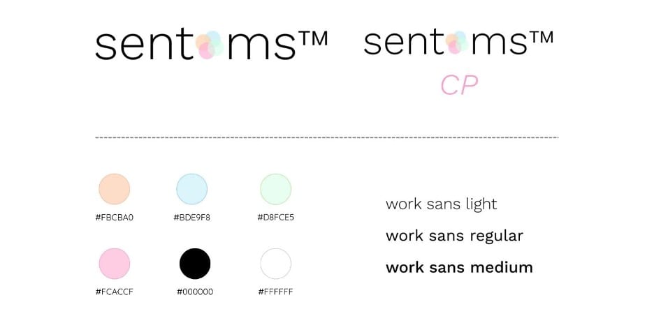
Figure 4. sentoms branding overview.
sentoms Icons
Figure 5 shows stills of the refined sample set of sentoms icons, crafted based on some of the responses from the user research questionnaire. An online video shows the icons with full motion and sound.
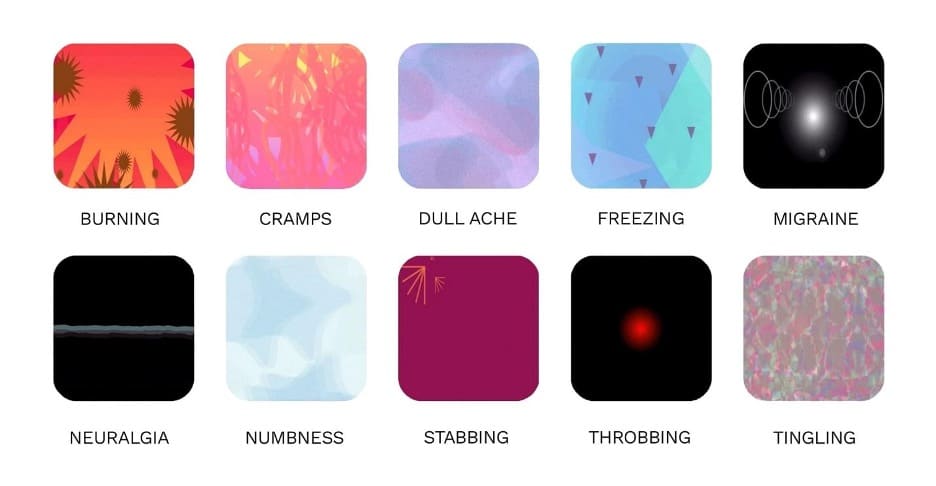
Figure 5. sentoms icon stills.
Despite recognizing the need for customization, I still chose to create standard icons that could be heavily modified rather than making users create icons from scratch. This was to make the process less overwhelming and arduous, especially as users would be in discomfort when using the icons to log symptoms and may also have limited dexterity, patience, or stamina. Ongoing work focuses on refining and eventually converting these into fully editable modules, utilizing a creative coding library such as p5.js or a vector animation code format such as Lottie.
I also created static versions of the icons, designed for situations in which motion is impractical, such as print materials or mapping symptoms on a 3D model of a patient’s body (Figure 6).
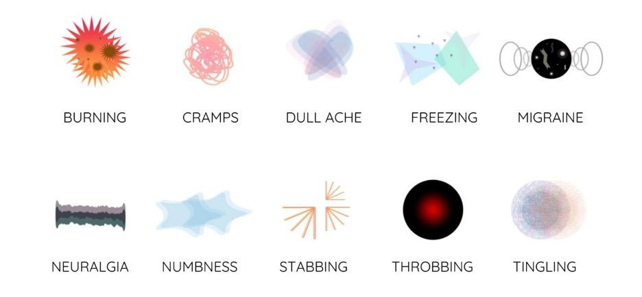
Figure 6. Static sentoms icon alternatives.
sentoms CP
I subsequently designed sentoms CP to serve as the functional proof of concept for the sentoms icons.
Overview
sentoms CP is a mobile application enabling patients to create and tailor sentoms, log their pain symptoms using the icons, and view the icons mapped onto a 3D model. Because the app allows users to change the visual intensity of sentoms through color, shape, motion, and sound, it is easy to see progress and relief at a glance as the icons are edited and logged over time, which enables meaningful clinical conversations to take place while motivating users to continue with their prescribed treatment plans.
The app also provides users access to additional resources, including general information about chronic pain (curated by HCPs), chronic pain case studies, direct messaging with HCPs, and personalized physical and therapeutic exercise plans designed by HCPs to alleviate pain symptoms.
Users have two options for exercises: the To-Do List and the Exercise Bank. The To-Do List is the set of exercises curated by the user’s HCP, and daily reminders can also be set. The Exercise Bank is the full range of exercises available, broken down into which symptoms/conditions they are recommended for. This gives users the autonomy to complete additional exercises throughout the day if they choose. Additionally, exercises that are comparable to the exercises on the To-Do List are marked as Fulfills To-Do List, meaning that users can do these exercises instead of the prescribed ones if they find them more comfortable or enjoyable. The original exercises on the To-Do List will still be checked off.
Examples of prescribed physical exercises include yoga, Pilates, and walking in place, while therapeutic exercises include meditation, guided imagery, sound therapy, and cognitive behavioral therapy. I included exercises in both categories based on responses given during the user research phase and additional literature that discusses the roles of physical therapy, meditation, and virtual reality in pain relief. While doctors focus on the physical aspect, many patients also experience associated feelings of hopelessness, depression, anxiety, and a general lack of motivation, which can be overlooked. Providing activities that promote mental health might have direct and indirect benefits for patients who will then feel more comfortable sharing and logging aspects of their experience with chronic pain.
Conversational experiences utilizing AI chatbots are a popular healthcare solution for providing immediate feedback. However, I opted to enable direct messaging with the user’s real HCP in this scenario because the core value of the sentoms concept is optimizing accurate communication about pain between humans.
Design Process and Final Prototypes
The design process began with wireframing to facilitate an understanding of how various application components would interact (Figure 7).
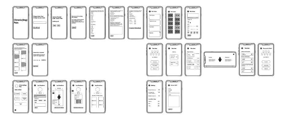
Figure 7. Mobile app wireframes.
Subsequently, multiple rounds of visual design refinement took place. Initial attempts aimed for a cheerful, positive aesthetic to avoid triggering reminders of pain. However, feedback led to simplifying decorative elements and allowing users to choose a single color for the entire application instead of using extensive color coding. Figure 8 shows the evolution of the interface.
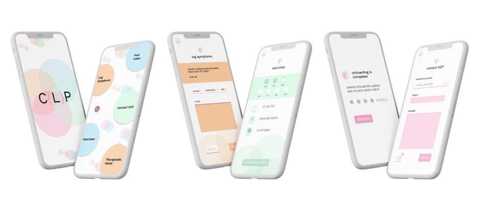
Figure 8. Mobile app visual design iterations.
Upon finalizing the visual aspects, the prototype was developed. Figure 9 demonstrates some key screens from the video walkthrough.
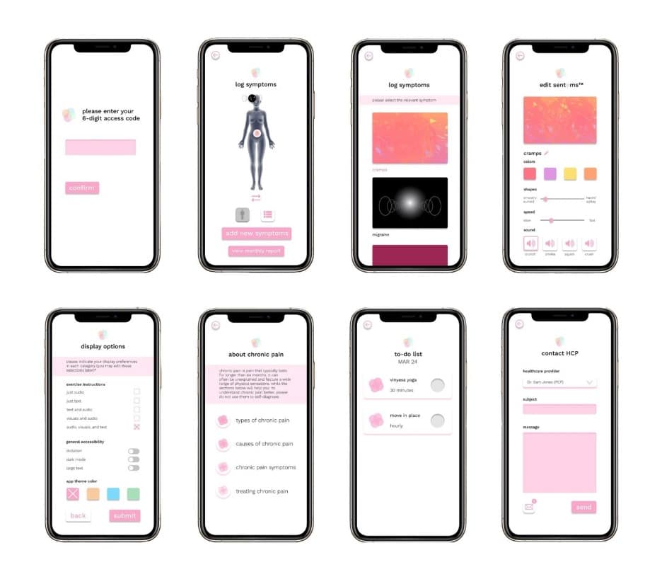
Figure 9. Mobile app screens.
Moreover, the mobile app can seamlessly integrate with a wearable/smartwatch app to enhance convenience in symptom tracking and exercise monitoring. This addition was prompted by user research responses emphasizing the motivation they gained from tracking progress and achieving specific goals. Allowing users to witness improved abilities in prescribed activities, as well as a general increase in physical activity, over time boosts morale. Because HCPs can monitor app data, patients can also be held accountable for their adherence to treatment plans, and these plans can be adjusted to be more accurate when necessary. Figure 10 shows some key screens from the video walkthrough.
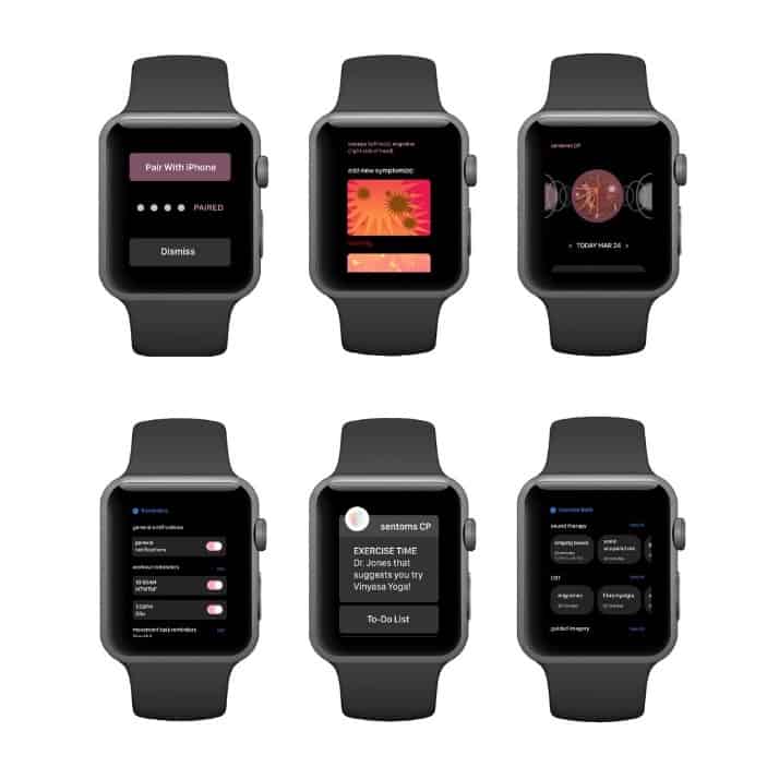
Figure 10. Wearable app screens.
Future of the Project and Broader Applications
I am currently dedicated to refining and perfecting this project while looking to involve larger groups of individuals living with chronic pain for further research and testing.
As it stands, this project sheds light on the limitations of existing pain description systems in healthcare. It also demonstrates the potential of dynamic, customizable, modular icons to enhance communication about pain. My firsthand experiences and the diverse responses from user research emphasize the importance of customization, nuance, and specificity when describing abstract and often invisible symptoms to healthcare professionals.
This concept is invaluable for the attending healthcare professionals and other clinicians collaborating with a patient, such as third-party consultants, telehealth practitioners, rehabilitation facility staff, home care providers, or family caregivers. Maintaining a comprehensive digital record of a patient’s pain symptoms and their real-time adherence to prescribed exercises is invaluable for gaining insights into concurrent symptoms, facilitating diagnoses, and determining the appropriateness of additional treatments. Furthermore, handwritten notes or hand-drawn sketches can often be illegible, making digitized communication a crucial asset for future reference.
The sentoms multimedia icons also have the potential to be used in campaigns that educate the general public about chronic pain to provide insight into what individuals with chronic pain may be experiencing, even when their condition is not immediately obvious.
Beyond chronic pain, this concept embodies an inclusive and universal design proposal. It can empower individuals with cultural, social, language, and class barriers, as well as groups like children and those with non-verbal autism, to effectively describe abstract symptoms they may be encountering in a clinical setting.

Shani Abass earned a BFA from Rhode Island School of Design. She is a Boston-based UI/UX designer interested in digital health, new technologies, code-based prototyping, and accessibility. Her work spans various platforms, including desktop, mobile, VR, and wearables.