“It is not the strongest of the species that survive nor the most intelligent but the one most responsive to change.”
—Charles Darwin.
Charles Darwin’s quote is very relevant to the design of user experiences and the need for designers to remain flexible in exploring and utilizing effective and efficient design processes and tools. My experiences designing a variety of interfaces, from web to mobile applications, have been challenging, yet fun. One of the biggest challenges that I have faced is recognizing and planning for designs that are intended to be responsive (a single design intended to render on a variety of display sizes) versus designing completely separate web and mobile applications with their own unique look and feel (that is, not responsive).
On several occasions, stakeholders have requested that first I create design mock-ups, then write the CSS/HTML, and then make the design responsive. Having followed this process a number of times, I began to wonder if I needed to create a more efficient process that would allow me to execute all these steps in parallel as opposed to sequentially, as I had been doing before. I came across an inspirational quote:
“If you’re making websites, chances are you’ve given some thought to what constitutes a responsive-friendly design process—and you’ve probably found that adding a mockup for every breakpoint isn’t a sustainable approach.” —Matt Griffin “Responsive Comping: Obtaining Signoff Without Mockups” (http://bit.ly/L2iWLK)
With the web becoming more and more interactive, and hundreds of devices hitting the market, each with different specifications and capabilities, it is time for designers to become more efficient and design for the overall “interaction experience.” By interaction experience I mean creating the best user experience on any device with which a user interacts with a given design (for example, a smartphone, or iPad).
Developers have the technical ability to create websites that look great on multiple devices; now we need an efficient and effective process for designers to follow. There is one technique that is certainly grabbing attention and has created a buzz: designing in the browser.
Strengths of Designing in the Browser
The typical project workflow goes from creating mockups, getting feedback, obtaining sign-offs, to finally, implementation. In some ways, the workflow exists out of necessity. We can only start development once our clients are satisfied with the prototypes. But how efficient are we in creating those prototypes? Specifically, how many designers use interactive prototypes over static prototypes for a client demo? What follows are some of the benefits that I have observed while following the “designing in the browser” technique on my projects.
Allows for quick prototype changes
In Agile work environments, feedback and requests from the client are frequent, with numerous changes to prototypes before reaching a final design. For example, consider what it takes to change the look and feel of an element common to all your pages. An HTML prototype would just require you to change one property in a cascading style sheet (CSS), a document that contains properties defining the look and feel of a website. By updating a class in the CSS, one design change is carried across all the mockups. Compare this with the traditional method of changing the color and other styles in multiple static mockups individually, where the whole process could be error-prone and time-consuming.
Helps communicate and envision a responsive design
A recent client requested desktop, iPad, and iPhone versions of mockups. I designed separate mockups in Photoshop for the web view and the mobile views. This process took much longer than it should have.
Photoshop is an awesome tool for creating designs. It comes with amazing effects, and those effects are great when you need to create a jazzy design. However, there are limitations when converting these designs to an interactive prototype. There are tools available to convert Photoshop layers to CSS3 layers, but they rarely replicate the design into the browser perfectly.
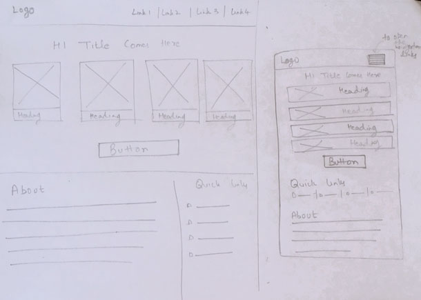
On the next project I tried designing in the browser. First, I gave my clients rough pencil sketches of the proposed desktop and mobile UI designs (see Figure 1). Pencil sketches allowed us to visualize the design—including transitions from desktop to mobile—before coding began. They also allowed ideas to run freely without the constraints of design tools, and could be easily understood, even across language barriers.
After a few rounds of discussing the pencil sketches, we locked down the UI design. Then, after the UI design was finalized, I started coding in the browser by referring to the sketches. Luckily, I already knew how to code in CSS and HTML, allowing me to get started with designing in the browser quickly. Using CSS media queries, I could see both web and mobile versions at the same time as I coded the design. Simple tweaks of a few lines of code allowed me to create a prototype that responded well to multiple devices. Compared to my old method of prototyping, designing in the browser saved me time and effort when creating a responsive prototype.
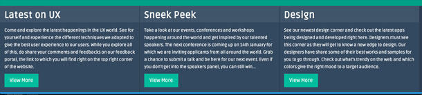
Let’s consider some specific, concrete examples. Suppose a design has three columns with different blocks of content. Technically, the code for the columns is placed inside of an HTML structure called a “div.” To display those three columns side-by-side in a horizontal line on a full width browser, the CSS property would read “display:inline-block.” (see Figure 2)
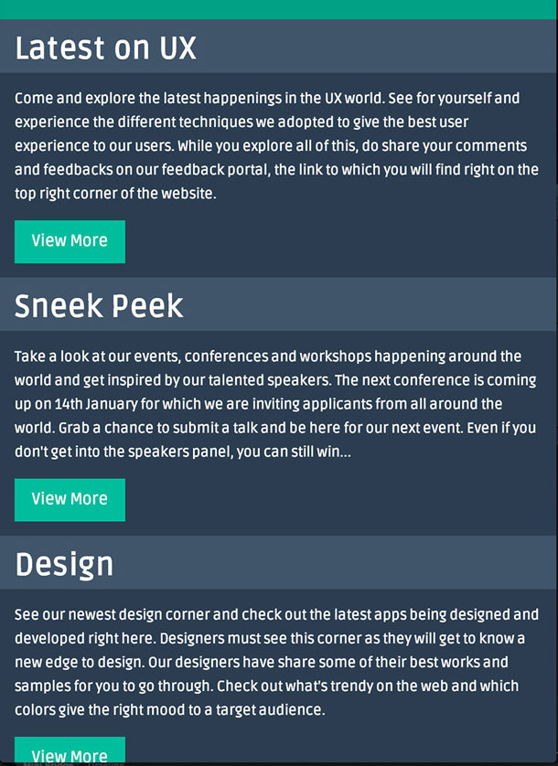
While this layout works well on a full-width browser, in a mobile experience it would be hard to read, resulting in a bad user experience. With the help of a CSS3 media query, the CSS property can be changed to “display:inline” allowing the content to be displayed vertically on mobile devices with varying screen sizes (see Figure 3).
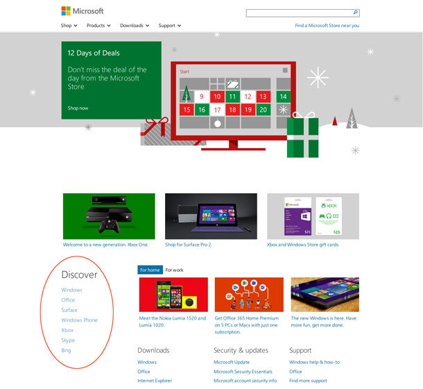
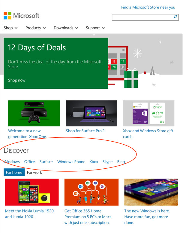
As another example, consider the fully responsive Microsoft homepage (see Figure 4). When examining the CSS, we see that the “Discover” section is given an initial CSS property “float:left” which is then changed to “float:none” with the help of a CSS3 media query, ultimately centering that section when the page is viewed on a mobile device (see Figure 5).
An important rule is to keep your design simple. The final design should respond well to multiple devices. Try to structure your website in such a way that the different UI elements fall in columns and rows so when the website is rendered on a mobile device, you know which row to convert into a column and vice-versa.
Writing the CSS and HTML for any website structure helps to mentally visualize how a div of a certain width and height would take form on a variety of screen sizes. The Chrome web store offers a nice extension called Window Resizer, which can be used to assess how your site looks on devices with different screen sizes. Ultimately, designing in the browser helps you explore how the site will respond to multiple devices early in the design process rather than forcing a visual design for one size on all the others later.
Obtain quick feedback on a more robust experience
Designing in the browser allows the designer to test the design early in the process. Testing can be loosely defined to include not only usability testing, but also with the UX team and their clients.
UI elements such as navigation menus, links, and animations come to life, allowing an interaction designer, client, and end-user the ability to experience a high degree of interactivity with the interface. Prototypes created with static images may be limited in the degree of interactivity allowed. For example, static comps do not allow for clicking on links or navigating to the next page unless you create image maps, which will end up consuming a significant amount of your time. By creating HTML prototypes, you can actually give your clients an overall “interaction experience” that mimics the real world application. Further, a visual designer may be able to test a variety of visual treatments, and a content strategist can test out different content styles easily, seeing how they work responsively.
Content is given priority
Designers often make a mistake of paying more attention to the look and feel of the interface while using lorem ipsum type for filler content. This practice tends to sidetrack the content, a very important element in deciding the fate of a website’s design. For a great user experience, it is important to ensure that your users are not distracted or confused by seeing different content on different media devices.
Designing in the browser offers a great way to foresee this aspect and produce content that fits well within the boundaries of any device, regardless of size. Alternatively, it can be used to ensure that the design of the site accommodates real content, rather than forcing content into boxes whose size have been determined without thinking about what the site needs to say.
Allows for cross-browser compatibility testing
With so many browsers hitting the web, it’s important to consider how a design might be rendered differently across browsers. Often, a designer specifies a design in a design tool while neglecting to consider if the designed feature is compatible with current web browsers.
Designing in the browser allows the designer to keep checking their designs in different browsers to see the end results; you don’t have such liberty with most design tools.
CSS3 has awesome features like shadow, gradient, text-shadow, and rounded corners, and those properties can now be used within the browser. (Note that some of those features are not compatible with a few browsers, like older versions of IE, but there are hacks for making such features run through the use of JavaScript.) Ultimately, you can make your design appear as you have thought it should appear in the browser.
Makes life easy for developers
Designing in the browser requires the designer to be well versed in CSS and HTML, and their knowledge of those design languages can be beneficial to a developer. Once done with the designs, the designer just needs to hand over the CSS and HTML code to the developer to integrate with the back end code. This saves a significant amount of the developer’s time and effort from coding the front end. Also, if desired, it allows the developer to pitch in, ideate, and share his/her thoughts with the designer from a developer’s mind; this helps the designer understand the challenges from a technical perspective and further helps the designer earn the trust and respect of their fellow developers. Overall, the technique helps build a great camaraderie between designers and developers.
Limitations of Designing in the Browser
There are requirements for designing in the browser that can limit its use.
Requires significant technical knowledge
Designing in the browser requires the designer to have adequate knowledge of HTML and CSS. Furthermore, the designer needs to be well versed in other technical aspects such as debugger tools (for instance, Firebug) and web browser compatibility tools (for example, Windows Resizer, Color Picker, Page Ruler). Such tools are a great help while coding and testing your website. Some understanding of Object Oriented Programming is also beneficial (for instance, when using JavaScript and its frameworks). An understanding of programming helps the designer analyze the technical needs of the UI from the beginning and know what it will take to achieve a responsive design.
For a designer with limited technical knowledge interested in designing in the browser, one option may be to partner with a developer very early in the process. For example, a designer could provide a developer with the pencil sketches, and the developer could code the prototype in HTML and CSS rather than the designer doing so himself. The pair could continue to work closely throughout the design’s evolution.
Meanwhile, the designer’s organization can take the initiative to train designers in HTML and CSS, while giving some basic overview of programming languages like JavaScript. Even though the designer’s focus is on specifying the user experience, it is beneficial to all team members when a designer is aware that the design they specified is possible through one of the JavaScript frameworks, for example, and can make suggestions to the team accordingly.
May not work for all project types
For websites that demand a very jazzy and snazzy look and feel, this technique may present some challenges; such websites may utilize graphic-heavy images with effects that might be impossible—or very time consuming—to reproduce in the browser. For such graphics, it becomes necessary to create an image with the desired effects in Photoshop first and then apply it as a background-image through CSS. For example, the CSS for background image will look something like this: body{background-image: /path-to-image/imagename.gif}, where body is an HTML tag.
This technique may also not be ideal for projects where the stakeholder wishes to experiment with the prototype on the fly and play around with the placement of various sections (for instance, by dragging and dropping). When trying to decide what goes where, simply dragging a section and moving it to some other place on the page might not be that easy in the code. With design tools like Photoshop, changing your mind and restructuring the layout is not that big a deal. However, when dealing with code, structuring a layout requires some pre-planning.
Nonetheless, it is possible to inject some flexibility into the prototype when designing in the browser by making use of CSS frameworks like Bootstrap and Foundation. In Bootstrap, for example, there are different CSS classes for different layouts such as “pull-left” and “pull-right” that align UI elements in left and right positions. Let’s consider a scenario where, in HTML you might have, < div class= “leftBar” >Some Content < /div >.
On the other hand, in CSS you would have, leftBar { float:left }; where “float” is a CSS property and “left” is a CSS value, which means you want the div having CSS class “leftBar” to be left-aligned.
In this case, if you are planning to shift this “div” that was originally left positioned to the right, you simply change classes within the HTML, so < div class= “leftBar” > will now become < div class= “rightBar” > in the HTML and in the CSS you would have rightBar { float:right }.
Hence, you do not need to edit the CSS since the framework already has those classes in place. However, you definitely need to do a rigorous study of such frameworks so that you have sufficient knowledge of the classes in the framework.
Similarly there are other CSS structures defined in the framework for different layouts such as single column, two-column, three-column, which can be used to structure your layout. In essence, you wouldn’t need to spend time creating a structure yourself; you just need to copy and paste the code into your HTML file.
Conclusion
Static comps were a great way to demo applications to clients when so many devices with varying screen sizes did not exist, but they are often inefficient when creating and demonstrating responsive designs. With the advent of design technologies like CSS3 media queries, it is possible to create robust and responsive prototypes more quickly, allowing designers to demonstrate to a client how a design adapts according to display size.
We, as designers, should accept this change, enhance our knowledge, and embrace techniques such as designing in the browser to make the process more efficient and dynamic. We need to move beyond using only graphics tools and challenge ourselves to become competent enough to incorporate interactivity in the user experience early in the process.
[bluebox]
More Reading
- Design in the Browser – CreativeBloq.com
- Responsive Web Design in the Browser – Treehouse Blog
- Tips for Designing in the Browser – Tuts+
- Designing in the Browser Leads to Better Quality Builds – CSS Wizardry
[/bluebox]
设计人员经常使用链接在一起的静态组件,来演示相应设计将如何显示在各种尺寸的显示屏上。更改此类原型枯燥乏味并且非常耗时。“在浏览器中设计”是一种新兴方法,需要设计人员将其设计直接编码到浏览器,利用 CSS3 媒体查询来改进原型的交互性,并监控相应设计如何在不同设备上呈现,最终可为设计人员节省大量时间和精力。
文章全文为英文版설계자는 설계가 다양한 디스플레이 크기에서 어떻게 표현될 것인지를 입증하기 위해 함께 연동된 정적 컴포지션을 종종 이용합니다. 그러한 프로토타입에 변화를 가하는 것은 지루하고 시간 소비가 많은 작업입니다. “브라우저에서의 설계”는 설계자가 브라우저에 자신의 설계를 직접 코딩하고 프로토타입의 상호 작용성을 개선해 설계가 다양한 기기에서 어떻게 표현되는지를 모니터하는 데 CSS3 미디어 쿼리를 이용함으로써 궁극적으로 설계자가 상당한 시간과 노력을 절약할 수 있도록 하는 최근의 기법입니다.
전체 기사는 영어로만 제공됩니다.Os designers usam frequentemente comps estáticos vinculados para demonstrar como um projeto será reproduzido em vários tamanhos de telas. Fazer alterações em um protótipo como esse é tedioso e consome tempo. “Projetar no navegador” é um método recente em que o designer codifica seu projeto diretamente no navegador e utiliza media queries do CSS3 para melhorar a interatividade do protótipo e monitorar como o projeto é reproduzido em vários dispositivos, economizando tempo e trabalho do designer .
O artigo completo está disponível somente em inglês.デザイナーは、様々なディスプレイサイズ上で、デザインがどのようにレンダリングされるか実際に見るために、互いにリンクされた静的な構成図(カンペ)を使用することが頻繁にある。このようなプロトタイプに変更を加えることは、面倒で時間がかかる作業である。「ブラウザー内でのデザイン」は、最近生み出された手法で、デザイナーがコーディングをブラウザービューへ直接行い、CSS3のメディアクエリを活用してプロトタイプのインタラクティビティを高め、デザインが様々なデバイスでどのようにレンダリングされるかを監視し、究極的にデザイナーの時間と努力を大幅に節約する。
原文は英語だけになりますCon frecuencia los diseñadores utilizan composiciones estáticas enlazadas para demostrar cómo un diseño se verá en diferentes tamaños de pantalla. Realizar cambios a este tipo de prototipo es una tarea tediosa que requiere mucho tiempo. “Diseñar en el navegador” es un método reciente en el cual el diseñador codifica su diseño directamente en el navegador y utiliza llamadas CSS3 para mejorar la interactividad del prototipo y evaluar cómo se visualiza el diseño en diferentes dispositivos, de modo que a largo plazo el diseñador ahorra una cantidad considerable de tiempo y esfuerzo.
La versión completa de este artículo está sólo disponible en inglés