Your software product is going through a major redesign.The user experience team needs to make interface design updates to all areas of the product. There is a tight timeline for the release, and scope is continuously expanding. Oh, and by the way, you will be working within an agile team. Yay!
This was the very scenario that the UX team was challenged with when I joined my current organization in 2010. We were tasked with delivering major updates and expansions to product functionality, working within a two-week iterative agile development process. Our team was struggling to balance user experience quality, quick turnaround, and functional completeness. We soon found ourselves spending considerable time iterating a single feature to its most perfect state instead of delivering a basic set of feature designs that formed a complete workflow. We needed to refocus our design priorities and use a different approach if we had any hope of delivering a meaningful user experience in the required timeframe.
Design mapping to the rescue! Applying the concepts from Jeff Patton’s story mapping tool (www.agileproductdesign.com), our team was able to identify and prioritize the most effective approach for feature design. Although story mapping is traditionally used to plan and prioritize scope at the product release level, because it integrates a persona (the user), their goal, and an associated workflow, it readily adapts to identifying options and planning a layered approach to the user experience design. Using the story mapping tool in a design context helped us successfully deliver the required features that formed a complete end-to-end user experience across the product.
Design Maps
Thankfully, the basics of design mapping are simple. As with story mapping, each design map has a persona that has a goal he/she wants to accomplish. There is a sequence of steps, or tasks, that make up a workflow the user will go through to accomplish that goal. These tasks are presented horizontally at the bottom of the map, left to right. Different approaches to accomplishing each task are posited by the design team. These design options are placed in columns above each task, ordered by simplicity. Once the framework is established, the result is a transparent, tangible artifact you can use in conversations about necessity and priority for each design option (see Figure 1).
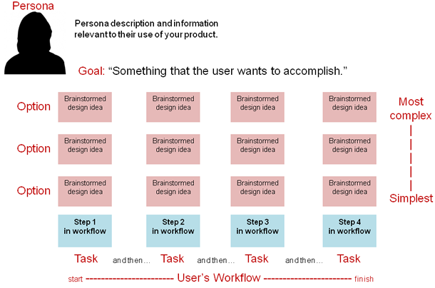
To build out a design map for your project, you first establish the persona, goal, and workflow. This is usually done in consultation with the person on your team that represents the business needs; for example, a business analyst, product manager, or client. Then, the design team can start brainstorming different design solutions for the tasks in the workflow. Each brainstormed idea is represented by a block above the task column (the light grey blocks shown in Figure 1). Once there are at least three design ideas created for each task in the workflow, it’s time to prioritize. What is the simplest solution that would satisfy the task? Start by placing those ideas just above the task step, and work your way upward to more complex solutions. Your design effort then continues by choosing one design option for each of the task columns.
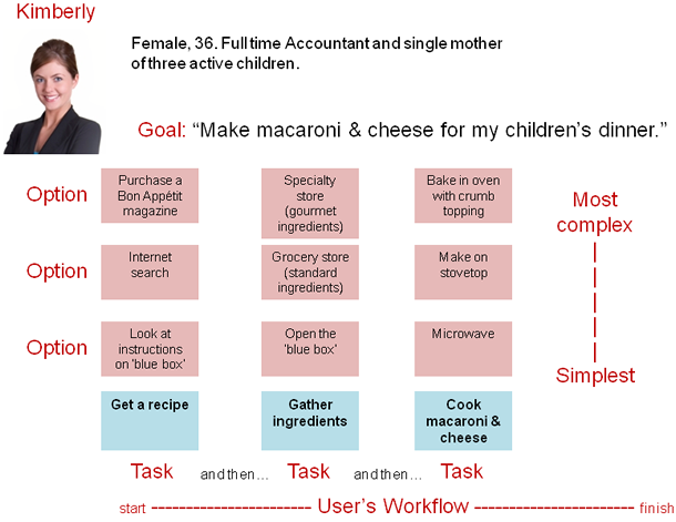
Let’s look at an example of a design map for making macaroni and cheese. The persona is a single mother who works full time, and her goal is to make macaroni and cheese for her children’s dinner. Her workflow might include things like, “Get a recipe,” “Gather ingredients,” and “Cook macaroni & cheese.” We could then brainstorm different ideas for how she could accomplish each task(see Figure 2). You can envision that for this persona, with her busy schedule and active children, the simplest thing that could possibly work may be the “blue box” prepared in the microwave oven! But what if she were making the macaroni and cheese for a dinner party? You might make different choices about the options. You’re on the right track as long as at least one option from each column is represented in the designs.
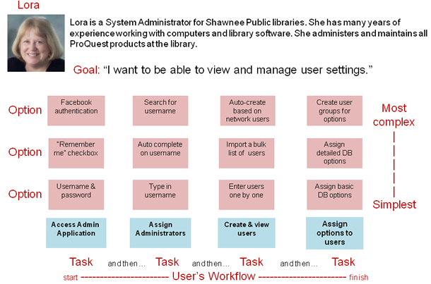
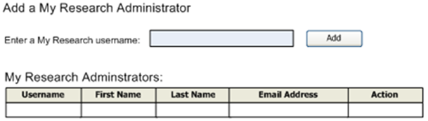
At ProQuest, we first used design mapping to approach a set of requirements for building new administration functionality. Among the user tasks that needed to be designed were accessing the application, assigning administrators, creating users in the system, and managing those users (edit/delete, assigning settings, etc.). The team was able to create a design map that presented options for each feature (see Figure 3 for a simplified version).
Once we had established the design map for our administration tasks, and prioritized by design simplicity, we invited the product team (business analysts, developers, and QA) to review it and help make choices about the level of support we wanted to adopt for each task. For example, while the simplest requirements layer may be good enough for some tasks (see Figures 4, 5, and 6), perhaps a more complex “enhancements” or “embellishments” level of design support is needed for other tasks (see Figure 7).
Often, the discussions among team members reveal factors that make one option more desirable than another. For example, there may be an option that makes the product more competitive. Other options may be more technically complex, potentially affecting delivery. There are many variables to consider when making these decisions, and there are no right answers. The most important thing is making sure that you have at least one design option from each column, forming a complete solution for the user workflow.
As you can see, although we started our design proposals with the simplest approach that could possibly work, there were cases where the business felt a more complex design was appropriate. In addition, what may begin as an enhancements-level design for a new product may, over time, become a required-level design as the product matures. As business and project needs change, the map will change, too. One of the most valuable aspects of creating a design map is the opportunity for continuous collaboration.
Cupcakes and Layers
When I teach this method, there is a story I like to tell about a party that I was asked to make cupcakes for. I only had an hour to put them together, and there were twenty guests on the list. When I looked at the list, the first person on it was my dear friend Mary. Now, Mary and I go way back, and are very close. I happen to know that Mary’s favorite kind of cupcake is vanilla cake with chocolate frosting and sprinkles. I really wanted to make this cupcake for her, and I wanted it to be perfect. So, I mixed enough vanilla cake mix for her cupcake and waited the twenty minutes for it to bake. I made the chocolate frosting, used a pastry bag to pipe it prettily onto the cooled cupcake, and took my time carefully placing sprinkles over the top. Things were going great! But, then, uh-oh! I checked the clock and discovered that I only had ten minutes left to make nineteen more cupcakes! I’d run out of time. It’s sometimes like that when we are working through design. We spend our entire time designing one feature up to the sprinkles, leaving other features in the workflow out of the party (see Figure 8).

This is where the design map and prioritized layering helps. If we had started off our baking project by making just a plain cupcake for everyone, each person would have gotten a cupcake and the most basic requirement would have been met. If we had extra time after the baking, we could go back and frost the cupcakes as an enhancement to the user experience. And, if really necessary, we could go back again and embellish them with sprinkles.
Agile design projects can be approached this same way. By mapping the user workflow, satisfying basic requirements across each of the tasks, and adding enhancements and embellishments as you have time (and/or budget), you can deliver the most basic and valuable end-to-end user experience right from the start.
Please, Hold the Sprinkles
While design mapping has been invaluable to our team in organizing and prioritizing our design efforts, there are a few caveats to watch out for when using it in your project. First, if your project doesn’t already have a persona, now is the time to create one. So much of the prioritization and workflow decisions depend on “who” is using the features, that design mapping will be much less effective without a basic persona.
Second, be careful about the differences between a user goal and a task. A user goal is “what” the user needs to accomplish, while the tasks are “how” they will accomplish it. For example, your goal may be to get cash from your savings account. The supporting tasks would be things like driving to the ATM, swiping your card, and entering your PIN number.
Third, make sure you are truly looking at the simplest design for each task. The idea is to create a basic experience that you can build on in future iterations. Agile design is about embracing simplicity and necessity over complexity and desirability.
Lastly, hold the sprinkles! As with many user experience professionals, I have had to learn to set aside my inner perfectionist and focus on the simplest thing that could possibly work for the user. User experience design doesn’t always need to be fancy, jazzy, or wonderfully elegant. Think first of what the user actually needs instead of embellishments that might wow, but ultimately do not satisfy. Embrace the cake, frost with care, and if someone on your team is insisting on iterations of sprinkles, tell them the story of Mary’s cupcake.
[greybox]
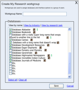
Figures 1-3: Full descriptions
These figures all show a persona with a name, picture and short description at the top. Below this is a series of columns. Each represents a task, arranged in order of the user’s workflow. The name of the task is at the bottom, with the options for the design of each task stacked from simplest to most complex.
The three figures show how the design map is built out.
- Persona: Persona description and information relevant to their use of your product. Goal: Something that the user wants to accomplish. Tasks: Step 1, Step 2, Step 3, Step 4.
- Kimberly: Female, 36. Full time accountant and a single mother of three active children. Goal: Make macaroni and cheese for my children’s dinner. Tasks: Get a recipe, Gather ingredients, Cook macaroni and cheese.
- Lora: Lora is a Systems Administrator for Shawnee Public Libraries. She has many years of experience working with computers and library software. She administers and maintains all ProQuest products in the library. tasks: Access Admin Application, Assign Administrators, Create and View Users, Assign Options to Others
Examples of task embellishments
- Task: Get a recipe. Look at instructions on box + internet search + purchase a Bon Appetit magazine
- Task: Access Admin application: Username & password + Remember Me checkbox + Facebook authentication
- Task: Assign administrators: Type in username + autocomplete username + search for a username
[/greybox]
[greybox]
Figure 8: Full description
The diagram shows a task with levels of design assigned to levels of priority.
- Task: Assign options to users
- Requirements (cake): Assign basic DB options
- Enhancements (frosting): Assign detailed DB options
- Embellishments (sprinkles): Create user groups for options
[/greybox]你是否是在敏捷环境中工作的设计师?是否曾经感到自己迷失了大方向,只在细枝末节上纠结?敏捷设计团队经常会因为单个产品功能忙得满头大汗,反复研究将这个功能做到完美。虽然这种方法会为用户提供在一个环节中最完整的功能,但常常忽视更上层的工作流程。我们知道,完整且有意义的用户体验对于产品成功很重要,但要将整个用户任务流中的需求排定优先级是有挑战的。
本文使用故事映射中的概念,讨论可以如何使用分层设计方法来打造最有价值的端到端用户体验。这种映射有助于确定任务流的基本设计要求。文中还展示了用于分层增强和美化的各种选择。该方法以角色、用户目标和任务流为基础而构建,增加了一个可视映射图来帮助创建具有适当复杂度的完整用户体验。
The full article is available only in English.당신은 애자일 환경에서 일하는 디자이너십니까? 세부 사항의 상호 작용에 집중하여 그 대신 전체 모습을 놓치고 있다는 느낌을 느낀 적이 있나요? 애자일 디자인 팀은 한 기능이 가장 완벽한 상태가 되도록 반복하며 종종 한 제품 기능에 압도될 수 있습니다. 이 접근법은 사용자에게 한 영역에서 완벽하게 구성된 기능을 제공하지만, 더 큰 규모의 작업 흐름은 종종 무시되기도 합니다. 완벽하고 의미 있는 사용자 경험은 제품 성공을 위해 중요하지만, 모든 사용자 작업 흐름을 통한 요구 사항에 우선순위를 정하는 것은 간단하지 않은 일입니다.
당신은 애자일 환경에서 일하는 디자이너십니까? 세부 사항의 상호 작용에 집중하여 그 대신 전체 모습을 놓치고 있다는 느낌을 느낀 적이 있나요? 애자일 디자인 팀은 한 기능이 가장 완벽한 상태가 되도록 반복하며 종종 한 제품 기능에 압도될 수 있습니다. 이 접근법은 사용자에게 한 영역에서 완벽하게 구성된 기능을 제공하지만, 더 큰 규모의 작업 흐름은 종종 무시되기도 합니다. 완벽하고 의미 있는 사용자 경험은 제품 성공을 위해 중요하지만, 모든 사용자 작업 흐름을 통한 요구 사항에 우선순위를 정하는 것은 간단하지 않은 일입니다.
The full article is available only in English.Você é um designer trabalhando em um ambiente ágil? Já se sentiu como se estivesse perdendo a perspectiva para focar em iterações de detalhes? Equipes de design ágil podem com frequência se envolver com uma única característica do produto, reiterando essa característica ao seu estado mais perfeito. Embora essa abordagem proporcione ao usuário uma funcionalidade robusta em uma área, o fluxo de trabalho mais amplo é normalmente negligenciado. Sabemos que uma experiência do usuário completa e significativa é importante para o sucesso do produto, mas priorizar requisitos por todo o fluxo de trabalho do usuário pode ser desafiador.
Usando os conceitos de mapeamento de estória, este artigo discute como você pode usar uma abordagem de projeto em camadas para criar uma experiência do usuário de ponta a ponta mais valiosa. O mapeamento ajuda a identificar o conjunto básico de requisitos de projeto para o fluxo de trabalho e ilustra opções para melhorias e aprimoramento de camadas. Esta técnica baseia-se em personas, objetivos de usuários e fluxos de trabalho e acrescenta um mapa visual para auxiliar na criação de uma experiência do usuário completa com o nível correto de complexidade.
O artigo completo está disponível somente em inglês.貴方がアジャイル開発環境で働くデザイナーであれば、全体像を把握しないまま、詳細部分の反復にばかりに集中している気分になったことはないだろうか?アジャイルデザインのチームでは、製品の一つの特長に注目し、その特長が最もパーフェクトな状態であるように作業を反復する。このアプローチでは、あるエリアではユーザに十分な内容のある機能を提供できるものの、より大きな全体的なワークフローがしばしば無視されてしまう。製品の成功には、トータルで意味のあるユーザエクスペリエンスが重要なことは分っているが、ユーザのワークフローすべてわたって要件を優先付けするのは、困難なこともある。
この記事では、ストーリーマッピングのコンセプトを利用し、最も価値あるエンドユーザ間のユーザエクスペリエンスを創造するために、いかに階層的デザインアプローチが利用できるかについて議論する。このマッピングは、ワークフローでの基本的なデザイン要件の特定を助けてくれ、階層の強化や補強を行うためのオプションを具体化してくれる。この技法は、ペルソナ、ユーザの目標、ワークフローを基にし、視覚的マップを加えることで、適切な複雑さの水準で完全なユーザエクスペリエンスを作り出すことを支援する。
The full article is available only in English.¿Es usted un diseñador que trabaja en un entorno ágil? ¿Alguna vez le pareció que no estaba viendo el contexto general y se estaba enfocando en el trabajo continuo de los detalles? Los equipos de diseño en metodologías ágiles pueden acabar atrapados en una única función del producto, y trabajar insistentemente en esa única función hasta alcanzar el máximo nivel de perfección posible. Si bien este enfoque le da al usuario plena funcionalidad en un área, el flujo de trabajo más amplio suele quedar de lado. Sabemos que una experiencia de usuario completa y significativa es importante para el éxito del producto, pero puede ser difícil priorizar los requerimientos en todo el flujo de trabajo del usuario.
Con los conceptos de la técnica de story mapping, en este artículo se analiza cómo se puede utilizar un enfoque de diseño por capas para crear la experiencia de usuario más valiosa. Los mapas ayudan a identificar el conjunto básico de requerimientos de diseño para el flujo de trabajo y grafican opciones para realizar mejoras funcionales y estéticas por capas. Esta técnica se fundamenta en las personas, los objetivos del usuario y los flujos de trabajo, y añade un mapa visual que facilita la creación de una experiencia de usuario completa con el nivel de complejidad adecuado.
La versión completa de este artículo está sólo disponible en inglés.