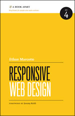
 A review of
Responsive Web Design
By Ethan Marcotte
A Book Apart, 2011
For years, web design and usability didn’t seem to go hand in hand. However, it wasn’t for lack of trying on the part of web designers. Designers created beautiful presentations only to see them break in an older browser, be stretched out of proportion by a larger computer screen, or become virtually unreadable with enlarged text sizes. As a result, designers tried to have more control over the display, such as setting absolute page and font sizes. But then people started viewing websites designed for a standard desktop display on a mobile phone or a TV-size screen, and things just had to change.
In his new book Responsive Web Design, Ethan Marcotte makes a case for creating a design that scales based on platform, and offers practical instruction for converting a website to a design that can scale small enough to be readable on an iPhone, or big enough to work on a wide-screen TV.
The book is a short read (just under 150 pages); it is the perfect size for someone who knows something about building websites and wants a quick tutorial on best practices for converting a website to a responsive design. It includes enough detail to be practical, but not so much that the reader is overwhelmed with unnecessary information.
In its five chapters, the book tackles three main areas: flexible grids and layouts, flexible images and media, and media queries. Each topic is given its own chapter. In addition, an introductory chapter makes the case for responsive design, while the concluding chapter offers advice on how and when to implement responsive design.
Marcotte believes designers need to let go of trying to enforce strict control over their presentation. To this end, he urges using flexible grids that rely on proportions rather than fixed sizes, tailoring style rules to make the design appropriate for both very small and extra large platforms, and using CSS3 media queries that seek out information about the display from the browser to be able to serve out the appropriate style rules.
Next, Marcotte walks readers through a detailed case study in which he converts a blog to a responsive design. He tackles converting fixed sizes to proportional measurements via CSS rules for page width, fonts, margins, and images. At each step, he looks at the changes to the design, illustrates the examples with images, and examines how the design will hold up in very small and very large displays. He includes advice on how to maintain balance in the presentation. For example, large margins might be appropriate with a larger display, but may not be desirable when the design is scaled to fit a phone screen, once the important content is scaled down in size.
Marcotte also addresses browser compatibility issues and offers some JavaScript fixes for the few cases in which his recommendations may not hold up with older browsers.
Some of the ideas in the book are not new. Proportional font sizes and screen widths that adjust when a user increases or decreases text size, or their window size, have been included in CSS for years. But Marcotte does introduce some new concepts, such as media queries (included in CSS3, the latest CSS standard), and pulls it all together in easy-to-follow instructions for adding responsiveness to a website.
With the growing popularity of mobile devices, and increased pressure on site owners to add a mobile website, this book is well timed. Marcotte’s guidelines allow a primary website to be adapted to work well on mobile platforms, eliminating the need for a second site. In fact, the author discourages creating a second site, noting that if the second site has a different URL and users try to pull it up on a platform it was not designed to work on, results are unpredictable.
Marcotte’s book is filled with good, practical advice. It is probably best suited for someone who has hands-on experience designing websites. The book delves into modifying CSS and HTML code, nothing too difficult for someone who has been exposed to writing web code, but probably pretty boring for someone who is looking for a broader overview of responsive design.
Responsive Web Design is a good book with a useful collection of best practices, particularly valuable for those designing for multiple devices. It should be included in the library of anyone tasked with creating or maintaining a website.The full article is available only in English.The full article is available only in English.Uma análise de web design responsivo por Ethan Marcotte
Justificativas e instruções práticas para a criação de um design escalonado de acordo com a plataforma.
O artigo completo está disponível somente em inglês.The full article is available only in English.Análisis de caso e instrucciones prácticas para la creación de un diseño que se adapte a la plataforma.
La versión completa de este artículo está sólo disponible en inglés.
