A nervous thirteen-year-old girl sat in a pre-operative room. As she spoke with the anesthesiologist about the impending knee surgery, a nurse came by with a clipboard, requiring that the eighth grader confirm she needed surgery on her left knee. She checked the box “Left,” and signed her name. Then the nurse handed her a giant permanent marker and asked the young patient to label her “good” leg, “NOT THIS ONE” and “NO SURGERY HERE.” Her finishing touch was a large, “NO!” on the top of her right kneecap (see Figure 1). The girl nervously laughed about why they might require her to do this.

Perhaps you have heard stories of a doctor operating on or amputating the wrong limb. Even though this is an age-old problem, some medical devices cause the user to confuse the sides of the body, consequently leading to recalls of the devices. Just last year, the U.S. Food and Drug Administration (FDA) recalled a software system because the interface led doctors to confuse the left and right sides of the brain when evaluating patients (see Figure 2). Imagine the consequences of this design flaw during brain surgery!

In 2008, the FDA recalled an ultrasound system because the graphics made users misunderstand the image orientations of the patient’s left and right sides. The users made the assumption that the patient’s right and left sides were oriented in the same direction as the transducer, but this assumption was incorrect. Usability testing reveals the assumptions that users make, which can prevent designers from overlooking medical device characteristics that may lead to a higher risk for users, and ultimately, a recall.
Unfortunately, evaluating the wrong side of a body is just one example among many usability issues challenging medical devices. In the medical field, problems with usability are referred to as “use errors” instead of “user errors” to defer blame away from the user. It is not the user’s fault when the interface sets them up for failure.
Use errors are defined as “something that the user does or fails to do that results in an outcome that the user or manufacturer does not expect.” Use errors can be reasonably predicted to occur. Their risk of happening can be minimized through contextual inquiry, risk analysis, and usability testing.
Users of medical devices fall into five general categories: the general public (patients and home caregivers), healthcare providers (clinicians, including physicians and nurses), laboratory and biomedical technicians, imaging specialists (such as radiologists), and pharmacy staff. Each user profile tends to have its own set of challenges for medical device development. Usability research can aid in predicting the use errors common within each user group and inform design.
Medical Devices for the Home
Use Errors Due to Displays
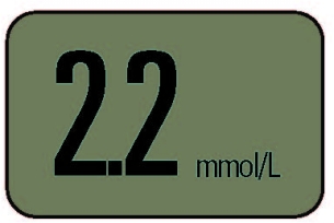
One glucose meter was recalled because its users incorrectly interpreted the numbers on the display. When it showed “2.2,” the square decimal point was so small and so close to the first “2” that users read the number as “22” (see Figure 3). As a result, the users thought their blood glucose levels were ten times higher than they really were. Patients would mistakenly believe they needed to adjust their insulin injections to a much higher level than necessary. The consequences of this mistake could range from severe hypoglycemia to diabetic coma or death.
In another case, the FDA issued an industry-wide recall of glucose meters that led to similar consequences for patients. The meters allowed users to choose between units of measure during setup. This feature allowed the meter to be marketed in both the U.S. and Europe. Additionally, it accommodated users who travel and regularly visit doctors in multiple countries. In the United States, insulin units are displayed in mg/dL, but in Europe and other parts of the world, units are displayed in mmol/L. The units differ by a factor of eighteen (18), which could lead to patients mistaking the units and taking incorrect therapy actions.
Users originally toggled through different modes when setting up the time and units of the device. When they set the clock or changed it for daylight savings, they would sometimes inadvertently change the units of measure from mmol/L to mg/dL or vice versa. Many times, users did not realize they had changed the units of measure because the units were not always prominently displayed.
In response to this use error, the FDA required the manufacturers to remove the capability of changing units on all glucose meters. Now travelers are inconvenienced by having to own two meters, and suppliers must manage additional inventory, but the prospect of serious consequences is diminished.
In the case of glucose meters and many other medical devices used by patients at home, design teams should confirm that users understand labeling, warnings, and instructions for use. This can be accomplished through comprehension studies in which users rely on instructions, labels, or the device itself in order to use the device.
Use Errors Due to Ergonomics
Failure to test the usability of a device can lead to poor ergonomic design—another common cause of recalls of medical devices. In 2008, the FDA recalled a wheelchair that had the potential to pinch a user’s fingers between seat bars when the user was opening the wheelchair, resulting in injuries as severe as fracture and severing.
To prevent the hazard of wheelchairs clipping fingers, a design team should create a detailed list of tasks associated with using a wheelchair and steps within each task. They should then consider each way in which a task could be performed incorrectly, and the consequence of skipping a step.
For medical devices, the FDA requires a formal risk analysis as part of the design process (see Figure 4). In a risk analysis, a cross-functional team considers the probability of a use error occurring and harming the user. Then, they rate the severity of the resulting harm to create risk level ratings for each task. Tasks with the highest risk level are prioritized during the redesign process.

Contextual inquiry is another useful tool for identifying potential use errors, since it reveals what users do during actual use. The design team must create a design that reduces the possibility of these use errors, and then ensure that the use errors have been minimized by performing an iterative set of usability tests.
Medical Devices in Hospitals
Use Errors Due to Misconnections
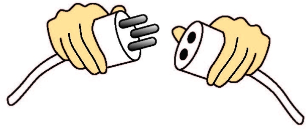
One hot topic in hospitals is medical device misconnections. There is often a maze of tubes, connectors, and cords surrounding patients in hospitals. Unfortunately, due to haste or momentary confusion, it’s not impossible to mistakenly connect a ventilator air supply tube to an IV line. The Association for the Advancement of Medical Instrumentation (AAMI) and ISO offers a standard for small bore connectors in healthcare (ISO 80369-1:2010). Currently, AAMI and ISO are developing enhanced universal standards for connectors used in medical devices to further minimize misconnections.
Correct practice of usability engineering dictates that mating parts should uniquely mate with their counterparts, with minimal possibility of an incorrect connection (see Figure 5). In 2010, a tool for cataract surgery was recalled because it was possible to mate two components incorrectly. This incorrect mating led to the generation of plastic dust during cataract surgery.
Medical device manufacturers can prevent misconnections by performing usability studies in which target users (medical professionals) perform tasks in a simulated use environment, typically without instructions. The results of the usability study would reflect what a doctor might do in the worst-case scenario—a situation in which the instructions are forgotten, ignored, or misplaced.
Manufacturers should attempt to foresee use errors such as misconnections by performing a thorough task analysis and determining all possible misconnections. They must take into consideration all other devices in the user’s environment as a routine part of risk prediction.
Use Errors due to Alarms
Another major concern in hospitals is alarms. Medical device alarms and signals must be understandable and audible in their use environments. Usability testing with healthcare providers can reveal whether an alarm is effective in its various modes (for example, lowest volume, visual only, and sound only). Designers must test users’ responses to alarms in a simulated use setting that replicates actual noise levels in the hospital room, along with the effect of having multiple personnel, and the distractions of many other medical devices alarming simultaneously.
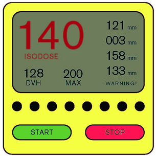
A monitoring device was recently recalled because of an ineffective alarm system. Device makers prefer to err on the side of overly-sensitive alarms, which lead to false alarms. To prevent alarm fatigue, healthcare providers sometimes turn audible alarms down or off, which is what happened in this case. However, the visual indication alone was insufficient in notifying personnel of a critical situation (see Figure 6). A usability study would have shown whether or not the visual alarm was attention grabbing and action inspiring. If the visual alarm alone was ineffective, designers might have chosen to prevent nurses from muting it.
Logically, users are less likely to respond to a quiet, unobtrusive alarm. Designers need to decrease the possibility that a nurse will turn off an alarm by reducing the number of false-positive alarms emitted by a device. Likewise, the designers of adjacent devices should reduce the volume or intensity of less safety-critical alarms in relation to more safety-critical alarms. Standards are available for guiding design teams in the development of effective alarms, including International Electrotechnical Commission (IEC) 60601-1-8.
Hospitals offer diverse use environments with wide-ranging levels of noise and activity. Medical device designers need to ensure that alarms can be heard under circumstances of normal operation. In one scenario, an alarm on a fluoroscopic imaging system could be heard by the technicians in the control room but not by the doctors in the procedure room. Since doctors sometimes base split-second decisions on the output of the imaging system, the consequence of an unnoticed frozen screen or an otherwise misleading image (which they would have been informed of by the alarm), could be fatal. As a result, the imaging system was recalled.
An understanding of how users interact with their environments is critical not only for designing effective and safe alarms, but also for medical devices in general. Designers must use contextual inquiry to unveil important characteristics of use environments and subsequently integrate these characteristics in their usability studies.
In sum, usability engineering offers numerous tools to avoid recalls due to use errors. The following three steps contain the key to reducing medical device recalls:
- Perform contextual inquiry to gain insight into potential use errors and to identify characteristics of the use environments that must be simulated in usability studies.
- Evaluate a detailed list of tasks to determine which tasks are the most risky. Then, design the device to reduce or eliminate risk.
- Test user interfaces in usability studies with representative users. Include tasks necessary for normal operation, along with the most safety-critical tasks.
Usability is a cornerstone of safety; use errors are frequently predictable and avoidable through proper contextual inquiry, task analysis, risk prediction, risk reduction, and usability testing.在过去五年中,美国食品药品监督管理局(FDA)因不良可用性召回了 50 多种医疗设备。在医疗设备行业,不清晰的屏幕显示会导致糖尿病人昏迷或死亡;不符合人类工效的设计会导致手指被切断;部件误连接导致空气栓塞。这篇文章讨论近期因这些严重后果而引发的召回。
在本文中,您将了解如何未雨绸缪地确保医疗设备安全。首先,选用正确的表述,用“使用错误”来替代有埋怨用户意味的的“用户错误”。如果是界面导致用户出错,那就不是用户的错。其次,实境调查可初步发现“使用错误”的潜在风险,是开发安全医疗设备的重要出发点。再次,以风险级别对任务进行排序是大有必要的,可确保设备设计不会引发高风险“使用错误”。最后,FDA 要求制造商在真实实使用环境中通过用户代表进行可用性研究,来说明设备可以被安全使用。
The full article is available only in English.지난 5년 동안, 미국 식품의약국(FDA)은 사용하기 어렵다는 이유로 50개 이상의 의료기기를 회수하였습니다. 의료기기 업계에서 불분명한 정보제공은 당뇨병으로 인한 혼수 상태 혹은 사망으로, 열악한 인간공학적 디자인은 손가락 절단으로, 잘못 연결된 부분은 공기 색전증으로 까지 이르게 할 수 있습니다. 본 논문은 이러한 심각한 결과로 인한 최근의 기기 회수 문제에 대해 논의합니다.
본 논문에서는 의료기기의 안전한 사용을 사전에 어떻게 보장할 수 있는지를 알아볼 것입니다. 우선, 우리는 “사용자 오류” 대신에 “사용 오류”라고 말함으로써 사용자에게 비난을 돌리는 일을 삼가해야 합니다. 사용자 인터페이스 가 오류를 범하게끔 한 경우에는 사용자의 잘못이 아닙니다. 둘째, 정황 연구는 안전한 의료기기를 개발하고, 잠재적인 “사용 오류” 위험을 초기에 식별하기 위한 중요한 시작점이라 할 수 있습니다. 셋째로, 의료기기 디자인이 높은 “사용 오류” 위험을 조장하지 않도록 보장하기 위해서는 위험 수준 순서에 따른 업무 분류가 필요합니다. 마지막으로, FDA는 제조업체가 현실적인 사용 환경에서 대표 사용자그룹들이 참여하는 사용성 연구를 수행하여 기기 사용이 안전한지를 확인하도록 요구합니다.
The full article is available only in English.Nos últimos cinco anos, a Food and Drug Administration (FDA) fez o recall de mais de 50 dispositivos médicos porque eles não eram fáceis de usar. Na indústria de equipamentos médicos, monitores que não forem de fácil leitura podem levar ao coma diabético ou ao óbito; um projeto sem ergonomia pode levar a dedos amputados ; peças mal conectadas podem causar aeroembolismo. Este artigo discute os recentes recalls que foram feitos devido a essas graves consequências.
Neste artigo, você descobrirá como garantir antecipadamente o uso seguro de um dispositivo médico. Primeiro, devemos tirar a culpa do usuário usando o termo “erro de uso” em vez de “erro do usuário”. Não é culpa do usuário quando a interface do usuário o induz ao erro. Segundo, a pesquisa contextual é um importante ponto de partida para desenvolver um dispositivo médico seguro e inicialmente identificar possíveis riscos para “erros de uso”. Terceiro, é necessário ordenar as tarefas por nível de risco para garantir que o projeto do dispositivo não promova “erros de uso” de alto risco. Por fim, a FDA exige que os fabricantes realizem estudos de usabilidade com usuários representativos em um ambiente de uso realista para mostrar que é seguro usar o dispositivo.
O artigo completo está disponível somente em inglês.過去5年にわたり、米国食品医薬品局(FDA)は50以上の医療機器について、使用に適さないという理由からリコールを行ってきた。医療機器業界において、不明瞭な表示は糖尿病性昏睡や死亡を招くこともあり、人間工学面で良くないデザインのために指の動きが妨げられたり、誤って接続されたパーツが空気塞栓症の原因となることもある。この記事は、このような重大な結果によりリコールとなった最近の事例について議論する。
この論文では、前もって行える医療機器の安全な使い方に関する対策を提示する。第一に、「ユーザのエラー」ではなく「使用上のエラー」という認識にたち、ユーザに責任を押し付けることを控えなければならない。間違えてしまうようにユーザインタフェースが設定されていれば、エラーの発生はユーザの責任とは言えない。第二に、安全な医療機器の開発、および初期段階での潜在的な「使用上のエラー」のリスクを特定するには、文脈における質問法の使用が重要な第一歩となる。第三に、機器デザインを「使用上のエラー」のリスクが高いものにしないために、操作をリスクの程度に従ってランク分けする必要がある。最後に、FDAは、代表的なユーザの協力を得て、現実的な環境で機器が安全に使用できるかどうか、ユーザビリティ調査を行うよう、製造業者に義務付けている。
The full article is available only in English.Durante los últimos cinco años, la Administración de Alimentos y Medicamentos (Food and Drug Administration, FDA) ha retirado del mercado más de 50 dispositivos médicos porque no eran usables. En la industria de los dispositivos médicos, pantallas poco claras pueden conducir al coma diabético o la muerte, un mal diseño ergonómico puede derivar en dedos cortados, piezas mal conectadas pueden conllevar embolias gaseosas. En este artículo se analizan los recientes retiros del mercado debido a estas graves consecuencias.
En este artículo verá cómo garantizar anticipadamente el uso seguro de un dispositivo médico. En primer lugar, debemos eximir de culpa al usuario y hablar de un “error de uso” en lugar de un “error del usuario”. No es culpa del usuario que la interfaz de uso los predisponga a un error. En segundo lugar, la investigación contextual es un importante punto de partida para el desarrollo de un dispositivo médico seguro y para identificar inicialmente los posibles riesgos de “errores de uso”. En tercer lugar, es necesario priorizar tareas en función de su nivel de riesgo con el fin de garantizar que el diseño del dispositivo no promueva “errores de uso” de alto riesgo. Por último, la FDA exige que los fabricantes realicen estudios de usabilidad con usuarios representativos en un entorno de uso realista para demostrar que el dispositivo se puede utilizar en condiciones seguras.
La versión completa de este artículo está sólo disponible en inglés.