User Experience (UX) design is thought by many to be a blend of art and science. Often, designers in large enterprise organizations must find a balance between these two disciplines within a business culture that believes success must be quantifiably measurable. Much literature can be found regarding successful application of Six Sigma metrics to UX practices to make our work more understandable to our business partners. After examination of the Six Sigma process, it is easy to see its affinity to UX; for example, Six Sigma practitioners’ value of data collection, analysis, and learning is very similar to the formative UX design process.
In 2015, we found ourselves designing analytic solutions for healthcare. The complexities of the ever-changing U.S. healthcare industry made it tough for our partners in product management to prioritize myriad needed product enhancements. We wanted to ensure that the voice of our customers was consistently part of this balancing act, so we looked to the Six Sigma toolkit for inspiration.
During this time, our interest in the Six Sigma Kano methodology was piqued when we found the 2012 article “Leveraging the Kano Model for Optimal Results” by Jan Moorman in UX Magazine. Noriaki Kano is an educator, lecturer, writer, and consultant in the field of quality management. He is the developer of a customer satisfaction model now known as the Kano model. This simple ranking system distinguishes between essential and differentiating attributes related to concepts of customer satisfaction with product features. In the late 1970s and early 1980s, Kano and his colleagues laid the foundation for a new approach to modeling customer satisfaction. Kano’s 1984 article “Attractive Quality and Must-Be Quality” challenged the conventional beliefs that improving each attribute of a company’s product or service will lead to increased customer satisfaction. Kano believed that not all attributes of product or service performance are equal in the eyes of the customer, and that some attributes create higher levels of customer loyalty than others.
Kano Overview
Kano’s approach centers on the premise that a customer’s satisfaction with a product’s features depends on the level of functionality that is provided—how much or how well they are implemented—and that how customers feel about a feature can be measured using a fairly simple questionnaire. Kano classifies features into four categories, covered extensively in Daniel Zacarias’ Folding Burritos article, “The Complete Guide to the Kano Model.”
Attractive. Attractive features trigger feelings of satisfaction and delight when present, but users are not dissatisfied if the feature is not included.
In our healthcare UX world, the ability to easily access our organization’s industry whitepapers, case studies, and evidence-based articles in one centralized experience is attractive to all of our healthcare customers.
Attractive features and capabilities tend to become “Must-be” features over time.
Must-be. These features are ones that customers expect the product to contain.
There is a limit to the emotional benefit gained by embellishing and enhancing must-have features.As Folding Burrito notes, and in our own experience in using Kano with customers, “we need to have them, but that won’t make our customers more satisfied. They just won’t be dissatisfied.”
Performance or One-dimension. These features result in satisfaction if present and dissatisfaction when they are not.
In healthcare UX, as in other industries, we see that the more capabilities we provide our users, the more satisfied they are with our products.
Not Important or Indifferent. Users are ambivalent about unimportant features; they simply do not care if they are included or not. The ROI for these features is low.
Using these categories and the template from Zacarias as a starting point, we began to use a Kano questionnaire at the end of each remote moderated formative or summative usability test, as well as summative usability surveys.
The team was excited about using Kano to prioritize capabilities and inform experience roadmaps. In our large enterprise organization, however, we quickly ran into a roadblock: How do we apply Kano to the various user types, market segments, and products we support? It was at this point that we began to experiment with Tableau and had soon created a Kano template that we are excited to share with you on Tableau public.
Our Data Collection Process
The research team adds a series of Kano questions to each 1:1 user testing moderator’s guide.
Following the Kano methodology, we utilize a pair of questions for each feature/capability that we want to evaluate. We ask customers a Likert scale question about how they feel if they have a feature. The other of the pair asks how they feel if they did not have a feature. For example:
- How do you feel if you had predictive analytics available to you?
- I like it
- I expect it
- I am neutral
- I can tolerate it
- I dislike it
- How do you feel if you did not have predictive analytics available to you?
- I like it
- I expect it
- I am neutral
- I can tolerate it
- I dislike it
We also ask them to rate the importance of a feature.
After each study, researchers update the responses from their various studies in the responses section of the Kano master template.
The results are then captured in an evaluation table that combines functional and dysfunctional answers in rows and columns (respectively) to align on a specific Kano category (see Figure 1). This table in Excel is an extension of Zacarias’ Excel template. Here, we capture market segment, persona category, the study in which we asked Kano questions, and a date (See Figure 2) so that we can compare how features perform over time.
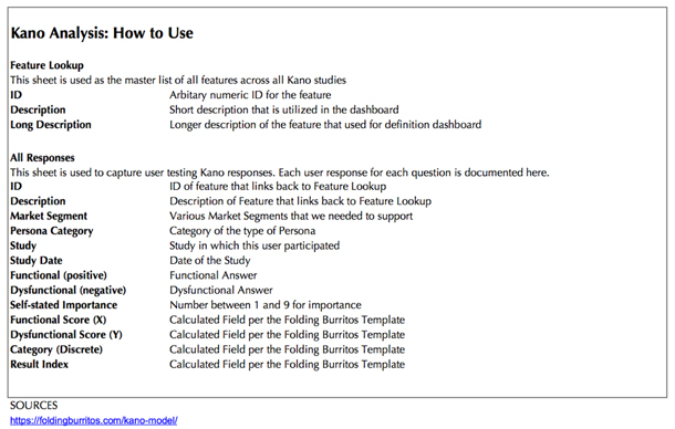
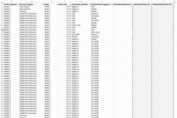
After tabulating and processing our results, we are able to categorize our features and capabilities. We then provide insights to the company’s product teams about the best way to prioritize them.
To visualize this information, we utilize Bill DuMochel’s continuous analysis methodology, which he introduced in “Thoughts on Graphical and Continuous Analysis” and “Kano’s Methods for Understanding Customer-Defined Quality” (Center for Quality of Management Journal, Fall 1993). Using Tableau to visualize the data allows us to provide an up-to-date, interactive dashboard to product and technical teams (see Figures 3-5).
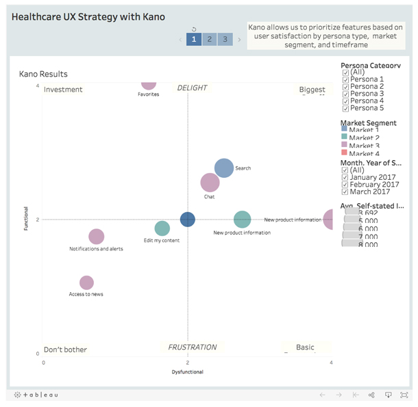
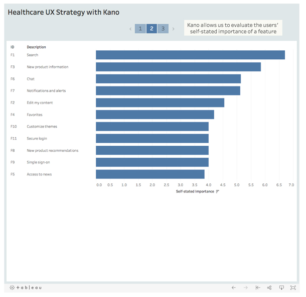
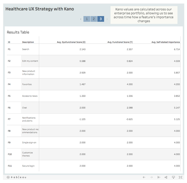
We reverse engineered Zacarias’ Excel template calculations into Tableau to be able to update it based on any number of responses. Data is refreshed and updated as we update our user responses. We created a quadrant graph in Tableau to display the information. We also created a time motion area in our dashboard so that others could see how users respond to feature satisfaction over time. The data has been invaluable in guiding prioritization of offering (product) improvements. The dashboards are available for download through Tableau public.
Conclusion
As UX designers we leverage customer feedback and actions to discover how to better meet their needs. However, as IBM’s Cary-Anne Olsen-Landis states in her 2017 article “Kano Model — Ways to Use it and NOT Use It”:
“ ..many of us have often struggled with new ways to quantify and visualize those needs in an effective manner for these teams to come into alignment. Customers can certainly vote on and rank features, which gives a great overview, but doesn’t always give that deeper understanding of what are the must-haves over what is already expected. Enter the Kano Model.”
Healthcare is a rapidly changing industry and our clients expect continuous delivery of improvements to our offerings. Our clients have immediate needs, and Kano allows us to rapidly understand and convey the prioritization of client needs into our backlog grooming process.


