One Saturday in October 2010, a dozen user experience folks spent their day stopping more than 200 strangers on the streets of New York City and asking them to use a prototype of the new paper ballots for the election the following month. They were volunteering with the UPA Usability in Civic Life project and the Brennan Center for Justice, gathering data about the usability of the ballots.
It’s 2010. Ten years after a bad decision about font size decided an election. Even after research, new standards, best practice templates, and a lot of public debate, we still can’t seem to get ballot design right.
What’s going on in New York City is a good case study. After fifty years of mechanical lever machines, New York switched to optical scan ballots. This is a huge step forward because it provides a paper trail. But it also means that voters are now able to make new kinds of mistakes in marking their ballots, like voting too many times in one contest (called overvoting). This is a real problem in New York, where the same candidate may appear under several different parties (See Figure 1). The Brennan Center wanted to know whether the ballots were going to be a problem—before the election.

The UPA Usability in Civic Life project has collaborated with the Brennan Center on several projects. It’s a chance to add our skills in design, accessibility, and usability to their connections and ability to instigate change. Like many projects with the Brennan Center, this one came up fast and had to be completely quickly. A call for volunteers went out on Twitter and got instant replies. Some people reposted the message to STC, UPA, IxDA and their own personal networks. Others helped find test locations in Brooklyn, Queens, Manhattan, and the Bronx; social media at its finest.
What’s really sad about the need for this project is that there is already a lot known about how to design ballots right.
Political scientists David Kimball and Martha Kropf regularly take a quantitative approach, looking at election data for unexpectedly high number of overvotes and undervotes (when a voter skips a contest on a ballot or votes for fewer people than allowed).
AIGA Design for Democracy put dozens of experiences designing election materials in several states, and all of our knowledge about designing ballots, into a set of best practices and templates for the Election Assistance Commission (EAC).
Usability and accessibility guidelines are part of the EAC’s national voting systems standards, backed up with research by National Institute of Standards and Technology (and well-known names in the field such as Ginny Redish, Dana Chisnell, and User-Centered Design).
Members of UPA’s Usability in Civic Life project have run usability tests on ballots in a dozen states.
In 2010 the Brennan Center’s Better Ballots report (co-authored by Whitney Quesenbery) pulled all of these best practices together into a set of simple guidelines for design and instructions that can easily improve ballots.
New York City paid no attention to all these publicly available resources. So bureaucrats, who are skilled in administering elections but not skilled in design at the Department of Elections, designed the ballot. The usability testing done that October Saturday focused on data collection. But even without detailed observation and think-aloud methods, we heard about a lot of problems. It’s not hard to see how confusing the ballot is:
Each column is supposed to be one party, but the ballot paper is too narrow. Six parties are crammed into the last three columns. In the usability testing, participants who wanted to vote for one of these parties noticed and complained about this.
Each row is supposed to be one contest, but the governor’s race has so many candidates that it take up two rows.
The repeated icons and headings add to the messy appearance.
The write-in box was confusing. Some people thought you checked this box to show that you had voted on that row.
Notice the instructions—in a block of capital letters—that tell voters to read the instructions on the other side of the ballot.
The real cap to the experience came a day or so later when the official sample ballots were issued. The hat tip goes to volunteer Michele Marut, who spotted that the instructions were just plain wrong. They tell voters to use the oval “above or next to” the candidate. Oops. The oval is actually below the candidate’s name. If you look at the ballot, the oval closest to the name is the wrong oval.
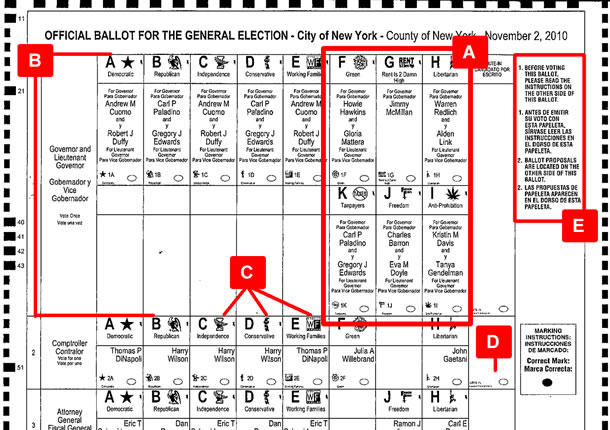
A: More than one party in a column.
B: More than one row for the Governor’s race
C: Repeated headings and unreadable icons
D: Confusing layout for write-in votes
E: Instructions on the front, in a place where they are not easy to find.
The good news? The instructions were on the back, not in a more visible position just before the first contest. They are so wordy and confusing, and in such small type, that very few people probably looked at them.
[bluebox]
General Election Instructions
(1) Mark only with a writing instrument provided by the board of elections.
(2) To vote for a candidate whose name is printed on this ballot fill in the (insert oval or square, as applicable) above or next to the name of the candidate.
(3) To vote for a person whose name is not printed on this ballot write or stamp his or her name in the space labeled “write-in” that appears (insert at the bottom of the column, the end of the row or at the bottom of the candidate names, as applicable) for such office (and, if required by the voting system in use at such election, the instructions shall also include “and fill in the (insert oval or square, as applicable) corresponding with the write-in space in which you have written in a name”).
(4) To vote yes or no on a proposal, if any, that appears on the (indicate where on the ballot the proposal may appear) fill in the (insert oval or square, as applicable) that corresponds to your vote.
(5) Any other mark or writing, or any erasure made on this ballot outside the voting squares or blank spaces provided for voting will void this entire ballot.
(6) Do not overvote. If you select a greater number of candidates than there are vacancies to be filled, your ballot will be void for that public office, party position or proposal.
(7) If you tear, or deface, or wrongly mark this ballot, return it and obtain another. Do not attempt to correct mistakes on the ballot by making erasures or cross outs. Erasures or cross outs may invalidate all or part of your ballot. Prior to submitting your ballot, if you make a mistake in completing the ballot or wish to change your ballot choices, you may obtain and complete a new ballot. You have a right to a replacement ballot upon return of the original ballot.
(8) After completing your ballot, insert it into the ballot scanner and wait for the notice that your ballot has been successfully scanned. If no such notice appears, seek the assistance of an election inspector.
[/bluebox]
We take our hat off to Valerie Vasquez in the Elections Department who told the Wall Street Journal in October 2010, “The instructions are not wrong.” The problem is, she said, “Our ballot design does not match up to the instructions.” The fact that she’s technically correct (the ballot does not actually follow the law) is cold comfort: the lack of interest in the voter experience is shocking.
There is movement toward reform and improved ballot design in New York. The Brennan Center does more than point out problems: they work with state and local governments to get laws and election processes changed. A coalition of advocacy groups (including UPA, AIGA Design for Democracy, and the Center for Plain Language) is working with state and local officials to recommend improvements to both the ballot design and the election process.
At the state level, an elections commissioner has called for the New York election operations division to designate a person on the staff to implement usability best practices. A committee of county election commissioners is working with the Brennan Center, UPA Usability in Civic Life, and AIGA Design for Democracy on revisions to state laws that constrain election design and better ballot design templates.
As this article goes to press, the story is still unfolding: changing an election process takes time. But there are other stories all across the country. We need more user experience people getting more involved with elections and our civic life.
This article is made possible in part by Christopher Fahey, Whitney Hess, Jessica Hewitt, Jonathan (Yoni) Knoll, Michel Marut, Gregg Palmer, Ashley Pearlman, Mary Quant, and Aaron Schwartz, who helped test the ballots in New York City, along with all the other Usability in Civic Life volunteers. Thanks!为什么无法进行正确的选票设计?在经历了臭名昭著的“蝴蝶选票”,设计、可用性和系统标准研究,以及可用性和政治学研究十年后,仍然有足够的空间来改进选举的用户体验。在纽约市,当地用户体验专业人员志愿组织起来花了一天时间收集有关布伦南正义中心 (Brennan Center for Justice) 选票可用性方面的数据。这些选票有很多设计问题,甚至说明都不正确。这些努力已帮助将注意力集中在追求更佳选举设计上,以及需要对某些小步骤进行改进。我们的讲述会持续进行,请继续关注更多细节。
其他读物
- 布伦南正义中心 – Better Ballots(更佳的选票)
- ReformNY,Brennan Center 博客包含数个有关这些问题的帖子。从“NYC Sample Ballot 2010 – An Early Look”(纽约市 2010 年选票样本 – 初期探索)(10 月 18 日)开始
文章全文为英文版投票のデザインはどうして上手くいかないのか? あの悪名高い「バタフライ投票用紙」から10年、デザイン、ユーザビリティやシステムの規格、そしてユーザビリティと政治学的な研究などさまざまな努力がなされてきたが、今もって選挙のユーザエクスペリエンスには改善の余地が大いにある。ニューヨーク市では、地域のユーザエクスペリエンスの専門家がボランティアで、一日かけてブレナン公正センター(Brennan Center for Justice)の超党派のプロジェクトのために、投票用紙のユーザビリティについてのデータを回収した。投票用紙はデザインに多くの問題があり、使用方法の説明にさえ間違いがあった。この結果は、よりよい選挙のデザインの必要性と改革のために行えるいくつかの小さいステップについて注目させてくれる。さらにこのストーリーの続きは別の号で。
追加の読み物
- Brennan Center for Justice – Better Ballots(ブレナン公正センター – よりよい投票を)
- ReformNY, the Brennan Center blog(ブレナンセンター のブログであるReformNYにはこれらの問題に関する記事が載っている。)「NYC Sample Ballot 2010 – An Early Look」(10月18日付け)から
原文は英語だけになります

Whitney combines a fascination with people and an obsession to communicate clearly with her work bringing user research insights to designing products where people matter. She's also passionate about elections, and leads the Center for Civic Design with Dana Chisnell. Her books are Storytelling for User Experience, GlobalUX, and A Web for Everyone. Twitter: @whitneyq and @awebforeveryone