Every day, unconscious biases allow us to make snap judgments about others, which is helpful for efficiently navigating daily life. For example, we can quickly identify police officers by the uniforms they wear. These biases can also be problematic. For instance, we don’t tend to associate women immediately with science. We developed the video game Pathfinder (with funding by NIH grant DP4 GM096822) to raise awareness about the nature of implicit biases and how they can impact women and other underrepresented groups in academic science, technology, engineering, mathematics, and medicine (STEMM).
In the game, players assume the role of a young researcher trying to achieve academic success. As they progress through the game, players experience and reflect on unconscious, implicit biases while trying to decrease their own biased behaviors. We designed Pathfinder to be played by faculty and staff in STEMM academic departments. We chose a video game medium for its ability to engage players deeply in a designed experience.
The first step in our design process was to conduct focus groups with STEMM faculty and staff to gauge their receptivity to a game about implicit bias. We discovered several challenges unique to designing a game for this audience. For example, many participants in our focus groups had limited experience with video games, and many of them believed that playing video games was a waste of time.
We also discovered that many focus participants had limited experience with other forms of digital media. While the majority of our participants use computers on a daily basis, their use is typically confined to typing manuscripts or conducting Internet-based literature searches. Several of the participants were unfamiliar with the components of a typical video game interface.
We wanted to construct a game that was easily accessible to our target audience, so the user interface would have to be intuitive, even for inexperienced users. At the same time, we wanted to ensure that we wouldn’t bore players who were already familiar with video game interfaces. To balance these competing agendas, we adopted a rapid prototyping design process. Quick prototypes paired with frequent playtests allowed us to address any misconceptions we had about our target audience. Questions we asked during playtesting were: Can players determine the goal of the game? Does the game retain players’ interest? Do game scenarios make sense? And, most importantly, are the game interfaces and mechanics obvious to gamers and non-gamers alike?

During prototyping, we invited faculty, staff, graduate students, and undergraduate students to play segments of our game. We sampled a diverse group to be sure that the game appealed to all types of players. This article presents a case study in which we compare and contrast the experiences of two playtesters, Ann and Betty (not their real names), who represent the extremes of our target audience. Ann is a twenty-something graduate student and frequent computer user who also plays video games. Betty is a middle-aged university staff member familiar with computers but with little video game experience.
Tutorials: Too Much or Not Enough?
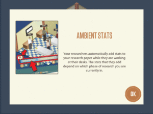
When designing the Pathfinder tutorial, we decided not to give complete instructions at the beginning. Instead, we gave players information about the interface as it became necessary for gameplay. This approach allowed players to explore the interface at their own pace and learn by trial and error.
While both users initially agreed that reading the tutorial text was a good idea, Ann quickly grew impatient. Ann thought the text in the tutorial was lengthy, and she decided to skip ahead. She assumed that she would be able to find the relevant information within the game. Betty, on the other hand, read all of the information in the tutorial, and then wanted even more instruction about the game. She decided there was not enough information available and felt uncomfortable doing anything without first reading detailed instructions.

A pattern began to emerge. Ann, the more experienced gamer, was willing to explore; Betty was hesitant to click on anything before confirming it was the right action. Ann expected to figure out the interface by trial and error. When asked about it, Ann said, “When I’m waiting, I will try to figure out what other features are in the game…like, what is this for?” In contrast, Betty said, “You guys like to do trial by error, but [we] like to have all the directions before we even start… It’s because we Baby Boomers were always told to do things in a logical order.” For Betty, our strategy of selective disclosure only led to confusion, and her inexperience with this design format led to frustration.
While exploration came easily to Ann, it did not for Betty. We learned that the tutorial should be explicit about what players can do in the game and should explain what happens when a player performs a game action. We also need to allow users to skip the tutorial and explore the game if they feel comfortable doing so. For future iterations, we may also make detailed instructions available on our website so that novice users can find additional information if they need it.
Conventions: Is That Supposed to Mean Something?
While designing our game, we looked to existing web conventions to indicate objects players can interact with. Since the majority of our target audience does not play video games but does use the Internet, we reasoned that we would be safe introducing conventions standard on the web. One such standard is graying out options and buttons that are unavailable. We incorporated this design into our game, expecting it to be easily understood. Ann had little trouble with this concept, but Betty was very confused. In reference to arrows on a particular game screen, she said, “Now, this one is lighter than this one, is that supposed to tell me something? …This is the one that I’m supposed to click on first because it’s a stronger color. I don’t know. I have no idea.” With time, Betty was able to pick up the convention.

This reaction taught us that it wasn’t enough to follow web standards, especially when the target audience has little familiarity with digital media. In the future, we may adopt more extreme measures, such as hiding a button until it’s introduced, or making clickable buttons stand out even more (perhaps by giving them an outer glow). Any future changes will be playtested to ensure that the user intuitively understands how the buttons function.
Content: Missing the Point
Another lesson we learned was to keep the content focused on the goal of the game. In our initial prototype, we gave a lot of attention to the underlying model of a research lab. We did this because our initial focus groups indicated that our target audience wanted a game they could relate to. Since all of them were familiar with the academic research lab, we inserted examples of implicit bias within the lab context via non-player character (NPC) interactions. From the playtests, we realized that using a realistic simulation of a research lab worked against us because it distracted from the main point of the game and it overcomplicated the head-up display.
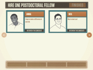
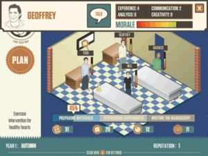
Learning the game’s underlying simulation and the various indicators associated with it was difficult for Betty. In the game, players were required to hire characters (NPCs) for the research lab, and each character had its own set of stats displayed in the user interface. NPCs worked on “research papers,” which required four more stats on the screen. In addition, a progress bar indicated overall game completion and status bars indicated each NPC’s productivity. Because of this, Betty was so distracted by the interface that she couldn’t find the point of the game. We are currently redesigning the game to focus on the bias scenarios, and eliminating the lab simulation. This simplifies the UI and enables players to focus on interactions with the NPCs.
Testing Our Assumptions
We found Ann’s and Betty’s comments valuable because their feedback reflected their digital media expertise. Ann was more willing to explore than Betty, but neither Ann nor Betty tolerated any ambiguity. We learned that if we want players to explore the UI, we need to provide more clarity, both in the tutorial, and in the game mechanics.
In designing a game for non-gamers, we learned not to rely on players’ prior digital media expertise, nor to assume familiarity with trial-and-error exploration. We rewrote the tutorials to be more explicit and allowed them to be optional for experienced gamers. We also learned to emphasize visual indicators, such as clickable buttons, to better convey interactivity.
The primary lessons we learned from this design process were:
- Highlight the game’s main goal first
- Keep the game content focused
- Design tutorials, mechanics, and UI elements suitable for a non-gaming audience
- Conduct frequent playtests to test our assumptions about our audience
It was only through developing rapid prototypes and conducting frequent playtests that we were able to address our misconceptions. We will continue reassessing, redesigning, and reiterating the game until we are satisfied that it matches the interests and abilities of our audience.
视频游戏能够让用户深入体会所设计的体验,并允许用户以其他媒介不可能实现的方式与虚拟世界进行交互。在我们的探路者 (Pathfinder) 游戏中,游戏玩家会遇到一些个人偏见,这些人来自学术科技领域代表性不足的团体。这篇文章介绍一个案例研究,比较两个游戏测试者的体验,表明我们不能依赖玩家对以前数字媒体和游戏的经验。
文章全文为英文版ビデオゲームは、デザインされた体験へとユーザを魅了し、他の媒体では不可能なバーチャルな世界とのインタラクションを可能にする。我々のゲームであるパスファインダー(Pathfinder)では、プレイヤーは、科学技術アカデミアの少数派グループが体験するようなバイアスの幾つかを経験する。この記事は、2人のゲームテスターの体験を比較したケーススタディを紹介し、デジタルメディアやゲームに関する以前の経験は当てにできないということを述べている。
