Our brains are complex decision making engines, charged with the difficult task of processing the world around us. In order to remain efficient when taking in the abundant amount of information we are faced with on a daily basis, our brains often rely on shortcuts, or automatic responses, during the decision making process. A simple example of this is the way we stop at red lights and go at green lights: we don’t have to think about this at every stop light we encounter because we have been conditioned to respond to these stimuli. Conditioning like this allows us to do many things at once without mental overload. Building a persuasive application is about recognizing automatic responses, and then creating a design that will trigger them.
Persuasion is an essential consideration in the development of products for a myriad of reasons, including the fact that if someone isn’t persuaded to use what you are selling, the product will ultimately fail irrespective of how usable it is. Unfortunately, persuasion is often left out of the product development process. It is often assumed that persuasion will organically be a result of a good design, or that it will be taken care of by the marketing department. However, in order to make a successful design that positively impacts the user and accomplishes a business objective, persuasive elements must be explicitly considered in the context of the behavior an application is aiming to affect; and, this must occur in the early stages of the design process.
This article provides an example of how persuasion has been successfully utilized, and describes five tips for how to approach the process of incorporating persuasion into product design. The tips are based on my professional experiences, in combination with shared experiences and reflections of other user experience professionals I have encountered.
Persuasion in Practice
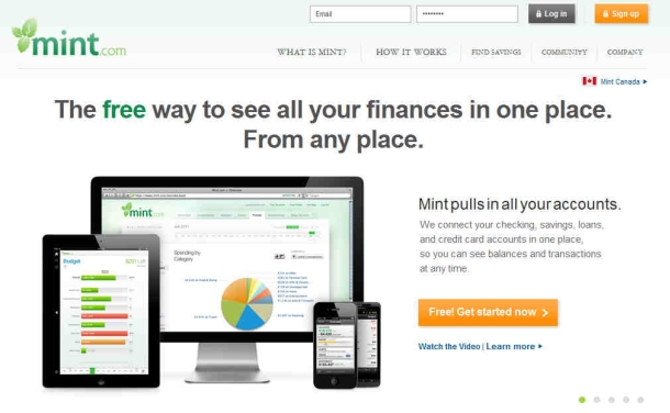
Mint.com is one of the most successful personal financial management tools in the United States and Canada. It began as a startup with its public beta launch in 2007. Its founders quickly realized that the key to its success was conveying a sense of security and confidence to new users. In order to do this, the designers employed a design strategy that placed an emphasis on aesthetics (see Figure 1). Research shows that people have a natural unconditioned response in favor of pretty things. This strategy of using aesthetics to persuade feelings of credibility and trust worked, which is partially why, in 2009, the small startup was acquired by Intuit for an impressive sum of money.
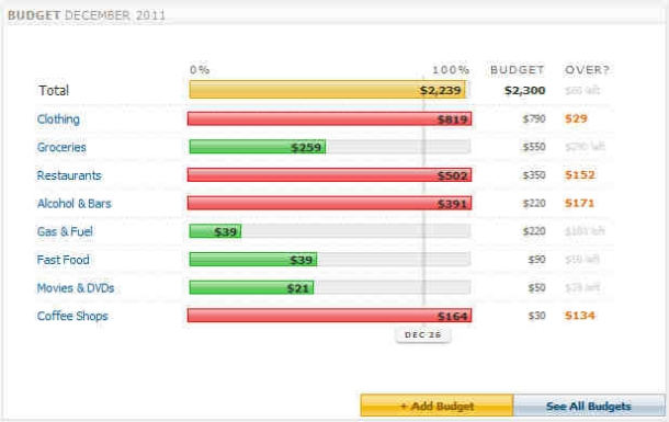
In addition to successfully getting people in the door, Mint.com also effectively created a dedicated user base. In accomplishing this, its designers turned to another persuasion tactic—fun. Users are motivated by amusing and entertaining experiences, and fun is especially persuasive because it leverages our intrinsic motivation for pleasure. So how does a financial application incorporate fun? Among other strategies, the website made creating a user account engaging through game-like automation. In a market where financial applications and tedious manual data entry were once inextricably linked, Mint.com was able to distinguish itself via tailored recommendations. When users add a budget, a simple interface appears asking them to choose a category, time period, and amount. With every tweak to these settings, the system instantly responds with visually pleasing personalized graphs and financial goals, which ultimately takes the impression of work out of the task of budgeting, and fosters motivation for financial improvement (see Figure 2).
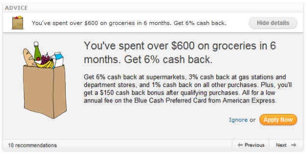
The website also routinely reaches out to its users with timely and customized feedback, yet another persuasive tactic in the form of reciprocity (see Figure 3). Not only can users elect to have bill reminders sent to them via SMS and email, but if a user likes to dine out often, the website will recommend restaurant-specific discount cards. If a user’s bank is charging too many unnecessary fees, Mint.com will suggest alternative financial institutions. This type of targeted feedback is a great way to trigger action and motivate users to keep on top of their finances, and users are inclined to repay the favor by continuing to use the service.
For the above reasons, it is easy to see how persuasion is used by designers to ensure the application’s success.
Tips for Integrating Persuasion into Design
Start by Prioritizing Behaviors
When deciding which persuasive elements to add to your design, you’ll want to start by determining the top behaviors you are trying to trigger with the application. For example, if you have an e-commerce application, you might want to encourage customer loyalty or completion of the checkout process. If you offer a health-related site, your goal might be to change users’ eating habits or to encourage them to stop smoking.
Once you have determined which behaviors the application should influence, you can begin the process of deciding which persuasive techniques will best encourage those behaviors and begin designing for those triggers. Prioritizing behaviors can be a difficult process and should always involve stakeholder input. Without first identifying the target behaviors, it is difficult to focus the design towards a specific set of responses.
Use Text that Frames and Motivates
Textual content should be carefully considered before adding it to a product experience. Copy is often thrown onto websites and other mediums with the assumption that users will read everything and process it just as it was intended. However, users read only a small amount of text and often interpret it in different ways based on their unique mental models. Copy should therefore be used sparingly and framed in a persuasive way that emphasizes target behaviors and initiates action.
For example, in financial software, when reminding a user of his or her looming tax due date, instead of saying, “Your tax return must be filed by 04/15/2012,” changing the text to read, “Only 10 days left to file your tax return” is much more likely to nudge the user towards finishing the return, as it focuses on the limit of time rather than a future date.
Incorporate Social Proof
It is human to look to others to learn behaviors, validate decisions, and inform actions—especially in uncommon or new situations. For this reason, social proof is a strong persuasive element that can be used in most designs.
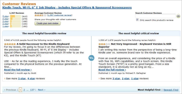
In e-commerce applications, showing consumer product reviews is one way to incorporate social proof. These ratings become especially powerful when they are accompanied with the number of people who have rated a product a particular way. This is important because such numbers show where the majority lies, which makes ratings feel more credible. Similarly, a review becomes even more persuasive when displayed with a name and additional information about the reviewer. When buying a child’s toy, for example, seeing a review from a mother in a nearby state with five children is more impactful than seeing a review from an unknown individual. E-commerce sites such as Amazon.com and REI.com do an excellent job of using social proof, via product reviews, to drive sales of their merchandise (see Figure 4). Social proof can also be shown through status, such as titles in front of names, or notes of recognition and achievement.
Integrate Appealing and Relevant Visuals
As was shown by the success of Mint.com, the visual arrangement and layout of a website or application can largely affect users’ perception of the information presented within it. The more attractive a website or application, the more likely users are to attribute it with positive traits like credibility, security, reputability, and even usability. These traits are often assigned in a split-second judgment.
Accordingly, it is important to choose appropriate color schemes that follow the rules of color theory. Images should be selected carefully and be pictures of, or related to, the product or service. It is also important to consider the psychology of the visuals and images chosen; for example, the colors red and yellow have been shown to stimulate appetite and would be appropriate for the food industry, but not as much for other industries.
Travel websites are often a great example of how to integrate visuals in a persuasive manner, as they incorporate pictures of people smiling and relaxing at exotic locations—not running around lost or exhausted as people often are while traveling (see Figure 5). These tranquil images trigger the specific emotional responses of relaxation that persuade people to book vacations.
Add a Little Fun
In most circumstances, users are more likely to buy products that they enjoy using in some capacity. Novelty and delight in what might otherwise be tedious situations result in increased product usage, even with enterprise applications which can be notorious for being monotonous. Google provides an excellent example of how to utilize fun in incorporating amusing interactions with queries such as “Do a barrel roll.” Other examples are mini games within websites, simulators such as Office Max’s Elfyourself.com, or subtle humor in error messages (see Figure 6). Ultimately, a company’s personality should influence how to incorporate fun within a product.
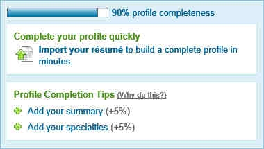
Setting goals for users can be another simple way to incorporate fun and motivate behavior. For this reason, many applications are starting to use profile progress indicators to encourage users to complete their profiles (see Figure 7). Additionally, showing users’ information and statistics about themselves or the way they use applications can motivate them to try and break records or change behavior.
Conclusion
Along with usability and utility, persuasion should be an important consideration in every design. Identifying behaviors, integrating social proof, incorporating stimulating visuals, framing text, and adding some fun are just a few of the many ways in which persuasion can be incorporated into designs to engage and motivate users. When applied correctly, persuasion brings to the table countless benefits: persuasion can nudge users to use a product, enjoy an otherwise dull activity, do a little more work than they would normally do, or work towards a goal they might otherwise never attempt.
[bluebox]
Want to Learn More about Persuasion in Design?
There are many great resources available on the subject of persuasion in design.
- For an introduction on how people are behaviorally predisposed to act in response to persuasive triggers, see Robert B. Cialdini’s book Influence.
- The first book to take persuasion and apply it to the technical realm was Persuasive Technology by B.J. Fogg.
- Susan M. Weinschenk’s book, Neuro Web Design, summarizes much of the prior work on persuasion and relates it to neuroscience.
- Finally, Stephen P. Anderson’s recently published book, Seductive Interaction Design, bridges the gap between behavior and design.
[/bluebox]劝导应当是每个设计中都需要考虑的因素。虽然使产品可用性对其成功无疑至关重要,但如果没人愿意用它,它最终仍是失败的。这篇文章概括介绍了为什么劝导是一种强大的设计手段,提供了劝导的成功应用实例,并探讨了五种结合劝导设计的技巧。
文章全文为英文版설득은 모든 디자인의 고려 사항이 되어야 합니다. 제품을 사용성 있게 만드는 것이 제품의 성공을 위해 분명히 필수적이기는 하지만, 누군가 그 제품을 사용할 동기가 없으면, 결국은 실패한 제품이 될 수 있기 때문입니다. 본 논문은 왜 설득이 강력한 디자인 도구인지를 요약하고, 어떻게 설득이 실제 애플리케이션에 성공적으로 사용되었는지의 예를 제공하며, 설득 디자인을 통합할 수 있는 다섯 가지 도움말을 탐색합니다.
전체 기사는 영어로만 제공됩니다.Fazer com que um produto seja fácil de usar é certamente essencial para o seu sucesso, mas se alguém não estiver motivado a usá-lo, ele acabará sendo um fracasso. Este artigo resume por que a persuasão é uma ferramenta de projeto poderosa, fornece um exemplo de como a persuasão tem sido aplicada com sucesso no mundo real e explora cinco dicas para integrar o design persuasivo.
O artigo completo está disponível somente em inglês.説得力はどのデザインにおいても検討されるべきである。製品を使いやすいものにするのはその製品の成功に不可欠なことだが、もしそれを誰も使ってみたいと思わなければその製品は結果として失敗である。この記事では説得力がなぜパワフルなデザインツールなのかを要約し、説得力が実際の場で上手く活かされたケースを取り上げ、説得力のあるデザインを取り込むための5つのヒントを検討する。
原文は英語だけになりますSi bien hacer que un producto sea usable es esencial para su éxito, si alguien no está motivado para usarlo, tarde o temprano será un fracaso. En este artículo se resume por qué la persuasión es una poderosa herramienta de diseño, se ejemplifica cómo se empleó con éxito la persuasión en una aplicación del mundo real y se examinan cinco sugerencias para integrar el diseño persuasivo.
La versión completa de este artículo está sólo disponible en inglés.

Lauren Martin is a lead user experience researcher at Ultimate Software in Weston, Florida, and founder of the South Florida User Experience group. She is also a recent graduate of Bentley University’s Master of Science in Human Factors in Information Design program. While studying at Bentley University, Lauren focused on social and cognitive psychology research.