What is the typical reaction to your research reports?
“Wow, thanks for sending that report. Those findings are really important and now we know what we need to do.”
Or
“Uh, gee, we’re still working through that report, thanks. However, we do have some questions about the data. Can you answer those for us now?”
If you sometimes hear the second response (and who hasn’t?), or you want to review your writing style to make sure it’s having the impact you desire, there are two key things to keep in mind:
- Flexibility: Use a report format that can expand or contract easily depending on how much detail your audience wants.
- Glanceability: Present information in a way that readers can understand it “at a glance.”
Aren’t there existing standards for user research reports?
Yes, there are existing standards.
The usability community has an international standard, ISO/IEC 25062:2006 that provides a “common industry format” (CIF) for reporting usability test findings. The standard consists of a seventy-four-item checklist for what should be included in a report, and can be found at http://zing.ncsl.nist.gov/iusr/documents/cifv1.0.htm. While important and useful for thorough documentation and archiving, the CIF comes across as a dissertation, and most of us don’t want to read one. So let’s move on past the CIF.
Classic usability textbooks (for example, Rubin and Chisnell’s Handbook of Usability Testing, or Barnum’s Usability Testing Essentials), offer a mixed bag of report styles. They start by outlining how to write a formal report and then suggest different formats that might work better. As Rubin and Chisnell write, “Deliver your report in a slide deck, in a company blog, or even an email if that way works best in your situation.”
How are other researchers doing their reports?
A quick survey with 28 respondents, distributed via the chi-consultants discussion list, found the following:
- The majority are split between writing up findings in Microsoft Word or PowerPoint.
- The executive summary and the usability issues list are two critical pieces included in just about any format used.
- The typical audience for reports is the whole product development team, with a subset focused on management.
Arguments in favor of the document-style report are that it leaves a comprehensive record of the research and satisfies an audience that likes a lot of detail.
Arguments for the slide deck-style include that it’s easier to write and consume, and that it provides better formatting for visuals. Your decision on what style to choose will ultimately come down to your audience:
- For management types that want something polished but quick to digest, use a PowerPoint presentation with very glanceable information.
- For busy audiences that want an easy-to-read format, use an executive summary.
- For skeptical audiences that need detail, provide a discussion section formatted in a question-and-answer style.
PowerPoint Presentation
PowerPoint has become one of our most requested, and, we believe, most effective styles of reporting. Why?
- PowerPoint can be effective in three slides or 300.
- A three-slide PowerPoint can easily be converted into an email summary.
- Good PowerPoint slides are glanceable.
Create your PowerPoint report in two parts: the first two-to-three slides are the executive summary and the rest are the usability issues list. The list is especially effective when you use screenshots to point out the issues and explain recommendations.
Does PowerPoint automatically make information glanceable?
No, it does not.
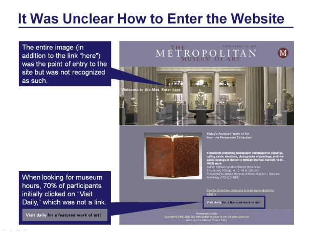
Some business executives believe PowerPoint presentations should consist of no more than three slides. Others believe all content should fit into one slide. The danger in that case is that you can end up with a very busy slide (see Figure 1).

The slide in Figure 1 requires careful reading of the summary, tracking numbers back from each cell, and guessing why some are highlighted. This works directly against one of the most appealing features of PowerPoint—its flipability. Readers should be able to flip through slides quickly to get to what is relevant to them. Therefore, you should keep the information clear and concise.
What does it mean for a slide to be “glanceable?”
A glanceable slide is one that uses callouts or pointers to show what’s important, rather than describing it in figure captions or paragraphs (see Figure 2).
The Executive Summary
An executive summary starts with the basic gist, and then expands as necessary. What’s the basic gist? Think:
- Highlights
- Lowlights
- How to turn the lowlights into highlights
The executive summary is the most important part of a report because it’s the only part that most people will read. It needs to stand in for the entire report. In discount usability testing, it will be the entire report in an email.
Don’t spell out methodology here. Your reader will generally assume you know how to design a good study, and won’t want to get bogged down by details. Focus on what you learned, and distill those findings down into the briefest possible phrases and points.
How can I draw my readers in right at the start?
Open with a quote.
What better way to communicate results of research with real people than to quote one of them right away? The best examples are the juicy quotes that exude love and joy for the product design or express frustration over poor usability. Picking one or two quotes from participants to start off a report brings your results to life and gives your readers an immediate sense of the validity and importance of the research. For example:
“I’m shocked at the things I was able to do…(my old program) took me several weeks to figure out some basic stuff…with this I could feel my way around right away…”
How can I get my readers invested in reading the whole thing?
Pull out some positives up front.
Everyone likes praise. Most usability studies will find some things that are working just fine, but there is a tendency to ignore those in favor of things that need to be fixed. We’ve found that opening with “highlights” or “things working well” helps to ease the tension and lower defenses.
Even in a straightforward usability issues list, we include a priority category of “good” or “working well” to make the point that certain UI elements are well-designed and should not be changed. This is especially important if the positive findings are answering research questions.
Document-Style Report
A good way to organize a document-style report is to use a question-and-answer format. It’s an easy-to-read, conversational style that helps readers locate the information most relevant to them. For the designer who created the blue dot display, what better way to get her the data she needs than to have a heading, “Did people notice and use the blue dot display?”, followed by the quick answer “Yes, they did.” A sample format would look like this:
- Question header
- Short answer
- Description and examples of data
How can I make my report glanceable?
Add a Table of Contents at the start, created from section headings. Readers will see at-a-glance what the report contains and be able to jump to whatever section they are interested in reading.
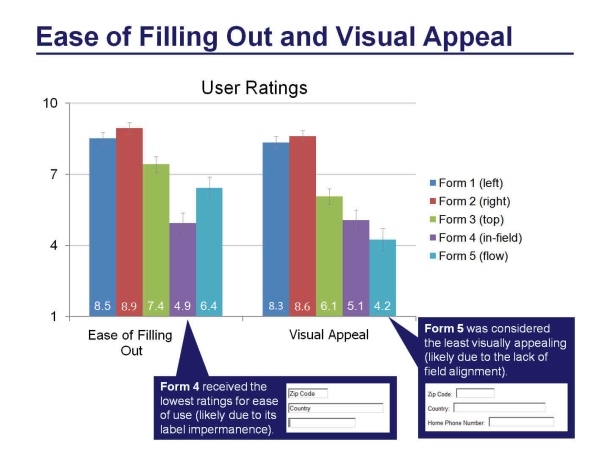
If I have to include numerical data, what’s the best way to present them?
Graph the data.
Tables may be a great way to organize data, but they’re convoluted and take time to decipher. Graphs are better; because readers can immediately see comparisons. Include the actual numbers in the graph and use error bars to show confidence intervals or standard error of the mean, and you will satisfy even the most statistically savvy audience (see Figure 3).
[bluebox]
Tip Summary
The tips we have found most effective for generating interesting and usable research reports are:
- Think glanceable.
- Focus on the executive summary as the full report, and expand only if necessary for your audience.
- Open with a participant quote.
- Pull out some positives up front.
- Follow good PowerPoint protocol for effective bullet points—be concise (even when writing in email or Word).
- Annotate your charts, diagrams, and screenshots.
- Follow a question-and-answer format using your original research questions for section headings.
- Graph numerical data instead of putting them in tables.
[/bluebox]与设计和研究带来的乐趣相比,写研究结果的报告让人想要撞墙。如何落笔?用什么格式?包括哪些内容?我们希望提供几个建议,通过格式灵活性(根据目标读者定制报告)和可浏览性(使得重要信息显而易见)来改善您的报告。
首先将“报告概要”视作独立的简要报告。在开场白中引用用户的话并包括正面的发现结果来吸引眼球。谈论研究结果,而非方法。对于扩展报告,复用您的研究问题作为讨论章节的标题,这样读者可以看到您的结果正是他们想要的明确答案。让整篇报告简洁明了,删除不相关的数据表和说明段落,使用带标注的图片和屏幕截图。本文介绍了以上及其他技巧,使您的报告更易于被人理解接受,从而更有影响力。
文章全文为英文版흥미 있는 연구 프로젝트 디자인 및 수행 작업이 끝난 후, 리포트를 쓰는 것이 힘에 벅차게 느껴질 수도 있습니다. 어디에서 시작해야 하나? 어떤 형식으로 하지? 무엇을 포함시키나? 형식 유연성(리포트를 독자에게 맞춤) 그리고 한눈에 알아차릴 수 있게 하기(이해시키고자 하는 정보를 이해하기 위해 독자가 애를 쓰지 않음)에 초점을 맞춰 리포트 작성에 활력을 불어넣을 수 있는 몇 가지 제안을 해 드리고자 합니다.
프로젝트 개요가 그 하나로 보고서 역할을 할 수 있는 요약 보고서라 생각하며 시작합니다. 시작 부분에 훌륭한 인용문과 긍정적인 연구 결과를 포함하여 독자의 관심을 끕니다. 방법이 아니라 배운 점이 무엇인지 이야기합니다. 확장된 리포트의 경우에는 연구 문제를 토의 섹션을 위한 제목으로 재활용하여 독자들이 연구 결과를 그들이 필요한 사항에 대한 명백한 답변으로 볼 수 있도록 합니다. 모든 것을 명료하고 분명하게 설명하고 부적절한 데이터 표와 서술적인 단락을 이용하지 않습니다. 대신, 콜아웃을 이용한 그래프와 스크린샷을 이용하십시오. 본 논문은 당신의 리포트를 손쉽게 읽을 수 있게 작성하여, 결과적으로 더욱 두드러질 수 있도록 돕기 위한 위의 내용 및 기타 사항을 설명합니다.
전체 기사는 영어로만 제공됩니다.Após se divertir com o projeto e a execução de um projeto de pesquisa, escrever o relatório pode parecer como bater de frente em um muro de tijolos. Por onde começar? Como formatar? O que incluir? Gostaríamos de oferecer algumas sugestões sobre como aprimorar a maneira de escrever relatórios focando na flexibilidade do formato (personalizando seu relatório ao seu público) e na facilidade e rapidez de leitura (não obrigar seu público a ir atrás da informação que você está tentando transmitir).
Comece pensando no Sumário Executivo como um breve relatório que pode ser lido isoladamente. Torne-o envolvente começando com boas citações e incluindo descobertas positivas. Fale sobre o que aprendeu, não a sua metodologia. Para relatórios mais amplos, transforme as perguntas de sua pesquisa em títulos para seções de discussões para que os leitores possam ver seus resultados sob a forma de respostas claras às suas necessidades. Mantenha tudo conciso e limpo removendo dados, tabelas e parágrafos descritivos estranhos. Em vez disso, use gráficos e capturas de tela com legendas. Este artigo descreve essas e outras técnicas para fazer com que seus relatórios sejam mais fáceis de ler e, como resultado, tenham maior impacto.
O artigo completo está disponível somente em inglês.研究プロジェクトの計画や実施が無事に終わっても、レポートをまとめる段階で、行き詰まってしまうこともある。どこから始めればよいか?どのような形式にすればよいか?何を含めるべきか?我々は、形式の柔軟性(対象読者に合わせてカスタマイズする)および一瞥性(レポートが伝えたいことを読者はすぐに掴めるか)に焦点を当て、レポートの作成の改善に向けたいくつかの提言を行う。
まず、それだけで短いレポートになるような「要旨」を検討することからスタートする。読者の興味を引くように、有名なフレーズの引用から始め、肯定的な発見を含める。方法論ではなく、何が分かったのかを述べる。詳細レポートの部分では、議論のセクションで見出しとしてリサーチクエスチョンを再利用し、読者のニーズに対する明解な解答として、調査の結果を読むことができるようにする。無関係なデータの表や記述的な段落は削除し、すべてを簡潔にして、不要なものをなくす。その替わりに、吹き出しを付けたグラフやスクリーンショットを利用する。この記事では、これらの他にも、消費者にとって読みやすく、その結果彼らにインパクトを与えられるレポートの作成テクニックについて説明する。
原文は英語だけになりますPasada la parte entretenida de diseñar y ejecutar un proyecto de investigación, escribir el informe puede ser como darse la cabeza contra la pared. ¿Por dónde se empieza? ¿Qué formato se le da? ¿Qué se incluye? Nos gustaría hacerle algunas sugerencias para que mejore la escritura de su informe focalizándose en la flexibilidad del formato (adaptando el informe a su destinatario) y en la comprensión a primera vista (que el destinatario no tenga que esforzarse para obtener la información que usted trata de transmitir).
Comience por pensar el Resumen Ejecutivo como un informe breve que tiene valor en sí mismo. Hágalo atractivo comenzándolo con buenas citas e incluyendo datos positivos. Hable de lo que aprendió, no de su metodología. Para los informes más extensos, recicle las preguntas de la investigación y conviértalas en encabezados de las secciones de discusión de manera que los lectores vean los resultados que usted obtuvo como respuestas claras a sus necesidades. Sea conciso y prolijo eliminando las tablas con datos irrelevantes y los párrafos descriptivos. En su lugar, utilice gráficos y capturas de pantalla con leyendas. En este artículo se describen éstas y otras técnicas para que su informe sea más fácil de leer y, en consecuencia, tenga más impacto.
La versión completa de este artículo está sólo disponible en inglés.